Seven of the most intriguing national pavilions to see at the Venice Architecture Biennale
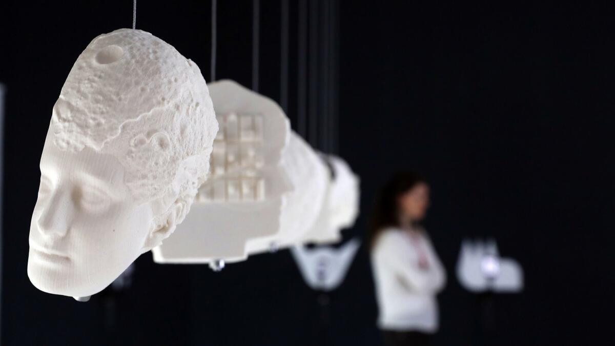
The Venice Architecture Biennale is a bit like being in a big city, where your every want and need can be instantly satiated.
Want to see architectural models floating in a giant pool? Check.
Need a room cleverly divided by a single, swooping sheet of paper? Done.
What about some bulbous inflatables that look like giant amniotic sacs? All good.
There are 60-plus national pavilions in the exhibition — all exploring some facet of architecture related to “Freespace,” the central theme established by biennale curators Yvonne Farrell and Shelley McNamara of Grafton Architects in Ireland.
Uruguay takes on the nature of space in prison. Poland is displaying models of historic architecture floating in that aforementioned pool. And Denmark is presenting, among other things, a lightweight, webbed material for building temporary structures.
With so much to see, it can be hard to think about where to even begin. Here is a selection of seven pavilions worth checking out:
Israel: A Solomonic divide
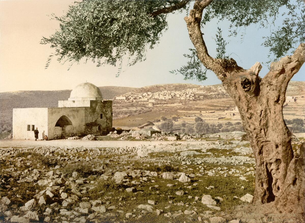
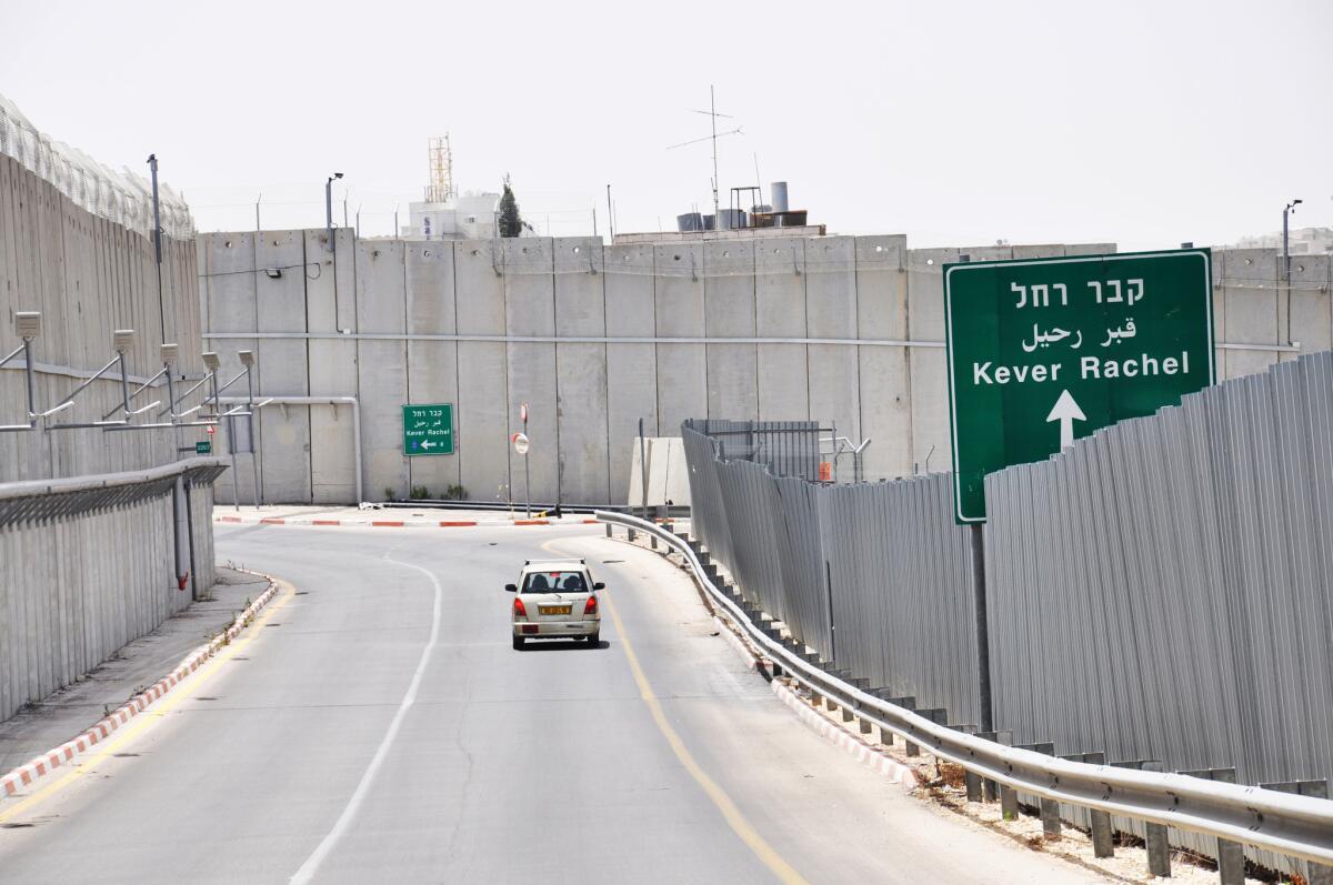
The Israeli pavilion looks at how public spaces that are purportedly shared can function as sites of delicate political tangos — in this case, five contested holy sites in Israel held dear by Muslims, Christians and Jews.
“In Statu Quo*,” as the exhibition is titled, is an incisive look at how places such as Rachel’s Tomb, the Cave of the Patriarchs and the Western Wall are shared — or not — under strict protocols often overseen by the Israeli military. The show includes a fascinating color-coded 19th century model of the Church of the Holy Sepulchre, hand-painted in wood, showing how its functions are divvied up by various religious groups.
Other elements include architectural models that show unrealized plans for Jerusalem’s so-called Wailing Wall (including concepts by Louis Kahn and Isamu Noguchi) and an animated film by David Polonsky, of “Waltz with Bashir” fame, that examines the Mughrabi Ascent, the only entrance to the upper levels of the Temple Mount that is available to non-Muslims.
It’s a clear-eyed pavilion that holds up a mirror to petty divisiveness — and the sort of thing that should have resonance well beyond the world of architecture.
Curators: Deborah Pinto Fdeda, Ifat Finkelman, Oren Sagiv, Tania Coean Uzzielli.
Location: Israeli Pavilion, Giardini
Great Britain: Every man is an island
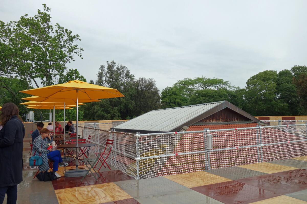
Enter the British pavilion and you will find nothing, just room after empty room containing only the occasional fire extinguisher (a nod to the local fire codes). That’s because this year, the curators haven’t installed anything in their building; they’ve installed around it, draping the structure in a massive scaffold. Climb the steps to the top and you’ll find incredible views of Venice — and the peaked roof of the pavilion peeking through the scaffolding like an architectural island.
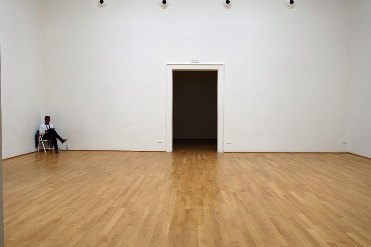
“Island,” as the installation is called, is certainly a nod to Britain’s geographic state. But it serves as a metaphor for other issues as well. In the age of rising seas, the scaffold provides an image of a building submerged. It also channels political isolation, a purposeful encircling of space — Britain in the age of Brexit. It’s a simple statement with a tremendous amount of bite — likely why the installation picked up a special mention for national participation by the biennale jury.
In true British style, tea is served on the platform in the afternoons, allowing visitors to hang out and admire the views as they sip. It’s a lovely gathering space. But in a city that sits on water, it also takes on the aspect of a raft — with the people aboard it resembling either the hardy survivors of a storm or the last bits of humanity in the moments before they become totally unmoored.
Curators: Caruso St. John Architects and Marcus Taylor.
Location: British pavilion, Giardini
Estonia: Honoring history
Say the word “monument” and you are likely to conjure images of old generals sitting atop gallant steeds or massive bas reliefs proclaiming the heroics of battles. These structures can often seem immovable, but they are not. The fall of a regime or the fall of an idea can be quickly followed by a quick round of statue-toppling. (Think: Confederate monuments in the American South.)
The nature of monuments and their permanence is explored in clever ways in “Weak Monument,” Estonia’s contribution to the Venice Architecture Biennale. This includes studies of monuments that were hastily removed, as well as monuments that were informally designated — such as the staircase in a park that became a site of pilgrimage after serving as a stage for important resistance speeches.
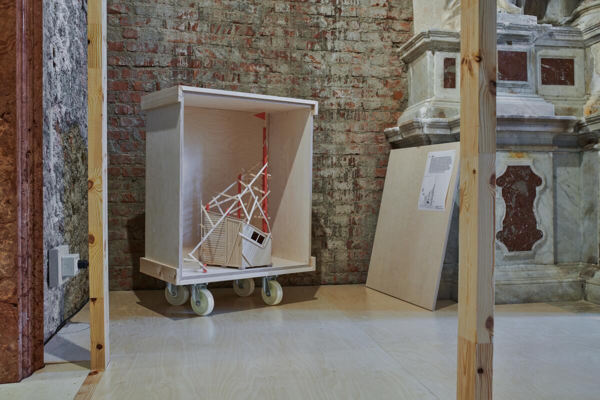
The show opens with a story about the Estonian village of Torma, in which a statue of a kneeling warrior was placed facing east or west over the years, depending on where the village concluded its greatest threats came from.
It’s a comic arbitrariness highlighted by the pavilion’s principal installation.
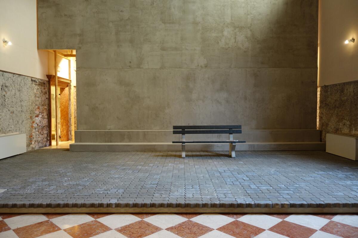
Located in a small, decommissioned baroque church, the curators have blocked all views of the altar with a temporary concrete wall. A park bench placed before it invites visitors to take a seat and contemplate the rear of the church.
Monuments, it turns out, are all about the direction we happen to be facing at a moment in time.
Collaborators: Tom Avermaete, Toomas Paaver, Klaus Platzgummer, Margrethe Troensegaard, Charlotte Grace, Sandra Mälk, Eik Hermann, Pavel Bouše.
Location: Former Church of Santa Maria Ausiliatrice, Castello Fondamento, S. Gioacchin, 450
U.S.: Citizens of the world
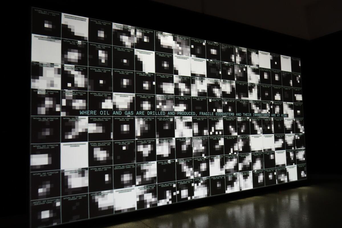
What does it mean to be a citizen in the era of globalism and the internet? The United States pavilion raises those questions at various scales — municipal, regional, global and galactic — examining the complicated notion of how we define space within a group and how these don’t always obey our established political boundaries.
Among the most intriguing installations are a work titled “Cosmorama” by the group Design Earth that explores how outer space is set to be defined by nation-states and big business, as well as an absorbing video presentation by several collaborators, including Diller Scofidio + Renfro and the Columbia University Center for Spatial Research, that looks at who does and doesn’t have access to electrical power in spots around the world.
It contains some stark juxtapositions: Poor rainforest villages lie in darkness while mining concerns are brightly illuminated; Houston’s lights bounce back after a major hurricane — Puerto Rico’s do not. Citizenship does not mean equal access to resources.
“Dimensions of Citizenship,” as the exhibition is titled, packs a lot of ideas into a single show — too many — but it raises interesting questions. Among them: Is the very premise of the Venice Biennale, which is based on national identity, increasingly irrelevant in a global age?
Curators: Niall Atkinson, Ann Lui, Mimi Zeiger
Location: United States Pavilion, Giardini
Chile: Stadium city
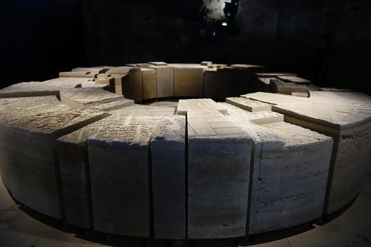
Too many architecture exhibitions are like reading a book on a wall: exhausting combinations of schematics paired with endless architecture-speak. The Chilean pavilion is an example of how a complicated urban phenomenon can be beautifully rendered as architectonic sculpture — and be more engaging as a result.
“Stadium,” as the installation is called, features a room-sized sculpture made of pressed earth laid out in the shape of a stadium. But on its surface is the imprint of a city. It looks both like an ancient relic and brutalist work of contemporary art.
The piece was inspired by a 1979 event, in which the regime of Augusto Pinochet gathered 37,000 inhabitants from marginal communities in Santiago’s National Stadium to offer them title to lands they had squatted — the space of a city defined by one blustery act. (Video on one wall shows Pinochet acting the part of benevolent dictator.)
It’s a charged piece, given that the stadium was also used as a place in which to jail and torture dissidents during Chile’s 1973 military coup. But it’s the use of material that ultimately makes it so powerful: earth — and the histories and bodies that it bears — as the foundation for everything we build.
Curator: Alejandra Celedón
Location: Corderie di Arsenale
Switzerland: House beautiful
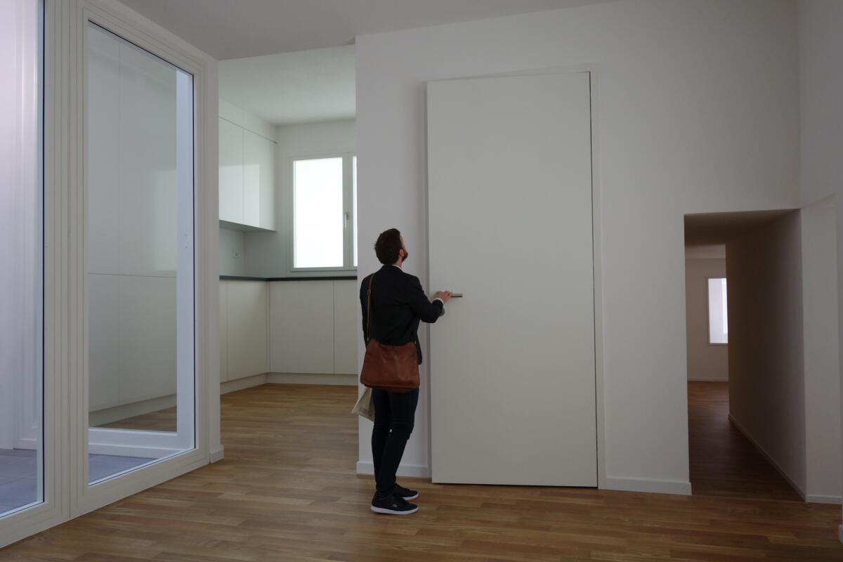
The biennale is a very serious place full of very serious architectural ideas. Which makes Switzerland’s wickedly humorous pavilion — devoted to the universal blandness of the contemporary home — a welcome respite from all the over-complicated high mindedness. Not that it sacrificed ideas for wit: the pavilion was the winner of the biennial’s Golden Lion Award.
“Svizzera 240: House Tour” looks much like any prototypical dwelling: white walls, wood floors, monochromatic counters — of the sort that have become a de facto part of the real estate open house. But as you proceed through the space, the architects begin to toy with scale: Average rooms lead to oversized doors that lead to hallways that shrink into “Being John Malkovich” proportions.
It’s a joyful play on space — one that takes the world around us and turns it into something downright Escher-esque.
Participants: Alessandro Bosshard, Li Tavor, Matthew van der Ploeg, Ani Vihervaara
Location: Swiss pavilion, Giardini
Egypt: Free market
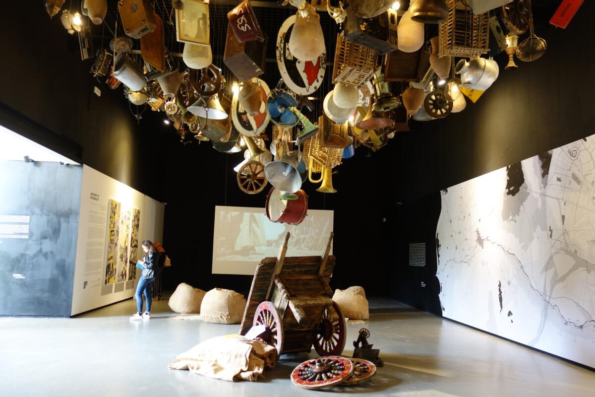
For “Freespace,” the curators of Egypt’s national pavilion analyzed the ways in which sidewalks and streets in Cairo are appropriated as sites of informal commerce — places where vendors of all stripes gather to sell used clothing, old electronics, furniture and food. “Robabecciah,” as the show is titled, features detailed analyses of how these spaces are used and how, despite efforts to clear them, they quickly return.
But it tells this story in a deeply humane fashion. Dangling from the ceiling are dozens of objects — including, pots, pans and an old drum — acquired at informal markets in Egypt. And on one side of the space a worthwhile short film captures a day in the life of an ambulatory junk peddler, a charming man who ends up on the receiving end of a tattered painting he admires so much that he finds himself reluctant to sell it.
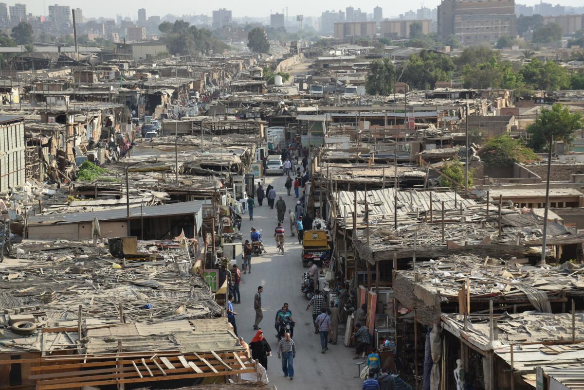
The pavilion doesn’t propose any “solutions” to what might be described as the “problem” of informal selling. Instead, it seems to posit that this centuries-old system works best when left untouched.
That junk peddler? Architects and urban planners should be designing for him, too.
Curators: Islam Mosleh El MAshtooly, Mouaz Abouzaid and Cristiano Luchetti
Location: Egyptian pavilion, Giardini
ALSO
The biggest entertainment stories
Get our big stories about Hollywood, film, television, music, arts, culture and more right in your inbox as soon as they publish.
You may occasionally receive promotional content from the Los Angeles Times.


