Micro-models and macro catalogs: the best and the heaviest at the Venice Architecture Biennale
Reporting from Venice, Italy — The 2018 Venice Architecture Biennale — with its cavernous galleries and 60-plus national pavilions — is too big to absorb in a single visit or even two or three.
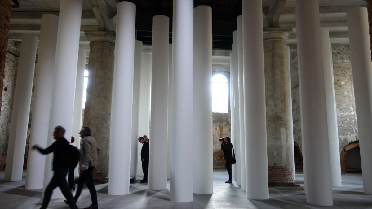
That doesn’t mean that there weren’t things that caught our eye — such as the installation of white columns by Valerio Olgiati that turned a corner of the exhibition site’s Corderie building into a temple of sorts. Or the aesthetically refined exhibition-within-an-exhibition, staged by Italian architect Cino Zucchi, that paid tribute to the late Italian modernist Luigi Caccia Dominioni.
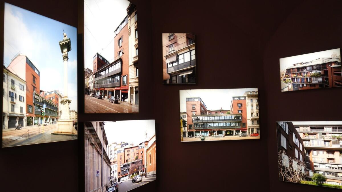
So we’ve gathered a few of those moments here — the good, the dissonant, the high-minded and the way too darn heavy — from Venice Architecture Biennale 2018.
Best use of color
In what would make an intriguing standalone show, biennale curators Yvonne Farrell and Shelley McNamara, of the Dublin-based Grafton Architects, invited 16 Irish architects to create a model inspired by the work of another architect.
The section, titled “Close Encounter,” included a tribute to Gordon Bunshaft’s marble-clad Beinecke Library at Yale University by Heneghan Peng, as well as a wooden pavilion, by GKMP, that was inspired by José Antonio Coderch’s accordion-like Edificio Girasol in Madrid.
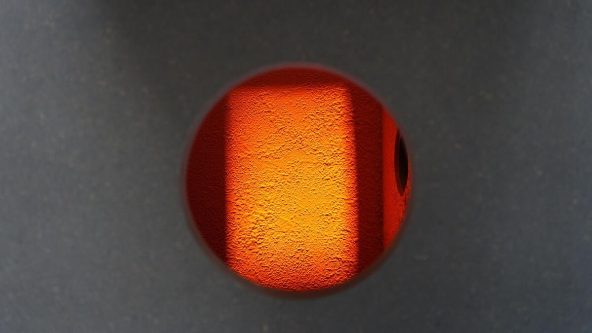
I was most captivated by an installation by Noreile Breen, who focused on the ways in which Mexican architect Luis Barragán employed light and surface to create what she describes as a “compelling human spatial experience.”
Her model consisted of a brutal grey box punctuated, at various intervals, by dark grey flaps. When you lifted these, a peephole revealed a Barragán-esque world of luminous color and light.
Most hypnotic performance
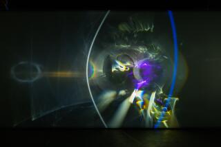
In its exhibition, “Dimensions of Citizenship,” the curators at the United States pavilion sought to broaden the concept of citizenship by looking at the ways in which important group identities extend beyond the current national borders. As part of their programming, they invited the U.S. art collective Postcommodity, to perform a sound piece before the U.S. pavilion at the May 26 preview.
Postcommodity is composed of artists Raven Chacon, Cristobal Martinez and Kade Twist, all of whom have indigenous backgrounds. Martinez and Twist didn’t make it to Venice, so it was Chacon (a member of the Navajo Nation) who led the show: a looped electronic sound piece that morphed into a dark incantation that seemed directed at the idealized neoclassical architecture of the U.S. pavilion building. At times, his thunderous growls seemed as if they might rip the architecture apart.
Our notions of citizenship? They required stripping others of their own.
Most dissonant
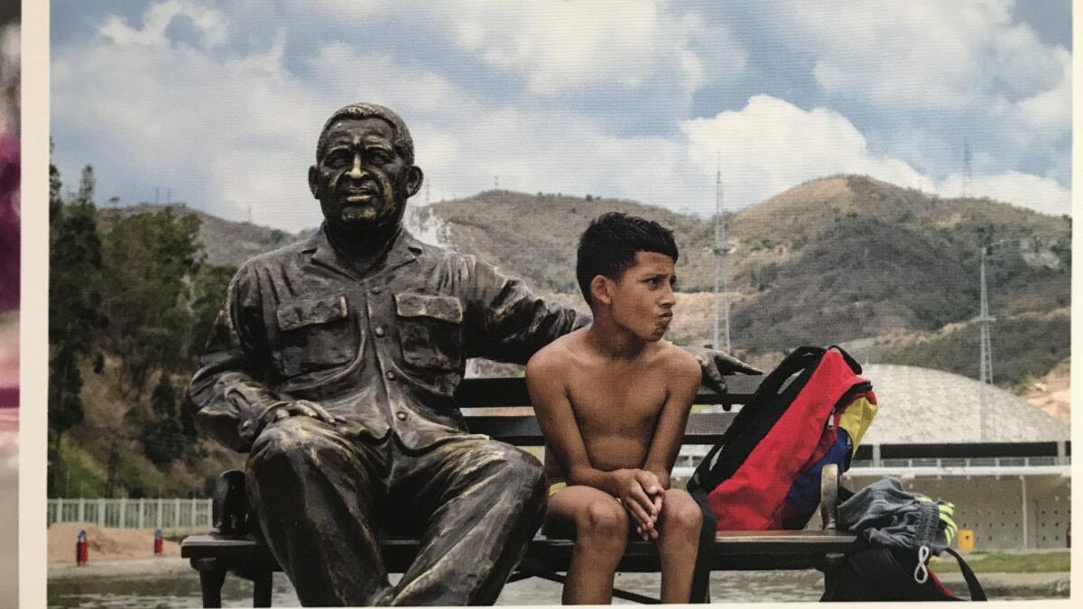
The Venezuelan pavilion reflects the limitations of the Biennale’s model, which is to present architecture submitted by nation-states — presentations that easily turn into uncritical self-promotion. The Venezuelan pavilion featured an installation titled “Espacio Rebelde” (Rebel Space) that examines three large-scale projects in which areas such as an old air base and stretches of Avenida Bolivar were turned into more habitable public spaces.
The adjacent wall text describes these spaces as being for “emerging and insurgent uses, re-occupied, re-valorized and re-inhabited as meeting places for the enjoyment of the communities.”
These insurgent uses included no mention of Venezuela’s political and economic strife or last year’s anti-government protests that resulted in the deaths of dozens.
A public space in which some of the public is written out of the story.
Most ecological
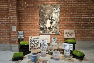
There are pavilions at the biennale made out of wood, rock, clay, marble, steel, bricks and pressed earth. Which begs a big ecological question: What is the carbon footprint of hauling piles of construction materials to an ancient city in the middle of a lagoon to make really cool architectural installations? Definitely spectacular.
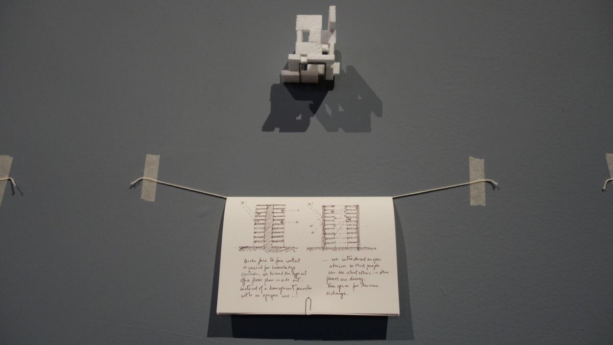
I therefore had to admire the installation presented by Chilean firm Elemental, led by Pritzker Prize-winner Alejandro Aravena (who curated last year’s biennale). It consisted of handwritten notes suspended on string and taped to the wall. Models of the firm’s buildings — which could fit in the palm of a hand — were crafted out of materials such as matchboxes and thumb-sized bits of Styrofoam.
All in all, the whole thing was probably shipped to Venice in a box no bigger than a FedEx Pak. Well done, Chilenos. Well done.
Simplest intervention
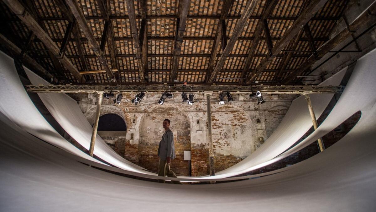
Likewise, the Indonesian pavilion was a reminder that a compelling installation doesn’t have to be a complicated one. It consisted simply of a massive draped piece of Tyvek (the synthetic fiber used for overnight mailers) that transformed an empty brick room at the Corderie into an undulating experience of space.
Most excessive use of paper
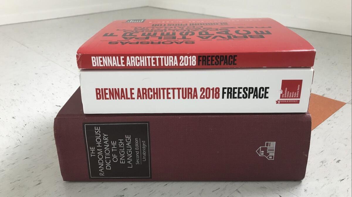
Goes to … the biennale! The catalogs for the exhibition are two monstrously large tomes — one covering the main exhibition; the other, the international pavilions. Their combined size is almost that of the Random House unabridged English language dictionary.
All of this dead tree matter is employed to reproduce what is essentially the exhibition’s wall text. (Seriously, a nice newsprint booklet or a password-protected website would do.) The young woman who managed the apartment I stayed at in Venice told me that in the wake of the biennale, hotels and apartments all over the city are littered with the catalogs since nobody wants to be bothered with dragging these book-bricks home.
Perhaps an enterprising architectural studio will gather them all and employ them as construction material in an experimental pavilion for the 2020 version of the show. It’s an opportunity to be eco and meta all at the same time.
ALSO
The women at the helm of 2018’s Venice Architecture Biennale and the unexpected generosity of design
Seven of the most intriguing national pavilions to see at the Venice Architecture Biennale
More to Read
The biggest entertainment stories
Get our big stories about Hollywood, film, television, music, arts, culture and more right in your inbox as soon as they publish.
You may occasionally receive promotional content from the Los Angeles Times.
