Now that Arata Isozaki won the Pritzker, let’s take a fresh look at his MOCA building
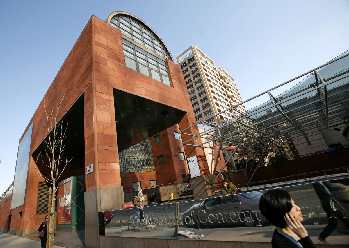
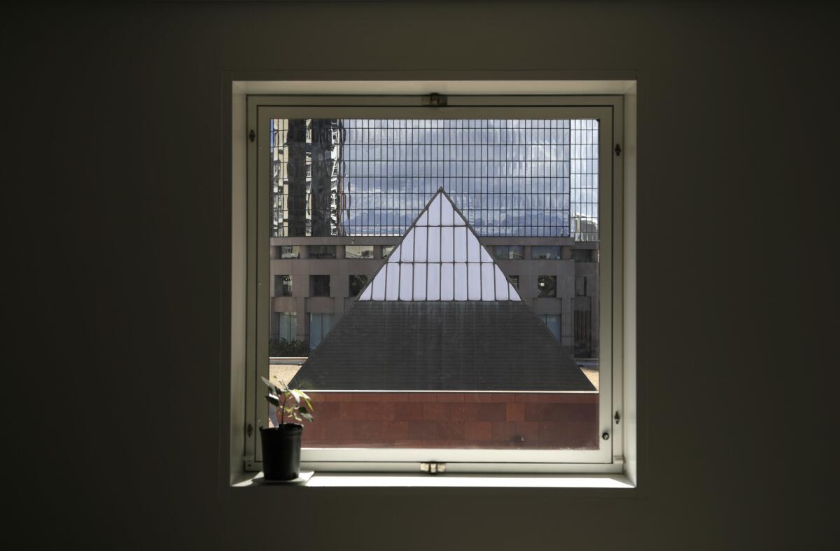
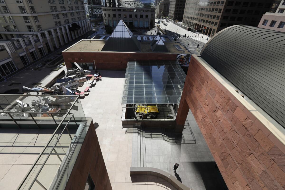
When Klaus Biesenbach took over as director of Los Angeles’ Museum of Contemporary Art in October, he was immediately intrigued by some of the architectural details of the museum’s Grand Avenue building. There is the ticket office, a cube wrapped in aluminum panels rendered in forest green. The barrel vault, containing a library, that hovers on a pair of pillars clad in red Indian sandstone. And there are the skylights — 11 of them, in various scales — all prominently rendered as glass pyramids on the roof.
These stripped-down geometric forms, Biesenbach says, remind him of minimal works by artists featured in MOCA’s galleries. He points to a row of color printouts spread out across the floor of his MOCA office. One image reveals Roni Horn’s cast-glass cylinders. Another shows an early geometric structure made of reflective glass by Dan Graham.
For the record:
10:30 a.m. March 15, 2019An earlier version of this article stated that aspects of the Museum of Contemporary Art building reminded director Klaus Biesenbach of work by artists he had worked with in Berlin. He actually said the building’s shapes reminded him of work by some of the artists featured in MOCA’s galleries.
“It was an immediate dialogue with the artists I’ve worked with,” he says of the building designed by Japanese Postmodern architect Arata Isozaki.
So he picked up his cell phone and began taking pictures. “I felt [Isozaki] is so clear about these simple geometric shapes. There is clarity.”
At his first meeting with MOCA’s board last fall, he did an informal slide presentation on the building’s design, “a little photo essay of every circle and cylinder, the triangles, the squares, the cube.”
“Everyone said, ‘Do you like the building?’ ” he recalls, conveying the surprised tone with which his presentation was received. “I said, ‘This is such an important piece of architecture, we need to let it shine.’ ”
ALSO: Arata Isozaki, the Japanese architect who designed MOCA, wins the 2019 Pritzker Prize »
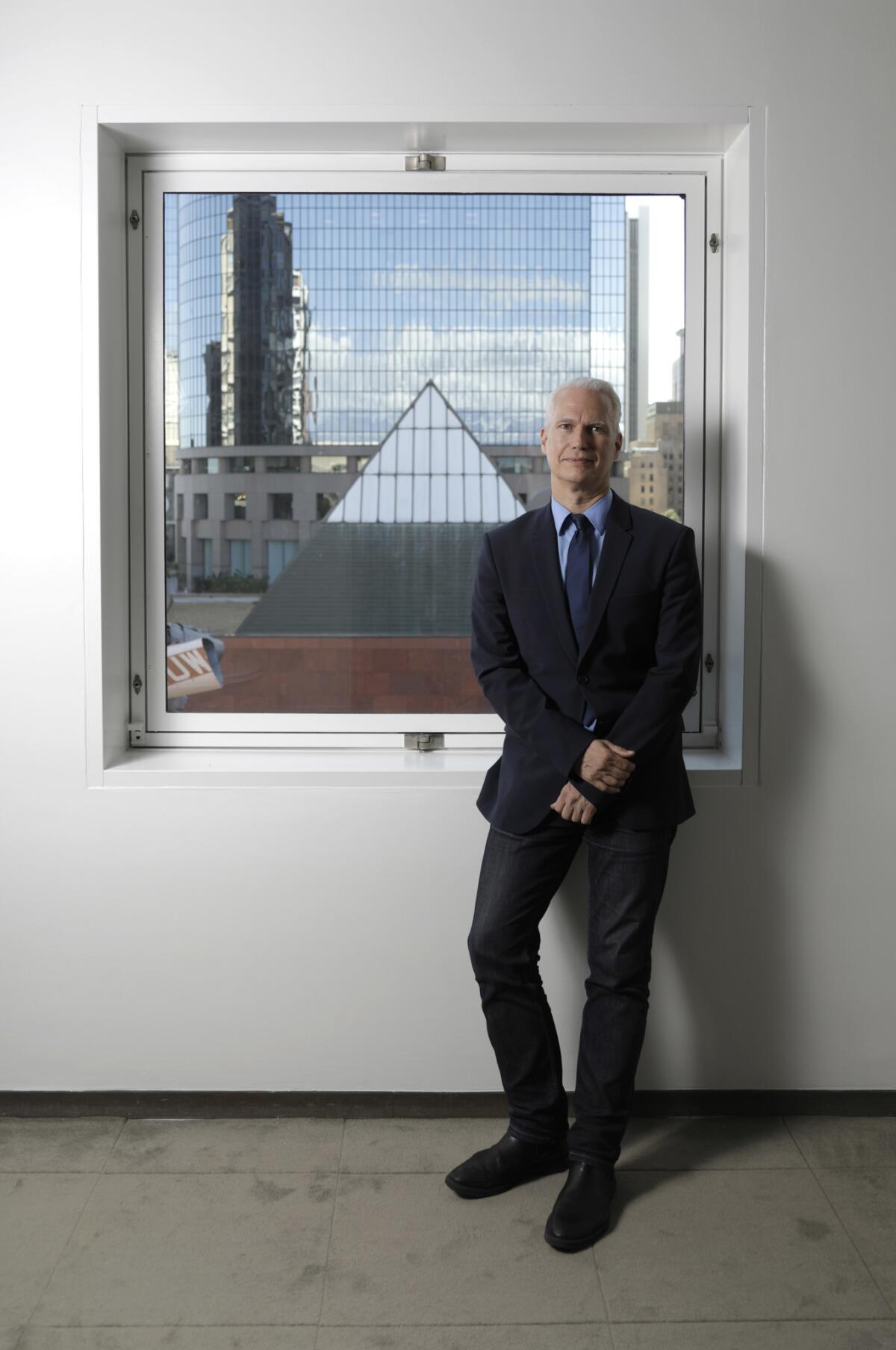
Biesenbach’s high opinions of MOCA Grand, a building that is respected, if not necessarily beloved, by Angelenos, got a significant boost last week when it was announced that the 2019 Pritzker Architecture Prize would go to Isozaki, who is now based in Okinawa.
In its citation, the Pritzker jury described Isozaki’s work as a “search for meaningful architecture,” in which “he created buildings of great quality that to this day defy categorizations.”
The announcement was a happy coincidence for Biesenbach. The director recently did away with a program established by his predecessor that wrapped the structure’s facade in images of art. (A practice that only served to obscure the building’s profile.) In addition, Biesenbach presented a plan to the museum’s trustees in January to restore one of the building’s original design elements: the skylights.
Over the years, Isozaki’s glass pyramids have been covered up to prevent sunlight from damaging works of art. It was a good move for delicate drawings and nearly century-old canvases, but it’s had the effect of divorcing the museum, much of which is huddled below grade, from the outdoors — in the process, erasing one of the building’s most attractive qualities.
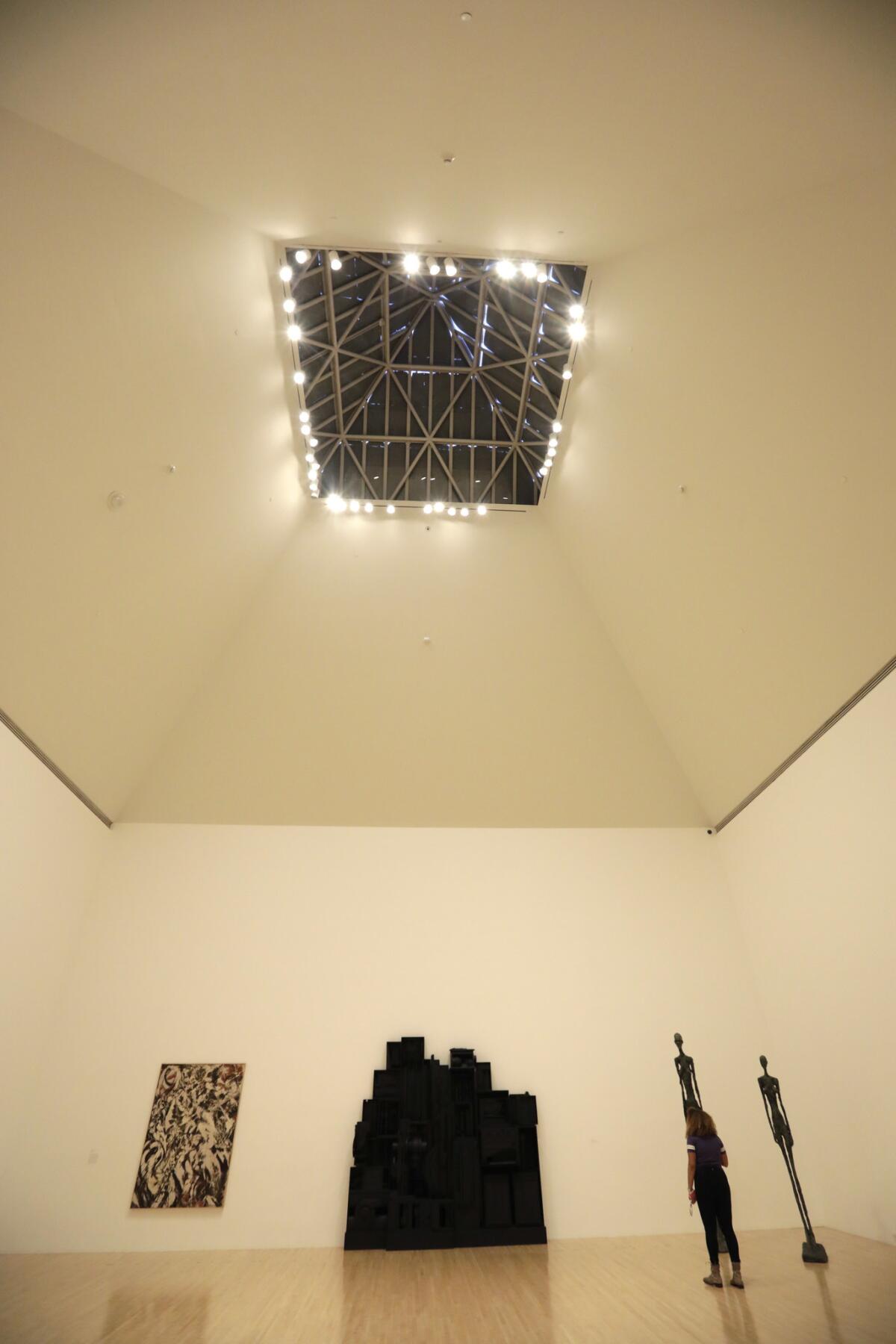
In an early review of MOCA, critic Jed Perl described the light in the galleries as “beatific, serene.” Today, the museum is illuminated by less inspiring artificial spotlights.
Since the museum’s opening, more sophisticated technologies for managing light have made it possible to consider uncovering the skylights without damaging the collection. Currently, the museum is conducting a light study with the support of trustee Marina Kellen French to see what methods might be deployed, including scrims that automatically fall into place if the sun gets too intense. Biesenbach hopes to put the recommendations into action at some point this year. (Houston’s Rothko Chapel, which displays 14 large-scale canvases by the late Abstract Expressionist Mark Rothko in a gallery capped by a skylight, is in the midst of a similar exercise.)
There are other elements to the plan too. Biesenbach doesn’t just want the skylights to draw light into the museum; he wants them to emit it as well.
“We want to light them at night,” he says. “Isozaki envisioned them as beacons.”
The mechanics for this were installed in the skylights as part of their original design. They simply need to be unearthed.
“It is,” Biesenbach says, “a lot of uncovering.”
Strings attached
Isozaki’s Pritzker win, along with Biesenbach’s tweaks to the architecture, is certain to stir debate about the legacy of a building whose submerged public profile has been vastly overshadowed in the last 15-plus years by the arrival of splashy new structures on Grand Avenue. Among them: Frank Gehry’s ebullient Disney Hall to the north in 2003, and Diller Scofidio + Renfro’s honeycomb Broad museum across the street in 2015 — the latter of which is often described as “the cheese grater.”
When it opened its doors in 1986 with an exhibition titled “Individuals,” MOCA joined Welton Becket’s ‘60s-era Music Center as the only other cultural player on what was then a denuded Bunker Hill. The museum’s immediate neighbors to the north (the Colburn School) and east (the Omni Hotel) had yet to be built. In its earliest days, the museum felt more prominent — a 98,000-square foot Postmodern mirage.
MOCA’s design was generally well-received by critics. The Times’ William Wilson described the structure as a “self-evident architectural masterpiece.” In the New York Times, critic Joseph Giovannini waxed rhapsodic about the “clarity and purity” of the ways in which Isozaki arranged his geometric forms.
Paul Goldberger, the Pulitzer Prize-winning architecture critic who was then at the New York Times, was generally pleased with the building, commenting on the “spectacular profile” of the pyramidal skylights and the “sensuous air” of the Indian sandstone. He was less impressed, however, with Isozaki’s approach to the galleries, which require descending down a flight of steps from the ticket office on Grand Avenue.
“There is something disquieting about going down rather than up to enter a building that aspires to a certain monumental presence,” he wrote. “It feels a bit like going into a basement to view art, even if the basement is as grandly conceived and as handsomely detailed as this one.”
It’s a common critique of the building. David Gebhard and Robert Winter, in their “Architectural Guidebook to Los Angeles,” sing the praises of the building’s design, but note that “the layout of the the museum seems a bit strange. The public galleries are approached down a flight of stairs … From the street, these stairs are hardly apparent.”
Much of this had to do with the museum’s infamously complicated site: a steep patch of Bunker Hill real estate that abuts the double-decker Grand Avenue. In addition, the museum rests on top of a parking structure to which Isozaki had to conform his column grid.
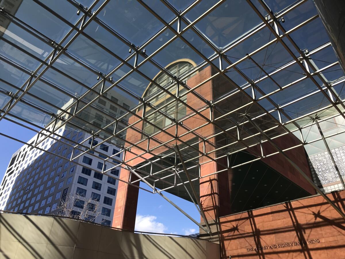
As with most things real estate in L.A., the less-than-ideal location came as a result of wheeling and dealing — between the city, a state community redevelopment agency and the developers who were looking to turn a moribund patch of Grand Avenue into an 11-acre, $1.2 billion commercial center called California Plaza. By carving out space for MOCA, and contributing $20 million to construction costs, the developers could fulfill their percent-for-art requirement — voilà, a museum.
But no gift comes without strings attached. In addition to the difficult terrain, all kinds of restrictions were put on Isozaki’s design for the museum: MOCA couldn’t grow too tall, lest it block the commercial towers that were soon to spring up, nor could it block pedestrian access to the plaza from Grand Avenue.
Isozaki, therefore, was given the impossible task of making a building that was really a non-building — something that wouldn’t get in the way — but that would still be a great place to see art. (L.A. seems to have a knack for selecting the most inhospitable sites for its important art institutions: The Los Angeles County Museum keeps its objets next to the tar pits; the Hammer Museum occupies a portion of a petroleum office tower; the Getty Center sits on top of a mountain.)
Village or bunker?
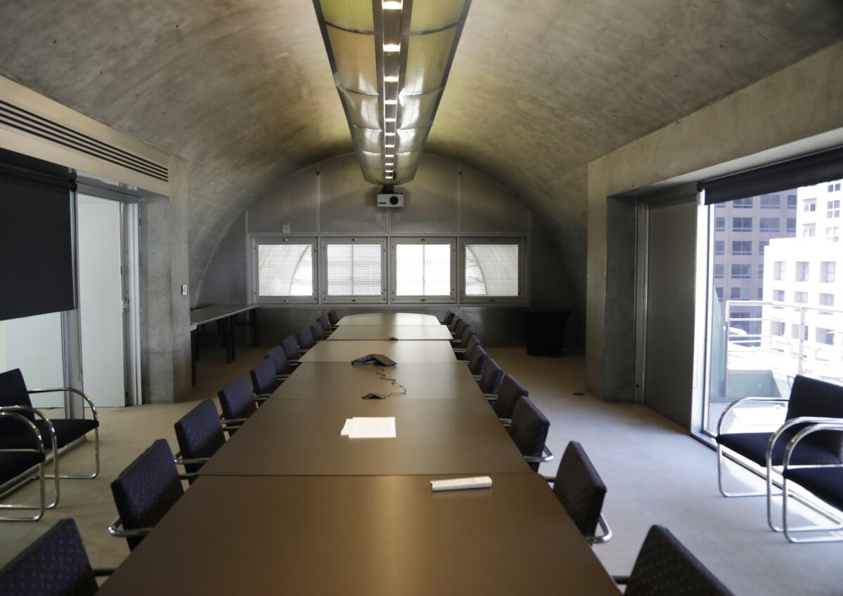
Isozaki’s response to the myriad demands put forth by developers was to sink much of the museum below street level. Once the skyscrapers were built, he once noted, MOCA’s roofline, with its jagged pyramid shapes would function as “a village in a valley of skyscrapers.” On the northern end, the administrative offices and their barrel vault arm emerge several stories above the street and face a small public plaza that allows access to the rest of the California Plaza development.
Unfortunately, Isozaki underestimated the visual clutter that would one day rise around museum and obscure it. The main entrance, under the barrel vault, feels reticent, facing away from the street rather than toward it — a problem that has evaded solution no matter how much signage MOCA throws up around it. And the staircase that descends into the galleries is blocked from passing pedestrian view by a wall. Like many 1980s structures on Bunker Hill, MOCA lives up to the name of “bunker.”
ALSO: At MOCA Geffen, Barbara Kruger reprises mural that asks ‘Who is beyond the law?’ »
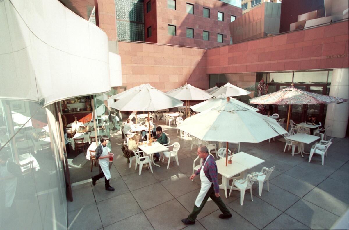
In addition, the museum has never quite figured out what to do with its rather barren plaza, which offers little in the way of shelter or engagement — an issue that Biesenbach would also like to tackle.
But something about the procession down into and through the museum are elements that nonetheless retain their power. The descent down the steps into the galleries offers a gradual disconnection from the hubbub of the street, putting visitors in a meditative state by the time they see their first Giacometti. Biesenbach says that once the skylights have been uncovered, the experience of descending into the museum will feel like slipping into a “a sunken pool, filled with light.”
In the wake of the opening of the Broad museum across the street, a place in which sidewalk and lobby all seem to be part of a single raucous, selfie-station, Isozaki’s contemplative descent is a quieting tool I have come to deeply appreciate.
This is such an important piece of architecture; we need to let it shine.
— Klaus Biesenbach, director, MOCA
The conversation about the MOCA building comes at a critical time for the museum — with yet another leader planning its future — but also for Postmodernism. The architectural style, with its clever historical references and its playful attitude towards form and material, is not widely beloved.
In recent years, important works of Postmodern architecture have come under threat: Michael Graves’ Portland Municipal Services Building in Oregon was in danger of being demolished (it is being renovated instead), while Philip Johnson’s AT&T building in Manhattan was almost deracinated by a proposed makeover that would have punctured the solid granite facade with a glassy, Apple store look. (The developer and architect have since pared back their redesign plans.)
MOCA Grand offers an interesting case study in Postmodernism (and a wild lesson in L.A. development history). It also serves as a somewhat curious architectural anomaly: A structure of unfinished sandstone in a commercial development composed largely of gleaming glass and polished granite. A building that sinks down instead of towering up. A little bit of wry Postmodernism in a buttoned-up late Modern complex that feels like someone slipped an asymmetrical, geometric-print shirt from the ‘80s underneath a beige, double-breasted suit.
When the Pritzker Prize was announced, Zachary Kaplan, who oversees the digital art organization Rhizome, which is affiliated with New York’s New Museum, tweeted that his first job ever had been at MOCA Grand.
“What can I say,” he wrote of the building. “It taught me it was okay to be weird.”
For an art museum, that can only be a good thing.
More views of Arata Isozaki’s MOCA building

Sign up for our weekly Essential Arts & Culture newsletter »
[email protected] | Twitter: @cmonstah
More to Read
The biggest entertainment stories
Get our big stories about Hollywood, film, television, music, arts, culture and more right in your inbox as soon as they publish.
You may occasionally receive promotional content from the Los Angeles Times.
