Elizabeth Diller’s designs on the Broad draw from architect’s avant-garde eye
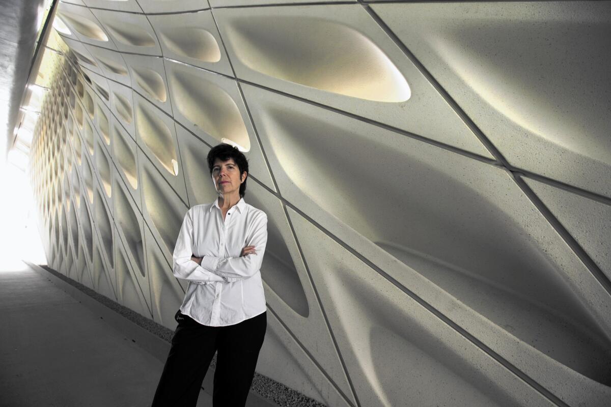
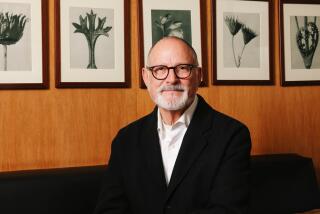
Architect Elizabeth Diller, founding partner of the New York firm Diller Scofidio + Renfro. The new Broad museum is her studio’s first building in Los Angeles.
For Elizabeth Diller, the one-minute escalator ride from the lobby of the new Broad museum to the building’s third-floor gallery represents the end of a very long journey. The architect, a founder of the New York-based firm Diller Scofidio + Renfro, has spent the last five years overseeing the design of this structure — the most significant cultural building in Los Angeles since the completion of Frank Gehry’s Walt Disney Concert Hall in 2003.
And it hasn’t been easy.
There were the challenges of construction, from the complicated site (a steeply graded hill across the street from Disney Hall) to the design and the creation of the museum’s intricate, webbed exterior (a feature whose fabrication pushed the opening back more than a year).
And, of course, there was her client’s renowned impatience. Eli Broad, the mogul and philanthropist whose downtown museum will store and display the roughly 2,000-piece art collection he has amassed with his wife, Edye, invited journalists on a tour of the half-built structure back in 2013 because, well ... he just couldn’t wait.
SIGN UP for the free Essential Arts & Culture newsletter >>
Now it’s Diller who can’t wait. It’s Thursday morning, about two weeks before the Broad opens its doors to the public on Sept. 20 and she’s been busily tending to last-minute details, including a lighting issue that kept her at the museum until 2 a.m.
Even so, she is personable and relaxed as she points out architectural details, resting casually against the handrail of the escalator, which crawls from the Broad’s dim, cave-like lobby, through a sci-fi concrete chute before delivering us to the gauzy California light of the expansive third-floor gallery, with its dramatic honeycomb ceiling.
“It’s like a tease,” she says of the ride. “It’s like stretching the moment and appreciating it more.”
FULL COVERAGE: Fall arts guide 2015
As we pick our way through rooms cluttered with wooden crates and a Jeff Koons balloon dog sculpture swaddled in plastic, Diller discusses the difficulties of producing the vertebrae-like exoskeleton formed by the junctures of the white webbing on the building’s southern point, and the earthen forms surrounding the elevator. But the real challenge, she says, was recognizing that this was a container that couldn’t overwhelm the art.
“It’s about turning it on and off,” she explains. “There are moments the building can express itself and then it dials it down — particularly in the galleries. You don’t want to take over the show.”
Diller is slight, decked out in an architect’s uniform of dark slacks and button-down shirt, plus a shaggy haircut that often defies gravity. Though she has numerous achievements — including a crucial role in the design of Manhattan’s wildly successful High Line park — she comes off more as enthusiastic professor than globe-trotting architect who gives TED Talks.
The completion of the Broad represents another interesting journey for Diller and her more than three-decade-old New York firm, which just over 10 years ago didn’t have a significant building to its name anywhere in the United States.
DS+R began life in the late 1970s as Diller + Scofidio, founded by Diller with her husband and fellow architect, Ricardo Scofidio. The two have also been together since the ‘70s, united by a love of theory and a lively sense of experimentation. Together, they created temporary urban structures, sets for avant-garde theater and dabbled in video. But even at their most experimental, Diller prides herself on the fact that Diller + Scofidio always built something.
“We were stealing spaces, doing everything on credit cards,” she says. “We worked without clients. We’d do stuff on grants. ... It was really about sharing it with the public. That was important.”
Even as they grew (Charles Renfro joined the team in 1997 and became a partner in 2004), they remained dedicated to genre-bending ideas. For Expo 2002, Diller + Scofidio conceived the Blur Building, a temporary pavilion made of mist that hovered like a spaceship over the waters of Lake Neuchatel in Switzerland. The “building” consisted of a walkable platform wrapped in fake fog, created with the help of 35,000 high-pressure nozzles.
For much of their career, Diller and Scofidio found their primary employment in academia: she at Princeton; he at Cooper Union. But roughly a decade ago, the firm began to build at an absolutely furious pace.
Even with few permanent structures to their name, Boston’s Institute of Contemporary Art put them on a shortlist to design its new waterfront home, the first art museum to be built in the city in nearly a century.
“Liz’s mind is like a super computer,” ICA director Jill Medvedow says. “She makes connections. She crosses disciplines. She is also persuasive. The challenge was how to build something that was civic and contemplative in a city that didn’t have much affection for contemporary architecture ... something that would reposition Boston’s relationship to the water. The ICA building really did that.”
Completed in 2006, the building — a strong, boxy form that rises off the ground and appears to reach out to the water — helped revitalize what had once been a barren landscape of parking lots.
SIGN UP for the free Essential Arts & Culture newsletter >>
Since then, it’s been hard to keep tabs on the ever-expanding DS+R portfolio. Most notably, the firm — in collaboration with the landscape architecture studio James Corner of Field Operations — reconceived a decaying elevated industrial rail line on the West Side of Manhattan as a unique elevated park. The High Line is today one of New York’s most popular destinations.
“There were designers who were trying to fetishize the landscape — to make it into a Disneyland version. But when I saw their [DS+R] designs, it just clicked for me,” says Robert Hammond, the co-founder and executive director of Friends of the High Line, the group that got the park built. “They created a spirit of what I felt when I went up there. It was wild greenery in the middle of the city and they re-created that tension in a way that was really simple.”
Diller remains modest about what was achieved.
“It was so beautifully derelict,” she says of the old rail line. “We pride ourselves in not screwing up what was already there.”
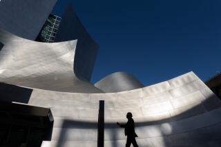
What was already there when Diller took on the Broad commission was Disney Hall — directly across the street.
“At first it was so daunting,” she recalls. “We were like, there is simply no way we can compete with this building. It’s a beautiful building, one of the best in the country, and one of Frank Gehry’s best projects.”
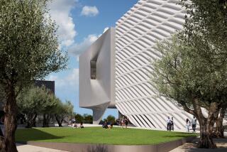
So the architects decided it’d be best not to compete at all. Disney Hall was crafted from shining titanium, so DS+R decided to make its facade out of matte white fiberglass-reinforced concrete. Where Disney was sculptural, the Broad would react by being a simple square. Where Disney reflected light, the Broad aimed to absorb it. In the early days, says Diller, the design team referred to the building’s webbed skin, now commonly called “the veil,” as “the sponge.”
The other challenge was the building’s conflicting purposes. Broad wanted a structure that would urbanize this moribund patch of downtown, but he aimed to achieve that with yet another large cultural institution. (In addition to Disney Hall, the Museum of Contemporary Art and the Music Center also sit on this stretch of Grand Avenue.) Moreover, he wanted a building that would serve as public museum, but also as storage space for his vast collection.
“The original program had more storage than exhibition space,” explains Diller. “What we saw as the first challenge of the project was that you have this major thoroughfare that you’re trying to urbanize and you put this storage facility on it.”
But as DS+R refined the design, they were able to flip that equation so that the museum now has more public exhibition areas than it does storage. In addition, the architects took the design right to the property line, so that the pedestrian experience along Grand Avenue would feel more urban. On either corner of Grand, DS+R gently lifted the building’s facade, a coy architectural reveal that also has the effect of drawing pedestrians, who will be welcome to cruise through the shady lobby and then exit the other side.
“From an urbanistic perspective, it was important to make a transition like in the traditional arcades of Spain or Italy,” says Diller, “where you can get out of the sun for a moment, but without having to go all the way in.”
For the visitor who decides to stay, the trajectory then leads through the undulating lobby, up the escalator, and toward the dreamy light of the third floor — a progression of cinematic moments that takes the viewer from dark to light to dark again.
In fact, the building’s geometric facade isn’t just a decorative motif, Diller explains. It’s a tool for “sculpting the light” (so that none of it ever directly touches the art), and it’s a way of admitting the outdoors into the galleries.
“It was about maintaining this sense that you’re in the city,” she says. “If a cloud passes over, you feel that cloud. ... We’re not just anywhere. We’re in Los Angeles.”
Broad says he is quite pleased with the results. In 2010, he invited numerous high-profile architects to submit their concepts in a design competition.
“Liz did the best job of understanding what was happening on Grand Avenue,” Broad says. “And she came up with a design that didn’t conflict with Walt Disney Concert Hall, but isn’t anonymous either.”
There’s one more thing: “I can’t think of any museum,” he says, “that has better lighting for art than we have.”
Diller recently wrapped up the final stage of the High Line and is about to debut another California museum — for UC Berkeley in early 2016. She has a medical tower under construction at Columbia University in New York, a building whose concrete slabs fold and bend like a work of origami, and there’s also the redesign of the lobby and various ground-floor art spaces at the Museum of Modern Art — a project that has earned the architects the enmity of some New York art critics. (“MoMA has a long history of expansion and an enormously fabulous collection,” she says, “so stepping into MoMA at any level is very charged.”)
She is also at work on two operas: one a revival, the other a new work she hopes to debut in the next couple of years. (For now, she is keeping the plots to herself.)
Despite the myriad construction projects, Diller remains true to her roots — inspired by the ephemeral and the spontaneous. When DS+R was working on the first stretch of the High Line, a woman who lived in one of the adjacent tenement buildings used the glare of the construction lights to stage guerrilla cabarets on her fire escape in the evenings.
“That is the most surprising and fantastic thing,” she says. “When you make a building or project, you script in your head what could happen. But then, often, things happen that are even better than anything you can imagine ... I love that.”
Twitter: @cmonstah
More to Read
The biggest entertainment stories
Get our big stories about Hollywood, film, television, music, arts, culture and more right in your inbox as soon as they publish.
You may occasionally receive promotional content from the Los Angeles Times.
