How shows of old photos and architectural designs hark back to a golden California of the 1900s
Reporting from San Francisco — Sometime between 1924 and 1929, an unknown photographer stood on the hillsides that flanked Beachwood Canyon, pointed a camera north and snapped an image that would come to represent the very concept of Los Angeles: Hollywoodland. At that moment, Hollywoodland was a housing development in the early stages of construction. In the photo’s foreground are the Hollywood Hills, covered primarily in scrub, though what is to come is already evident. A roadway snakes through the landscape connecting the silhouettes of homes in an array of fantastical styles, and in the distance stands an advertising sign — erected to promote the real estate venture — that will become world-famous when it is later shortened to “Hollywood,” land of dreams.
“It’s French Normandy and English Tudor and Spanish Mediterranean,” says curator Erin Garcia of the storybook architecture styles depicted in the image. “Previously, it was this chaparral-covered hill, and you couldn’t get up there. So to build a road up there and to build these developments that we now know as the Hollywood Hills, it’s so incredible. There was money to be made and there was land to be sold … and it’s, ‘Let’s put it on this hillside.’ It’s all very optimistic.”
The image is now on view at the California Historical Society in San Francisco, in the exhibition “Boomtowns: How Photography Shapes Los Angeles and San Francisco.” Organized by Garcia, it displays a century’s worth of urban photography charting the growth of California’s two most prominent cities. The show provides an excellent look back at a time in which both cities are looking forward — contending with growing pains related to infrastructure, equity, affordability and homelessness.
“I wanted to think about who cities are for,” Garcia says.
Photography and California grew up together. Photography arrives here as the state becomes a state.
— Erin Garcia, curator, California Historical Society
In addition to the Hollywoodland image, the exhibition, which runs through March 10, features numerous other photos of Los Angeles in the 1920s, a time when the city’s population was in the process of doubling, when filmmakers were turning Hollywood into a metonym for the film industry and when the city was in the process of building some of its most iconic buildings — Art Deco City Hall among them. It is, in other words, a period when the city was coming into itself.
“Photography and California grew up together,” says Garcia. “Photography arrives here as the state becomes a state. Photography was there from the Gold Rush. It witnesses the state become this urban place it is today.”
The images collectively show a landscape in a state of light-speed evolution: Photos by Carleton Watkins capture a San Francisco with dirt roads and empty lots in the 1860s, while a panoramic shot of L.A.’s Cahuenga Pass, shot in 1910 by Charles Pierce, shows the area in a wild state, bearing only a couple of structures (and no traffic!). Subsequent pictures reflect increasing density: crowds gathered for the opening of L.A.’s Union Station in 1939, and multiple images featuring acres of postwar homes in both Los Angeles and San Francisco. (Some of the latter include elegant compositions by Minor White.)
The show is drawn from the California Historical Society collection and includes rarities, such as an 1851 daguerreotype panorama of the San Francisco shoreline, from a time when San Francisco looked more like a glorified mining encampment than a sophisticated urban center.
It also features a curious series images by Anton Wagner, a German PhD student who arrived in Los Angeles in the 1930s to study the city’s design for a dissertation.
“He brought a Zeiss Ikon camera — it’s a handheld camera, and he allegedly traversed Los Angeles on foot and took all of these pictures,” explains Garcia. “He really was the first person to take the city seriously at the time. So many people thought it was a weird city because it was not like a European city.”
His images — the California Historical Society owns the only complete set — “were very scientific, very frontal and very uniform,” says Garcia. The feel is almost evidentiary. But they provide an invaluable record of the city’s landscape before it had been overwritten by postwar sprawl, by freeways and dingbat apartments.
They also capture a certain ebullience, such as the photograph of a small bungalow in Long Beach with an oil derrick planted in the yard, or the flamboyant strip mall on Wilshire Boulevard trimmed with Spanish tile.
At a storied Chinatown bakery, four generations labor to learn lessons of family »
In this way, “Boomtowns” overlaps thematically with “Architects of a Golden Age: Highlights From the Huntington’s Southern California Architecture Collection,” which recently closed at the Huntington Library, Art Collections and Botanical Gardens in San Marino.
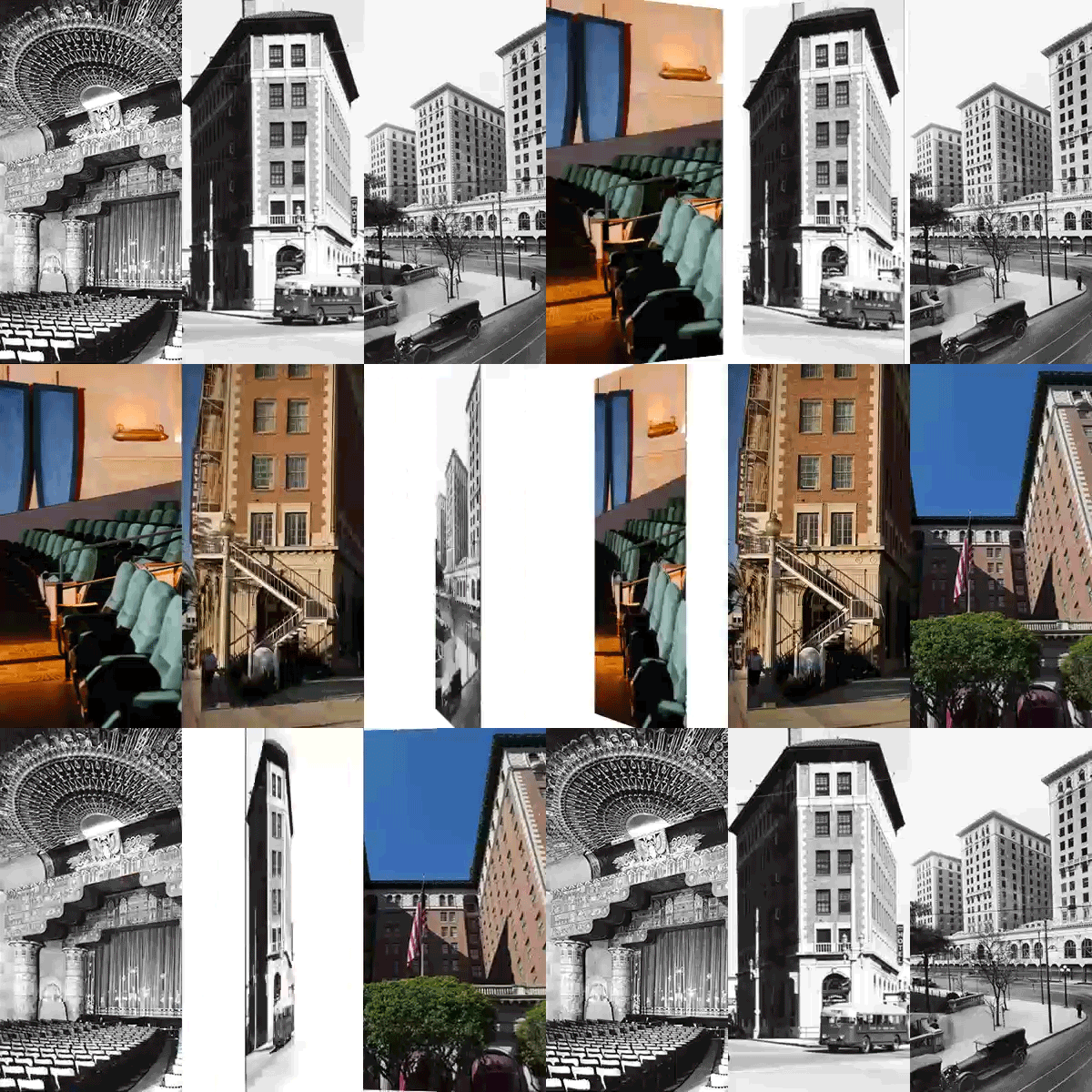
Since the 1970s, the Huntington has collected the papers of early 20th century architects who shaped the look of Los Angeles. This includes drawings by the influential John Parkinson and Donald Parkinson, who built Union Station and the Los Angeles Memorial Coliseum, and Morgan, Walls & Clements, the firm that designed architectural extravagances such as the Mayan Theatre and the Assyrian-inspired factory for Samson Tire & Rubber Corp. in Commerce (now the Citadel Outlets).
For “Architects of a Golden Age,” curator Erin Chase zoomed in on some of these architects’ most artful renderings. The show contained no blueprints or mechanical reproductions. Instead, she presented almost two dozen remarkable drawings of L.A. architecture — some extant, some never built — in materials such as as charcoal, ink, graphite and watercolor.
“These were the objects created by these architectural offices, a draughtsperson or an artist to sell a project, sell an idea, to a client,” says Chase. “I really wanted to show pieces that people could relate to, that were not really technical.”
The show read like a portrait of Los Angeles in all of its experimental, early 20th century zaniness. The burgeoning film industry contributed to a sense of fantasy, and the newness of L.A. meant there were no long-running architectural traditions to violate.
“It was very free form and very free thinking,” Chase adds. “It gave way to this expressive, no-holds-barred ability to create a structure on a whim.”
Why so many Mexicans revile the Colonial Californiano architecture that spread from SoCal »
A standout in the exhibition was an imposing (and slightly surreal) watercolor of the Los Angeles Stock Exchange by Roger Hayward for architects Samuel E. Lunden and the Parkinsons that showed the building bigger than scale. Other items impressed with their attention to detail, such as the delicate drawings of the Mayan Theatre, with its powerful facade that fused the pre-Columbian with Art Deco.
Also notable: a landscape rendering that William Adolph Peschelt created for department store magnate Arthur Letts’ grand Tudor-style home. The latter, painted in warm watercolors, featured a terraced garden, complete with a mustachioed Letts accompanied by a small dog — a piece of Europe airlifted into Southern California.
It is a Los Angeles where anything went — “a combination of the building boom that was happening, especially in the 1920s,” says Chase, “but also the creative spirit.”
All the sunniness, naturally, can obscure who was already in Los Angeles when those 19th century gold and real estate prospectors arrived. In the 1920s, for example, almost a fifth of L.A. was of Mexican origin. And many of the fanciful designs featured in both exhibitions were intended not for those Angelenos, but instead were designed to seduce white Midwesterners into relocating to the region.
At the California Historical Society, a 1911 postcard produced by Sunset magazine, then a publication of the Southern Pacific Railroad, beckons with the phrase: “California needs people like you.”
“And, of course, they’re not just talking about anyone,” says Garcia. “They are talking about a certain kind of European, Midwestern American.”
Even so, the diversity of California slips through — in a moody rendering of Union Station’s influential Mission Revival Style, harkening to the early days of the Mexican colony, or the ghostly depiction of a neon design for Chinatown architecture (an architecture that speaks to the strong presence of the state’s Chinese immigrants).
“We are on top of former settlements,” says Garcia. “We will keep evolving, and our cities will keep changing. California, it’s so incredibly layered.”
Sign up for our weekly Essential Arts & Culture newsletter »
[email protected] | Twitter: @cmonstah
More to Read
The biggest entertainment stories
Get our big stories about Hollywood, film, television, music, arts, culture and more right in your inbox as soon as they publish.
You may occasionally receive promotional content from the Los Angeles Times.


