Cooper-Hewitt curator walks the International Contemporary Furniture Fair
NEW YORK — CARA MCCARTY has walked only halfway down the first aisle of the International Contemporary Furniture Fair when she glances back and says with an apolo- getic wince, “There is a lot of bad design.”
It’s a true statement for any show, even here at the nation’s premier exhibition of modern home furnishings, where more than 600 designers and manufacturers present their latest collections this week across 145,000 square feet of the Jacob K. Javits Convention Center. But looking for good design is particularly daunting when you are the curatorial director of the Smithsonian’s Cooper-Hewitt National Design Museum here and you are scouting for the classics of tomorrow.
“That’s just different for the sake of being different,” McCarty says as she cruises past a plywood chair, its cantilevered seat accented with a polished metal post. “That’s not of interest to me.”
Indeed, McCarty has attended ICFF for nearly 20 years, and the relatively restrained designs of the 2008 show aren’t yielding a bevy of potential additions to her museum’s permanent collection. The good often is eclipsed by the boring, the clumsy and the downright bad: florid tile installations that mistake bravado for beauty, pendant lights draped in so much decorative excess that they offer little illumination, stools shaped like the most inelegant parts of the human anatomy, even a ceramic sushi dish reminiscent of a bedpan.
At one point, as though trying to find some logic for oddities on display, McCarty politely speculates: “This must be the student design section.” (It wasn’t.)
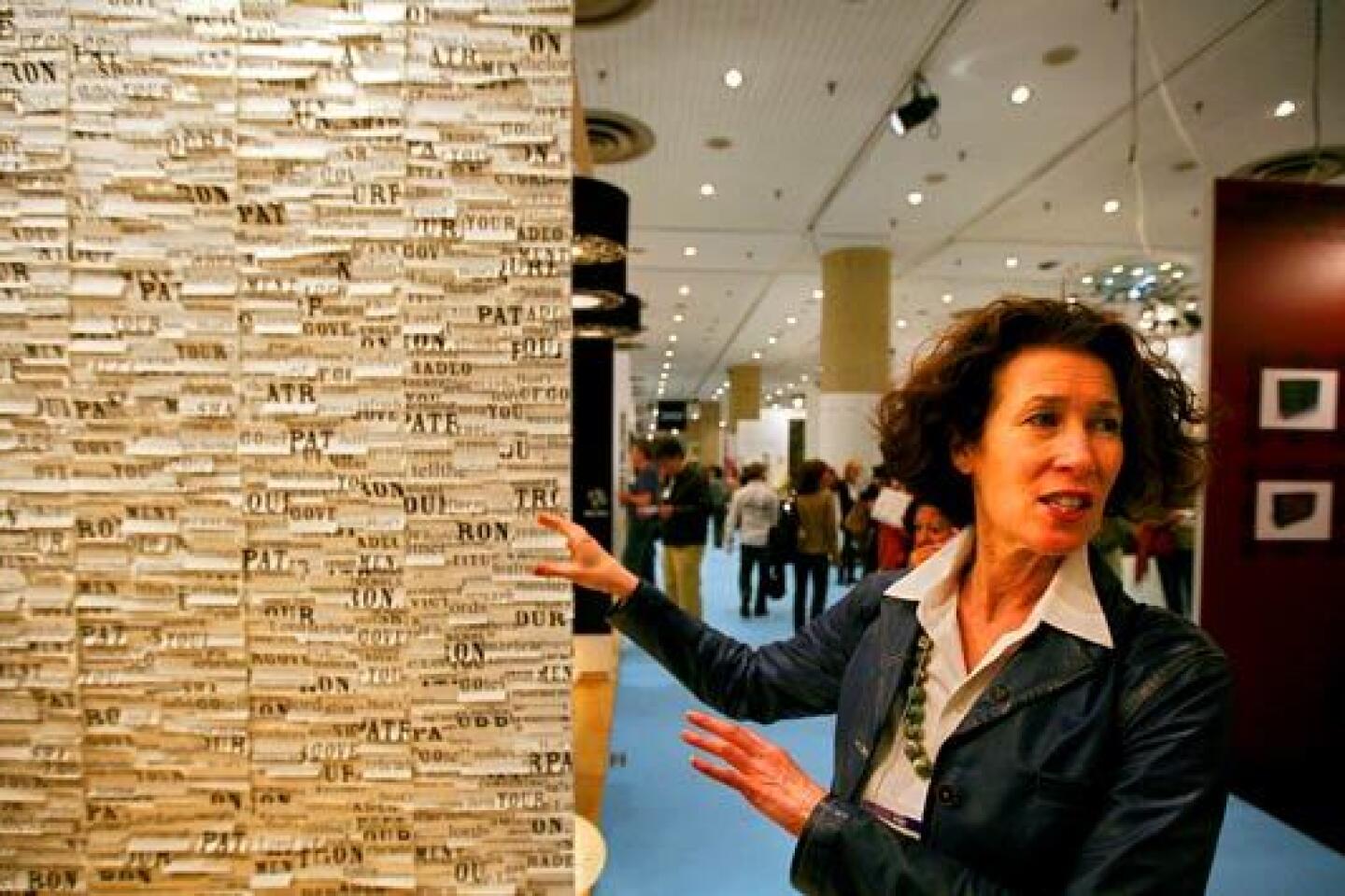
But then she comes upon exhibitors such as Tracy Kendall, a quiet, bespectacled, exceedingly polite British wallpaper designer holed up in the tiniest of booths. McCarty’s face immediately lights up.
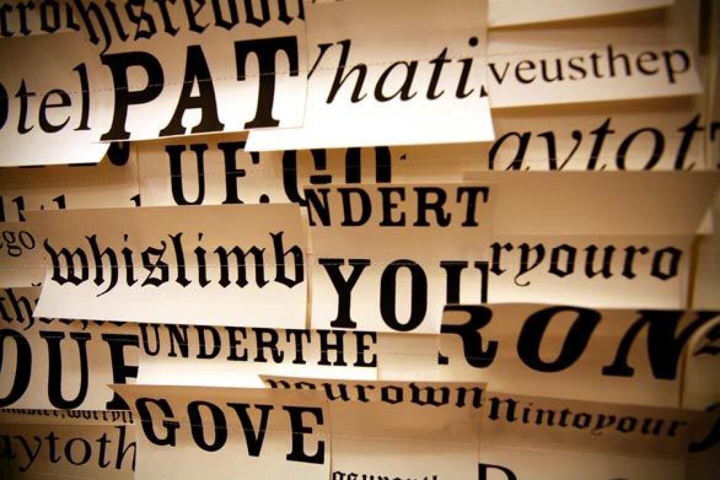
“What I like about this is it’s really a piece of conceptual art,” McCarty says, running her fingers across passages from “A Midsummer Night’s Dream” that have been printed in different fonts, cut into strips and hand-sewn onto a wallpaper backing. Kendall expects clients to hang art over her designs, but McCarty says the wallpaper’s hand-crafted artistry transforms Shakespeare into a site-specific installation unto itself. “It really is a composition,” she says, still beaming at the whimsical result.
McCarty moves on, arms folded, scanning booths and rendering verdicts as she goes. A transparent umbrella: “It makes sense,” she says. “Think about it.”
Some companies have invested thousands in Vegas-like displays, but McCarty makes a beeline for Koncept, a 6-year-old lighting company from Baldwin Park. Edmund Ng stands behind a humble table adorned only with his product.
“Now this is interesting,” McCarty says, playing with Koncept’s new Z-Bar desk lamp, flexing its joints and spinning the six LEDs so the light points up, down, left and right. Ng demonstrates the dimmer function and explains that this new Z-Bar creates twice as much illumination as an earlier model but uses less energy. Suggested retail price: $170.
“I like the sleekness of it,” McCarty declares, noting the simplicity of design. “It’s so efficient -- an economy of means.”
The Z-Bar seems like the discovery of the day till she reaches the Pablo booth, whose prototype for a magnetized LED lamp elicits a rare flash of excitement.
“Did you see that?” McCarty exclaims, pointing as a fellow fair-goer rotates a simple aluminum arm along a steel block base, instantly shifting 18 LEDs with all the freedom of a symphony conductor waving his wand. The magnetic design means light can be directed down over a desk, bounced up off the ceiling or even shined sideways onto a wall for ambient illumination -- all from a piece no thicker than a ruler.
“I think it’s really beautiful,” McCarty says, grabbing a brochure and noting that the lamp, due out this summer, is a potential addition to the museum’s collection. “You can’t get much more minimal than that. It almost disappears -- just a graphic line.”
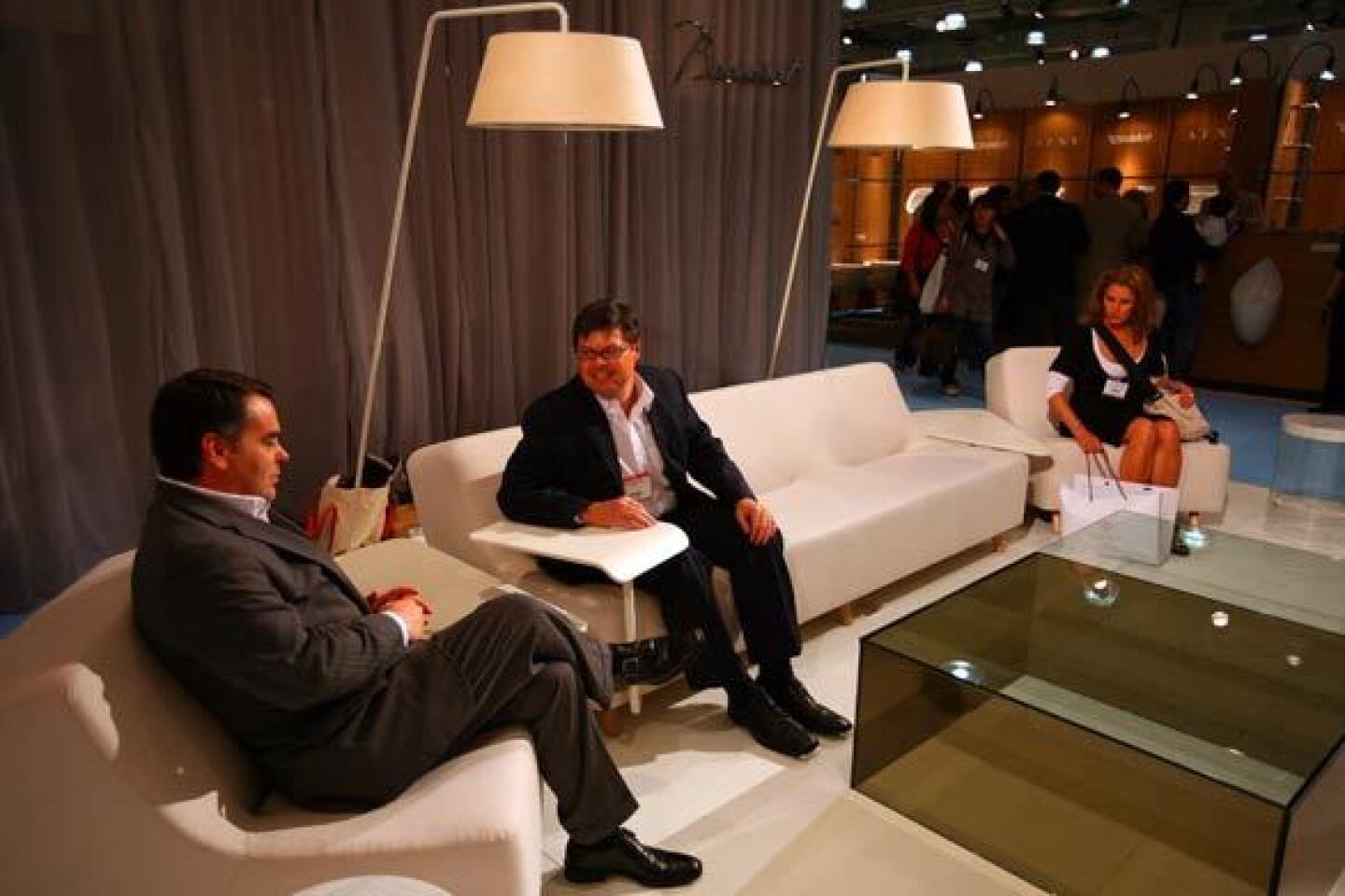
At the exhibition space for HBF, McCarty exchanges a quick hello with designer Yves Behar before sitting down on a prototype for his new sofa: a minimalist curve cloaked in cloud-white lamb’s wool and equipped with a built-in desk that slides along the front on a track underneath the sofa. The C Collection was conceived as office furniture -- a place where employees could lounge in comfort, brainstorm ideas, take notes and work on their laptops.
“Nice,” McCarty says, swiveling the desk into various positions -- first as a computer workstation over her lap, then as a side table. She notes the design’s uncommon elegance for functional office furniture; she could even see it in small apartments or lofts where residents need multifunctional solutions. “Great idea.”
Her enthusiasm, however, is doused at the nearby Kohler display, where six faucets are splashing away in a long sink. The point: to showcase the company’s new Karbon line, carbon-fiber and brass fixtures meant to deliver increased control and accuracy. The über-industrial design strikes McCarty as overkill.
“It’s like a robotic faucet. I mean, who needs . . . “ she starts to ask, her question finished with a frown as she tries to manipulate the spray. “Water is so beautiful and fluid. To think of it coming out of something like that? It looks like the plumber is still screwing the pipes together.”
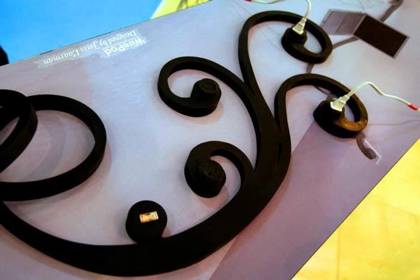
In terms of making the pragmatic look pretty, she much prefers the latest from Joris Laarman. Designing for the Los Angeles firm Artecnica, Laarman’s new WirePod prototype is a decorative riff on the humble surge protector: Rather than hide the power strip, his solution is to make a design statement with it, turning the conventional linear block into a vine-like design with individual outlets in the curls -- a beautiful solution to a household eyesore, she says.
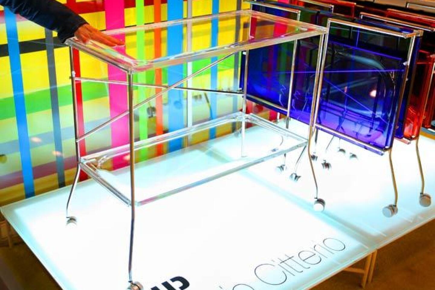
During the course of the afternoon, McCarty identifies other standouts: At the Kartell booth, she doles out praise for Flip, a folding bar table whose plastic is so flawless in color and translucency it looks like glass. While passersby ogle one of the Dutch collective Moooi’s design stunts -- a table shaped like a life-size pig with a cocktail tray balanced on its head -- McCarty expresses more interest in a gleaming white console with a subtly tactile finish.
“It’s paper,” she says, smiling, explaining that the cardboard core is finished with a papier-mâché-like effect. The result is a large piece of furniture that the average person could carry to a fourth-floor Manhattan walk-up.
“It’s a marvelous play on the old,” she says, “but you look at it, and it’s of the day. It’s like a ghost of traditional form.”
McCarty ends the day at a table of Scandinavian crafts. She picks up a clever piece by goldsmith Kim Buck: a silver foil balloon shaped like a small serving plate and packaged with a straw for easy inflation.
“It’s like, ‘Have fruit plate, will travel,’ ” McCarty says with a laugh. “Love it.” When the photographer suggests that instead of blowing up the balloon, McCarty could fill it with helium, she laughs even harder. A brilliant design solution, she says: a fruit bowl that floats at your side -- and a little less hot air in the design world.
More to Read
Sign up for The Wild
We’ll help you find the best places to hike, bike and run, as well as the perfect silent spots for meditation and yoga.
You may occasionally receive promotional content from the Los Angeles Times.
