Most Read in This Section
-
Nov. 5, 2024
-
-
-

By David A. Keeps
Interior designer Ryan Brown, known as the voice of reason on the Bravo reality series “Flipping Out,” has made a living buying ugly duckling properties, turning them into beauties and selling them for profit. But as fans of “Flipping Out” know, Brown and his domestic partner, chef Dale Monchamp, had a daughter through a surrogate and wanted to put down roots. Two years ago they bought a 1942 two-story stucco house in the Hollywood Hills area of Los Angeles.
Brown, shown here entering his living room, embarked on an extensive renovation that mixed Hollywood Regency, British Colonial, Asian-accented Modernism and nautical charm. Architectural images in black frames are hung on the wall and on top of molding, giving the gallery added dimension. The designer supplements black and white with a color scheme that also integrates browns, grays and other earth tones. “With a neutral palette you can bring any color in as an accent,” he says.
Back to L.A. at Home design blog (Christine Cotter / Los Angeles Times)

The living room is furnished in a sophisticated mix of vintage and contemporary pieces: A white-lacquered Art Deco side table sits next to a minimalist Italian sofa. A wooden-topped factory stool flanks a Danish armchair covered in a bold floral. Matching high-backed chairs sit across from an embossed leather ottoman on casters. Above it is Jonathan Adler’s three-tier Ventana chandelier. On the small wall to the right of the bay window, another Brown touch: wooden paddles from European bakeries hung as art.
“It’s not an authentic period house like you’d find in Hancock Park or Pasadena. It’s an L.A. special,” Brown says, “a little bit of everything architecturally.” Brown painted the window frames in non-traditional black, which give them architectural presence. “It’s beautiful in the day,” he says, “and at night it enhances the views.”
Back to L.A. at Home design blog (Christine Cotter / Los Angeles Times)

The opposite view: Daughter Chloe crosses the living room, with the elevated dining area in the background. Note how the crown molding at the ceiling juts out at the window and serves as curtain valances. “Molding adds instant warmth and character to a room,” says Brown, who also connected baseboards and chair rails to vertical trim pieces, creating the appearance of paneled walls. “You can get it at a hardware store and just nail it up. It doesn’t need to be real wood since it’s going to be painted.” Although Brown splurged on high-priced designer fabrics by Lulu DK and Kelly Wearstler elsewhere in the house, when it came to larger jobs such as curtains and Roman shades, he went to the Fashion District in downtown L.A. and shopped discount stores.
Back to L.A. at Home design blog (Christine Cotter / Los Angeles Times)

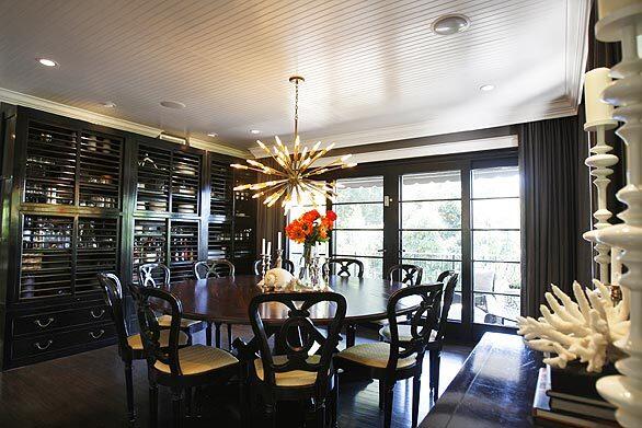
In the dining room, Brown covered the ceiling in bead board, which makes the space feel intimate yet casual, he says. The horizontal lines also echo the wall of cabinetry, which Brown created from three matching Chinese pieces, an eye-catching alternative to a built-in unit. He designed the table, which can seat 12. It’s built on a base of reclaimed Douglas fir with a distressed walnut top by Ian Ferguson of [Dig It Furniture in Venice. “I always tell him to beat up table tops so I don’t have to worry about them,” Brown says. Though they look like antiques, the dining chairs are a cheat, Brown admits. “I was running out of budget so I got them from Anthropologie and recovered the seats.”
Back to L.A. at Home design blog (Christine Cotter / Los Angeles Times)

On a vintage bar cart from Lawson-Fenning in

The Sputnik lamp hanging over the dining table was purchased at Downtown in
Back to L.A. at Home design blog (Christine Cotter / Los Angeles Times)

The family’s chocolate Lab, Jordan, cruises through the kitchen. Brown designed a fretwork pattern for cupboard doors, giving the room the Chinese Chippendale look associated with Hollywood Regency style. The work also was done by Dig It Furniture in Venice. Note the top portion of the walls, which are covered in bead board running horizontally, coordinating with the marble subway tiles above the countertop.
Back to L.A. at Home design blog (Christine Cotter / Los Angeles Times)

Brown holds Chloe while Monchamp chops vegetables in the kitchen. Monchamp, who was an interior designer before becoming a chef, had clear ideas about the space where he cooks. “We’ve had a lot of islands,” he says, “and I always ended up on the side with no legroom.” The solution was a 6-by-5-foot surface that could be used to work on or eat at. It seats 10 and is made of river-washed black granite.
Back to L.A. at Home design blog (Christine Cotter / Los Angeles Times)

A banquette style sofa from Mitchell Gold & Bob Williams in a kid-friendly floral print anchors the space adjoining the kitchen. Monchamp says the home nicely balances formal spaces with family areas. “We couldn’t do anything too precious,” he says. “We are not ‘No, don’t touch that’ people.”
Though some seating and tables were custom made, Brown also shopped at Crate & Barrel for the stools at the kitchen island and West Elm for rugs and this table. “The key is to mix it,” Brown says. “Get the cheap pieces in with good looking, more expensive pieces and no one knows the difference.”
Back to L.A. at Home design blog (Christine Cotter / Los Angeles Times)

Mad for molding: To create visual interest on the way to the bedrooms on the second floor, Brown created a zigzag pattern of baseboard trim.
Back to L.A. at Home design blog (Christine Cotter / Los Angeles Times)

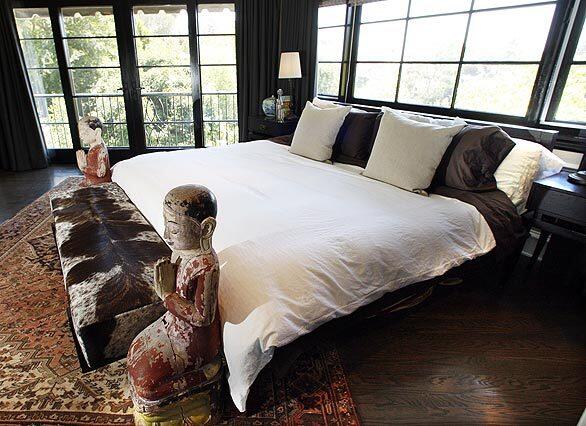
Brown’s improvements included new hardwood floor, doors and windows, which brighten the master bedroom upstairs. And the mix of décor? “The world is an art gallery,” Brown says. “You can learn something new at every turn.”
Back to L.A. at Home design blog (Christine Cotter / Los Angeles Times)

At the foot of the sleek Cappellini bed, Thai temple figures and a bench covered in cowhide are a modern take on a traditional footboard with posts.
Back to L.A. at Home design blog (Christine Cotter / Los Angeles Times)

The master bath gets the glam spa treatment with a Piedmont skirted tub purchased at Living Square in Los Angeles. Hexagonal Mist limestone floor tiles are from Ann Sacks. The chandelier, which Brown repainted white, was 60 bucks. “A lot of the lamps in the house cost under a hundred dollars at flea markets and garage sales,” Brown says.
Back to L.A. at Home design blog (Christine Cotter / Los Angeles Times)

In the stairwell, he hung the 30-bulb Meurice chandelier, a Jonathan Adler design that can be found online for $750.
Back to L.A. at Home design blog (Christine Cotter / Los Angeles Times)

Chloe plays chef in her bright and cheery room, furnished from catalog resources such as Pottery Barn Kids. Brown and Monchamp wanted a beautiful house that was still kid-friendly. The living room sofa may be B&B Italia, but that doesnt mean Chloe and her playmates are impressed. “They’ll take every cushion and pillow off and throw them on the floor, then they’ll jump on them,” Brown says, nonplussed.
Back to L.A. at Home design blog (Christine Cotter / Los Angeles Times)

The yard was relandscaped to include a mosaic tile pool, an organic vegetable garden and a lawn with a concrete paver path from Arto Brick in Gardena. With extensive changes inside and out, the tab for renovations came to about $700,000. “I did it as inexpensively as possible to use the materials I wanted,” Brown says, adding that without his industry sources the cost would have run $1 million.
Back to L.A. at Home design blog (Christine Cotter / Los Angeles Times)

Under a wood-framed arbor, Brown created an outdoor dining area with a 13.5-foot-long table and four teak benches for seating. A zinc planter and an aged metal votive holder add a touch of French country charm.
Back to L.A. at Home design blog (Christine Cotter / Los Angeles Times)
Nov. 5, 2024