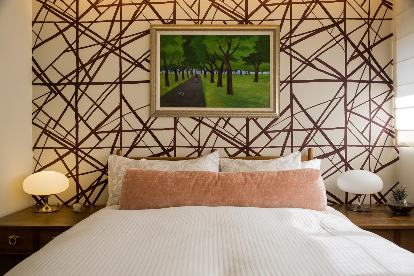
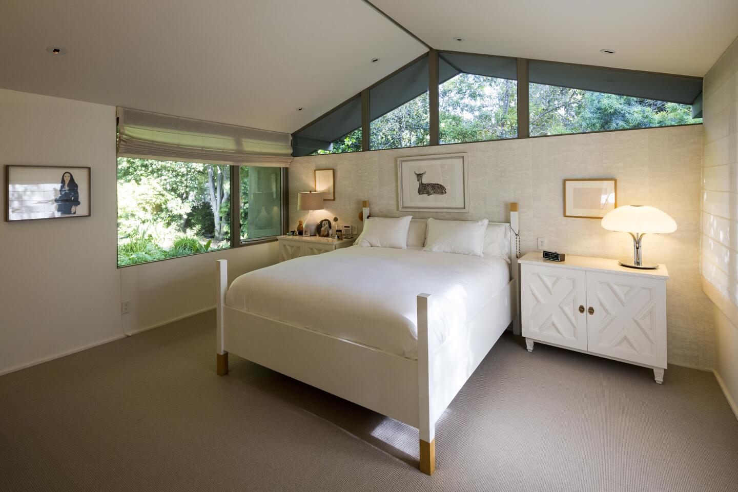
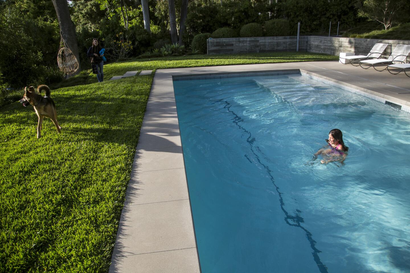
Before & After: A modernist home goes from dark and dismal to filled with light
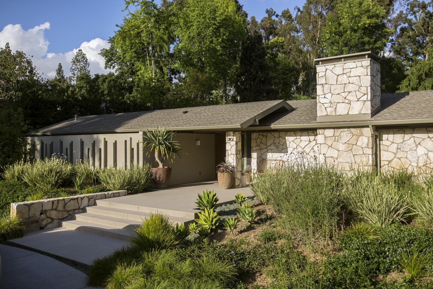
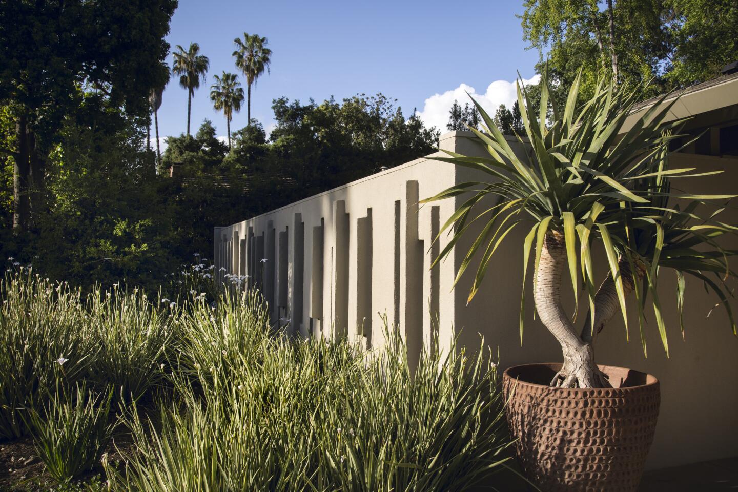
Featuring walls of glass, a natural stone façade and post-and-beam construction, the 1962 Cornet Residence, designed by pioneering Modernist architects Smith & Williams, looked like an ideal home for Midcentury Modern fans.
But Jenny Levy wasn't one of them.
“You could feel the angst,” Levy says of the dismal interiors she toured at a 2012 open house. “I did not want this house.”
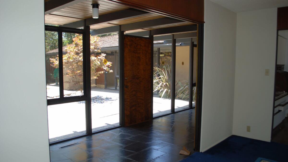
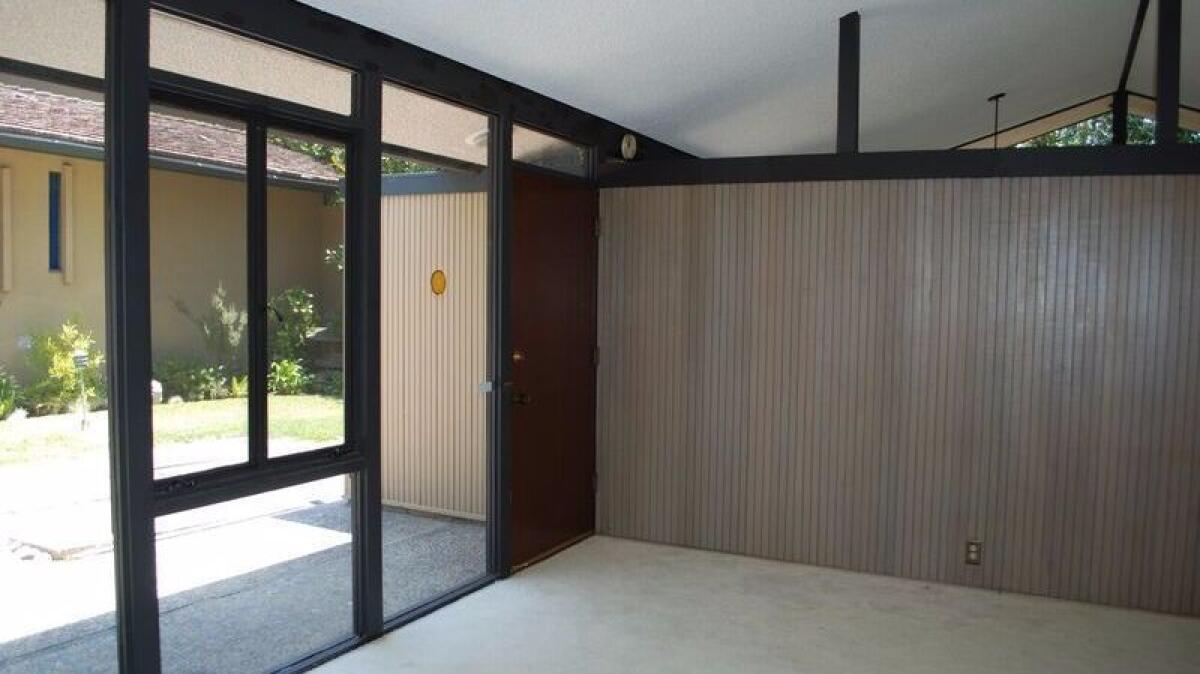
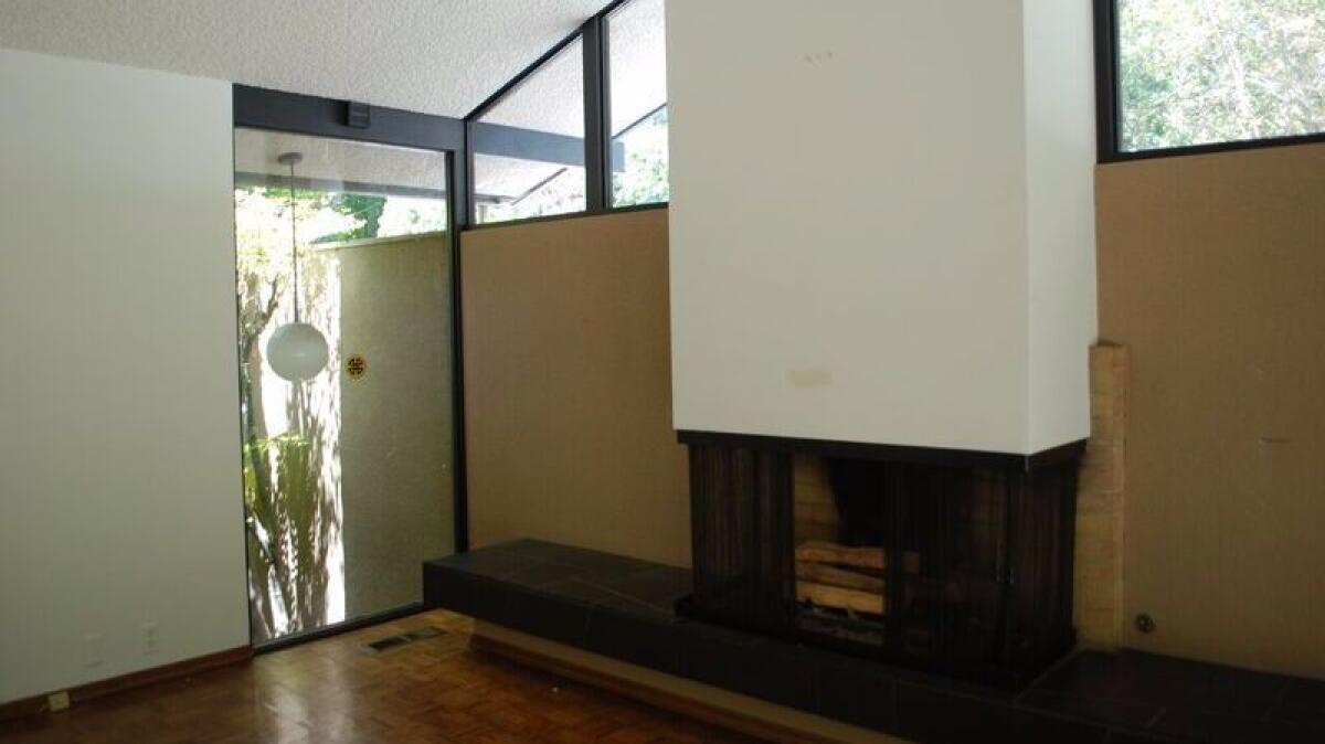
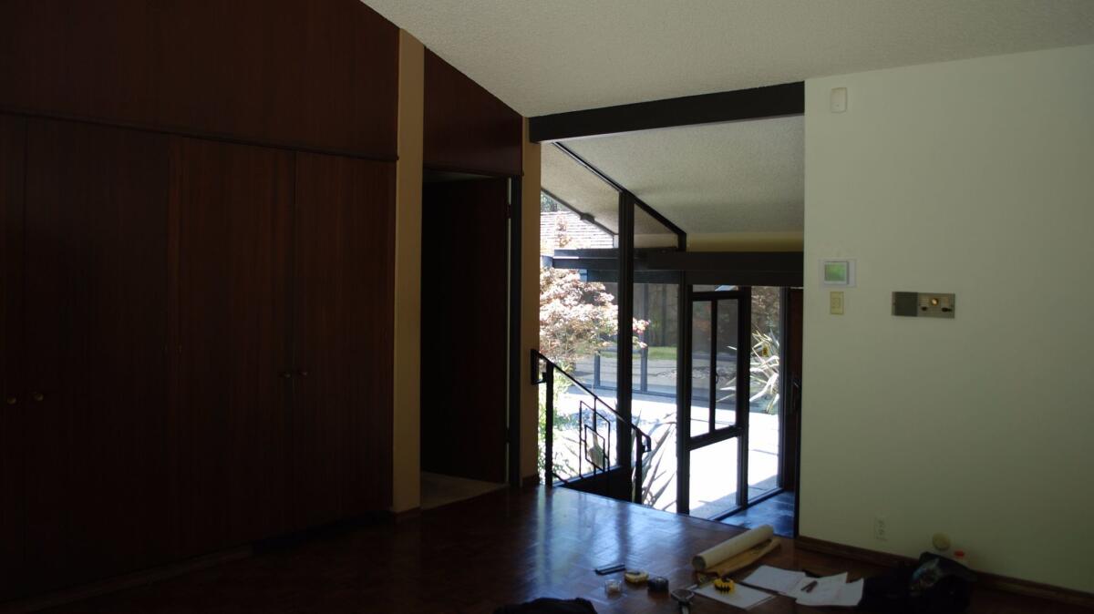
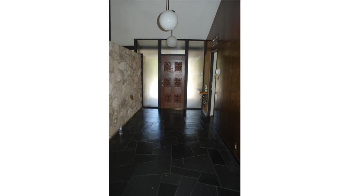
The interiors were dark and gloomy, with black, irregular slate and parquet floors, gilt and floral wallpaper and wood paneling. Even the home’s surplus of glass could not counter what Levy describes as “a feeling of entrapment.”
But there was no denying that it was something of a find — an architectually significant house with good bones.
“The house was not without its shadowy allure,” says architect John Bertram, who was hired to renovate the 3,800-square-foot house after Levy and her husband purchased it. Still, he said: “Its somber elegance and cool aloofness was the kind you might find in a certain sort of funeral home.”
Bertram’s goal: Create an open and informal house that worked for Levy’s family of four without compromising Smith & Williams’ original design.
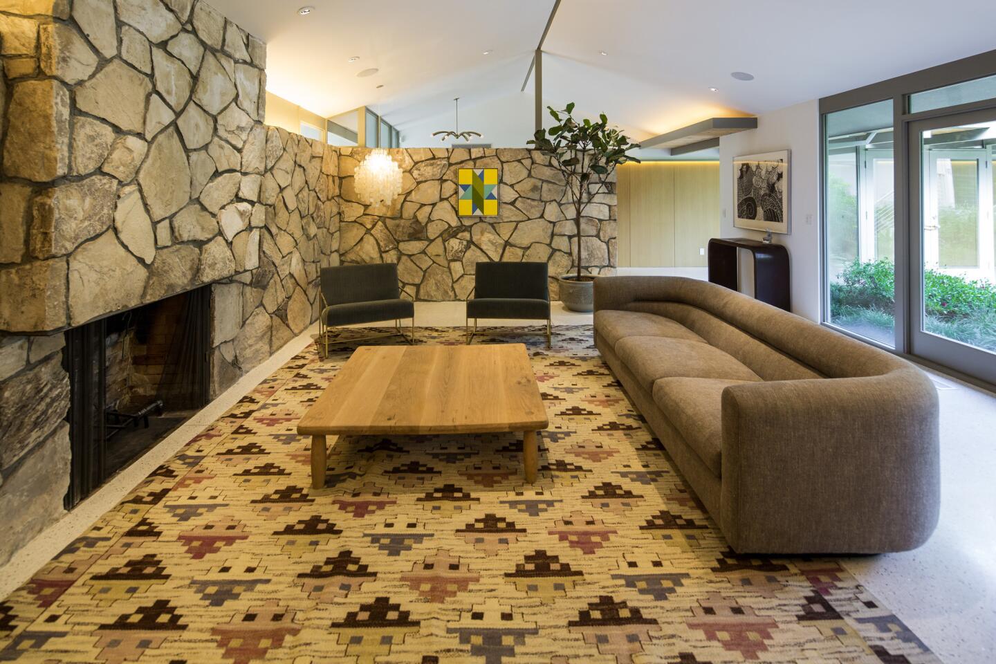
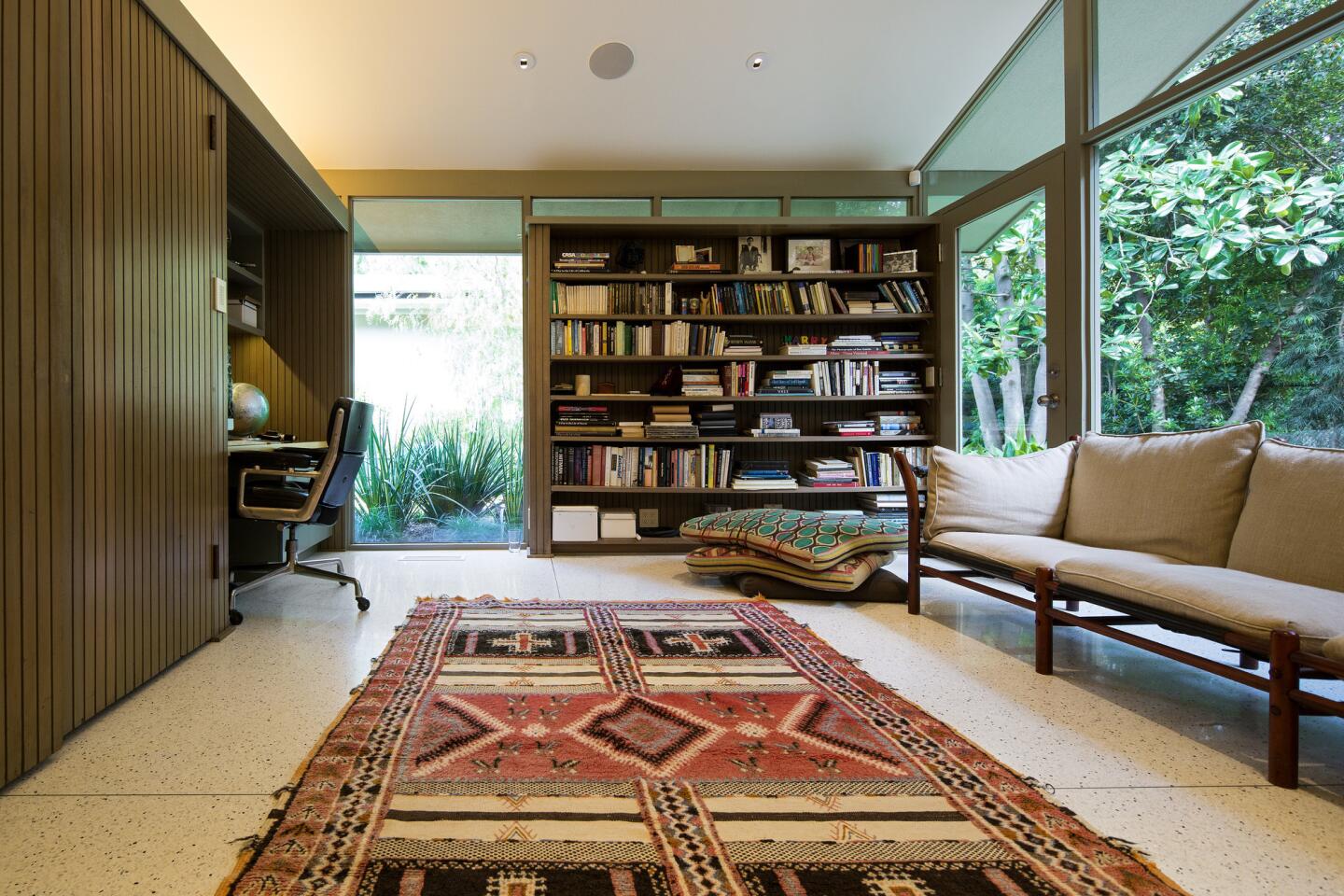
He took the house down to the studs, retained the home’s H-shaped envelope and embarked on brightening the interiors, leaving the windows, living room and office intact.
Bertram started with the floor plan.
“The house was so meandering,” he explains. “There was no center. You were always walking through corridors trying to find the place where you were going that did not exist.”
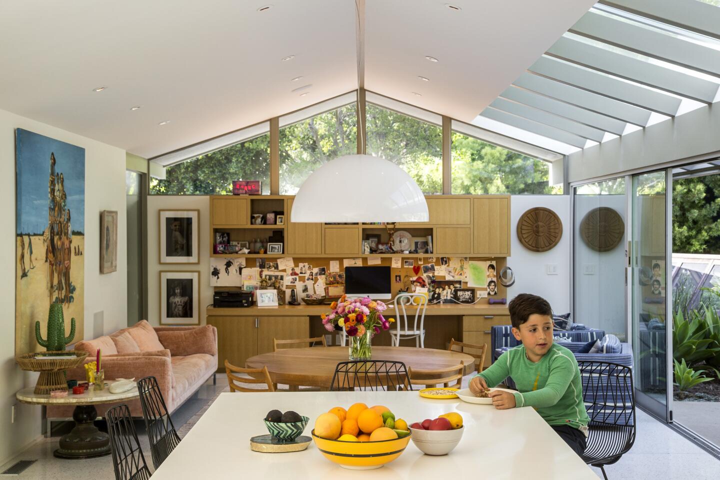
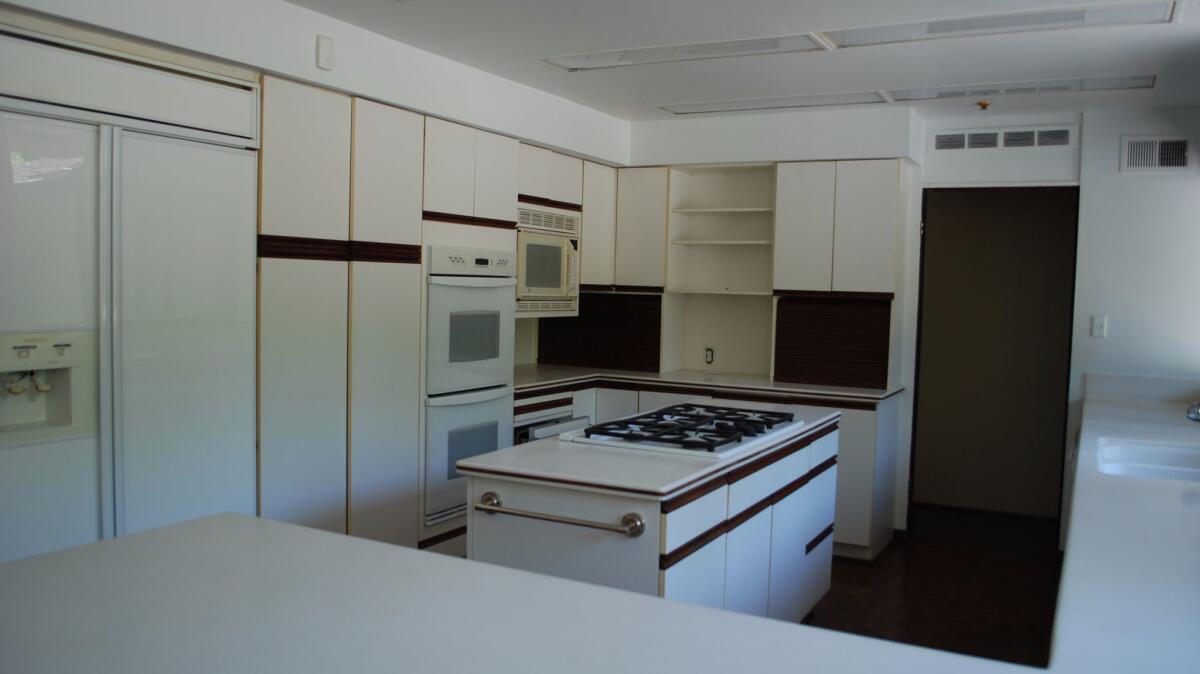
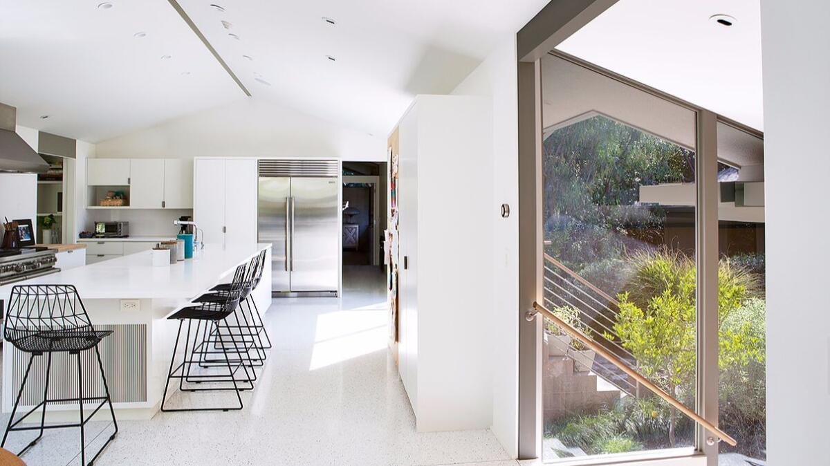
In a move that changed the mood of the entire house, Bertram relocated the kitchen and dining room, which were oddly placed off of the long corridor, to the back of the house. He then removed the wall between the kitchen and family room to create one open great room. “The kitchen is now the center of the house,” he says.
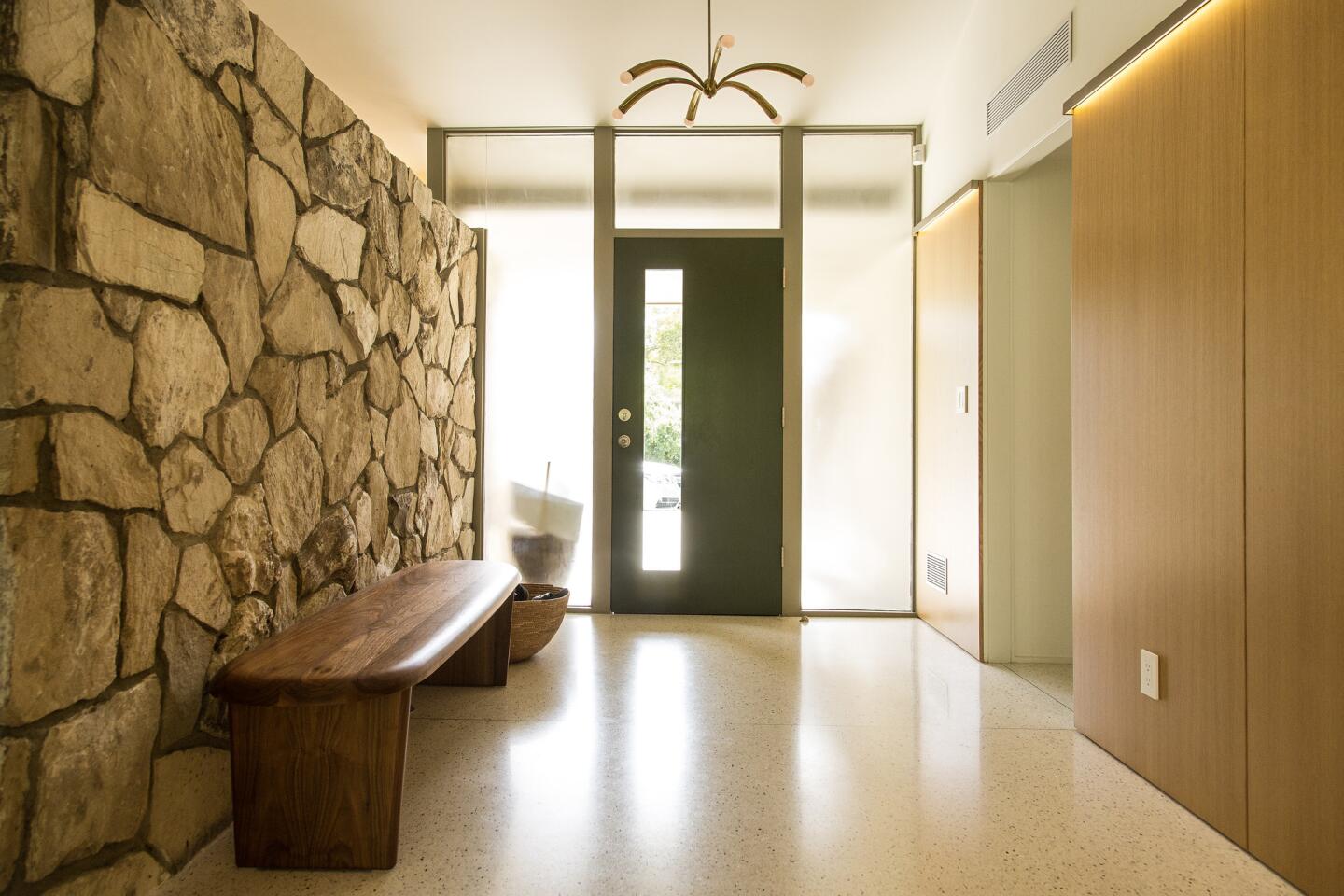
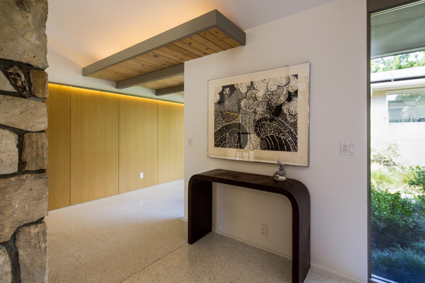
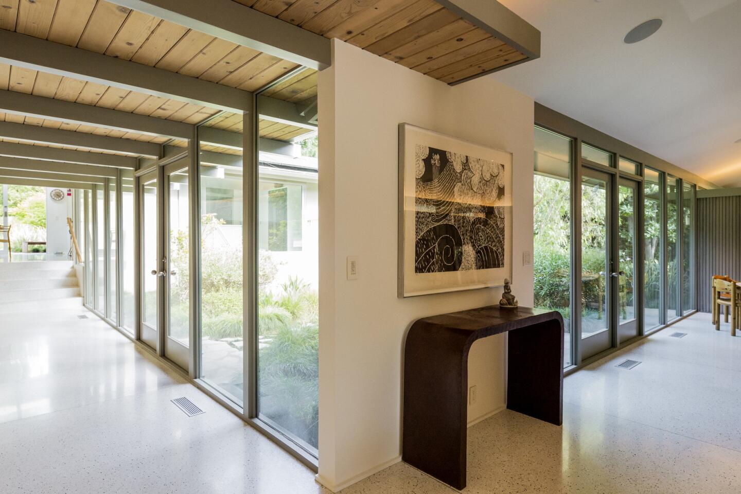
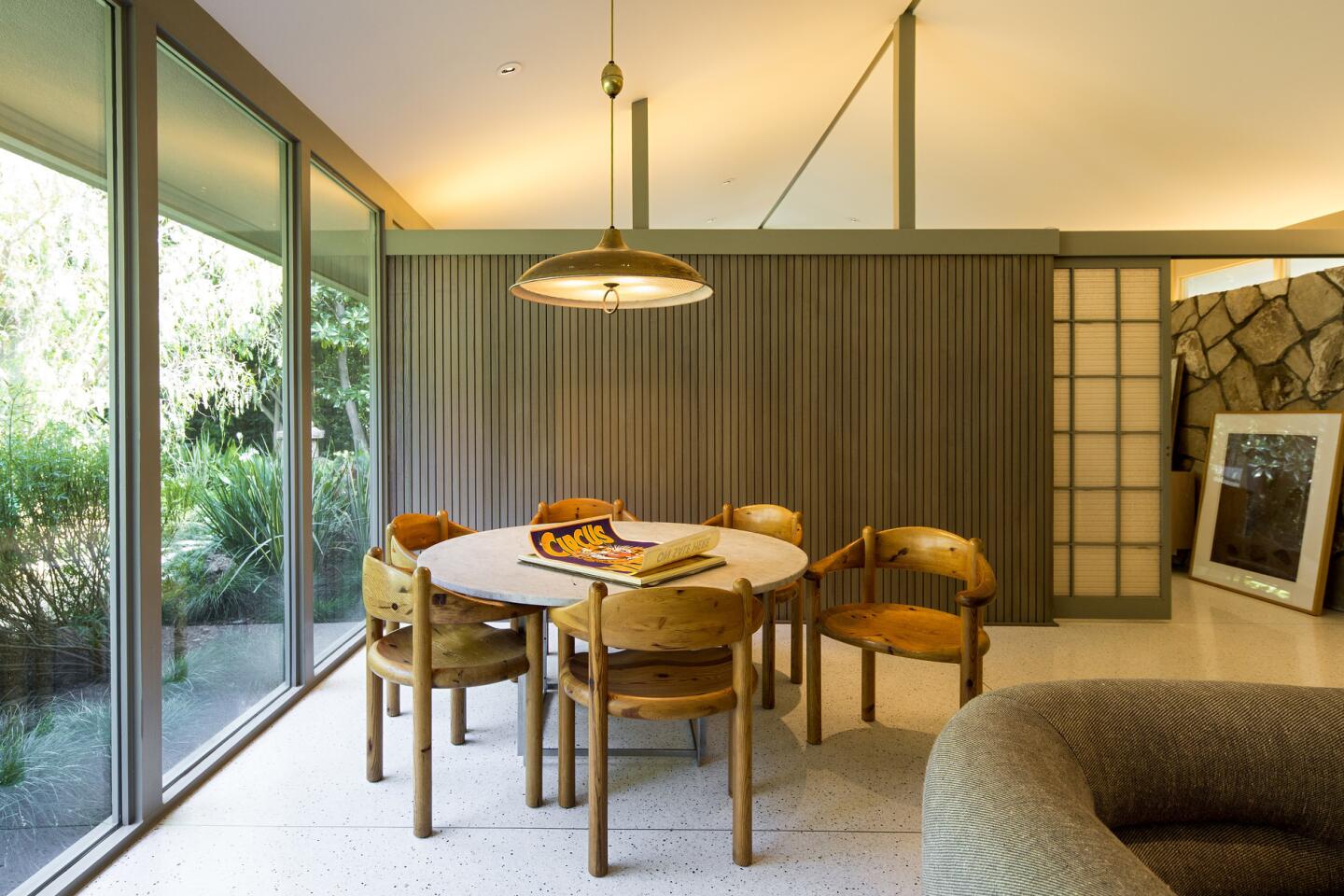
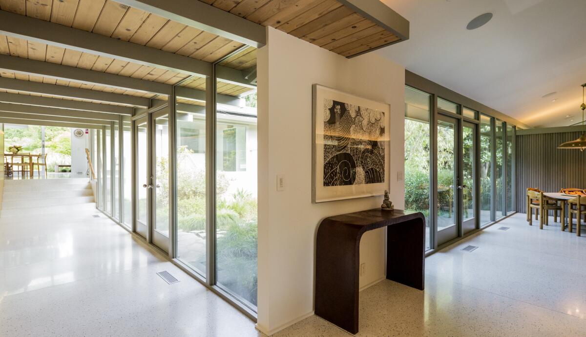
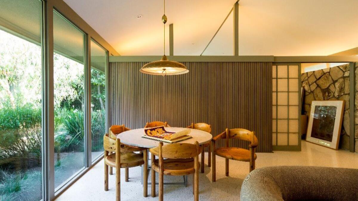
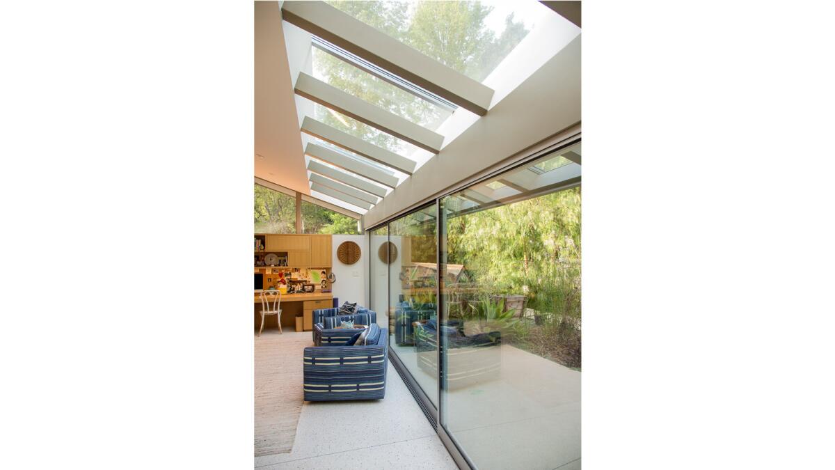
To add light, Bertram removed the home’s many solid wood doors, added three skylights and poured white terrazzo flooring throughout. He also replaced all of the black paint on the windows and beams with a serene pale gray-green from Benjamin Moore.
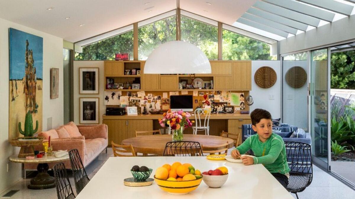
Instead of adding a single skylight in the family room, Bertram added a post-and-beam-style roof structure with skylights. “It humanized the space,” he says. “I didn’t want it to feel out of place with the rest of the house.”
Now, as you enter the house, you walk down a sun-filled corridor to the family room and kitchen, where you are greeted by a newly landscaped backyard by designer Matthew Brown.
Levy calls it the grand ascent. “It’s like living in Big Sur in Pasadena,” she adds.
Inspired by a renewed connection to the outdoors, Levy now hosts Rosh Hashanah, New Year and Thanksgiving celebrations on an outdoor patio that is within easy access of her kitchen.
“There is so much life here now, with my friends and family and kids,” says Levy who invited famed yoga teacher Gurmukh to come and cleanse the house before they moved in.
The sage must have worked.
“It’s a super happy place now,” she says with a smile.
From darkness to light: A midcentury update
Homeowner Jenny Levy wanted a midcentury beach house in Pasadena: An open and bright home with a degree of informality. Here’s how architect John Bertram transformed the dark 1962 home by Pasadena-based architects Smith & Williams:
Poured-in-place terrazzo floors
The original flooring was a combination of irregular slate flooring, dark-wood parquet and carpeting. Bertram brightened the interiors instantly by installing poured-in-place white terrazzo. “Flooring is huge,” he says. “It made a huge difference. It has visual interest, it is shiny and hard, and it plays with the light.”
Swapping black trim for softer tones
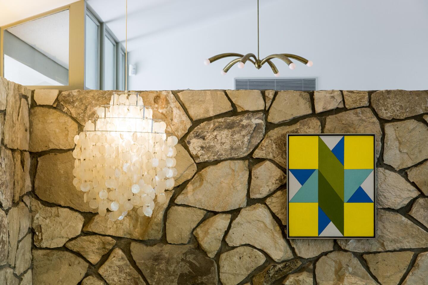
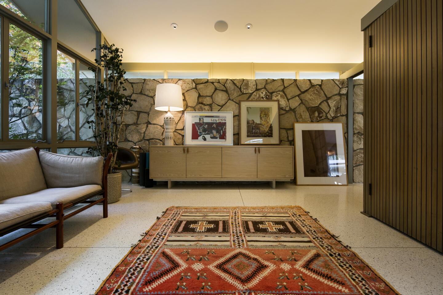
Bertram removed all of the black paint on the windows and trim and replaced it with Benjamin Moore Gettysburg Gray HC-107. “Once we introduced the pale gray-green, all of the stone work became quite beautiful,” Bertram says. “As the house lightened up, the stone became more elegant.”
If you can't stand the heat, move the kitchen
Bertram moved the kitchen off of the long corridor and installed it next to the family room, creating an open family, dining and kitchen area. The kitchen also connects to the home’s courtyard and den. White painted cabinets help to brighten the interiors.
A new, open great room
Bertram removed the fireplace and replaced it with a wall unit and desk. He also added post-and-beam-style skylights to bring in more light and play off the home’s original architecture.
Skylights
Three new skylights, located throughout the house, add to the home’s current sunny, airy feel. “Now you can look up and see the sky,” says Bertram.
Twitter: @lisaboone19
For an easy way to follow the L.A. scene, bookmark L.A. at Home and join us on our Facebook page for home design, Twitter and Pinterest.
ALSO:
It's a mod, mod world: See some of our favorite Midcentury Modernism photos
Home of The Times: They found a Fickett house, bought into the neighborhood
Restoring a neglected tract home to Midcentury glory in Palm Springs
More Southern California home tours
