Photos: A 1913 cottage with a modern glass topper stands out
By Paul Young
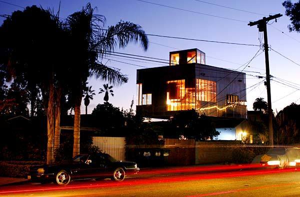
Robert Choeff and Krystyan Keck’s home in Venice stands out. The residence looks like two houses stacked on top of each other, largely because it is. The bottom is a 1913 cottage, the top a translucent modernist box. One almost expects to see Dorothy inside this bit of Oz. “We definitely have more than our share of gawkers,” Keck says.
Some passersby find the style mash-up to be weird, but to others the house is a clever solution to a difficult problem: How do you take a small lot, double the size of your living space and still end up with a piece of interesting architecture? Though the husband and wife have worked together on projects in the past, this is their first collaboration as the Bureau of Architectural Affairs. Each decision they made was driven by pure practicality.
The choice to float the new space over the original home, for instance, was driven by code. If they had built a new structure from the ground up, they would have been required to include a garage, which would have taken up precious space. “We also needed to keep the cost down,” Keck says. “So that was a big factor in keeping the original house intact.” (Robert Gauthier / Los Angeles Times)
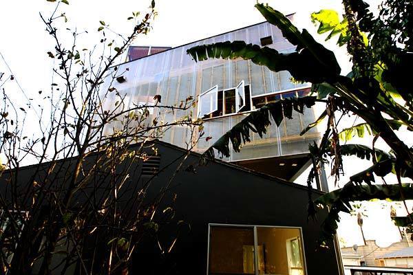
Major alterations were required to transform the original 800 square feet into three bedrooms, one for themselves and two for their children, ages 1 and 4. Though the couple remained faithful to the original interior aesthetic of white walls, country maple floors and built-ins, they took more liberties with the old cottage’s exterior.
The plan called for it to be stripped of any ornament, then painted black, or the “color of sleep,” as Choeff describes it. They also wanted to coat the exterior with a slick polyurethane resin to give the home -- the old lower level as well as the new upper floor -- a uniform sheen. In the end, fearing that the polyurethane would be problematic, the couple ditched the resin, kept the shingle siding and went with a charcoal color instead.
The kitchen and living areas were moved into the new construction upstairs, which feels like a marvel as soon as you step into the stairway. The transparent facade allows for views of Abbot Kinney Boulevard, while the stairwell’s bright orange cabinets (which can be seen from the street) provide ample storage space.
“My son loves the stairs,” Choeff says. “He uses them like another room.” (Robert Gauthier / Los Angeles Times)
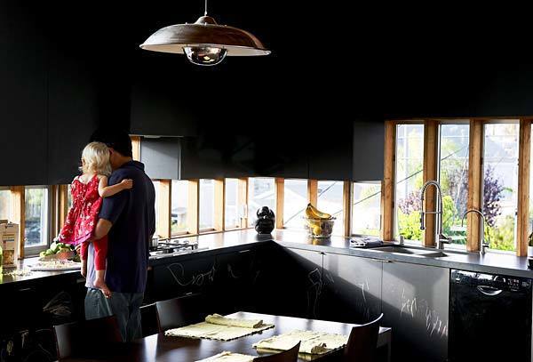
Robert Choeff holds daughter Zara in the kitchen, where dark cabinets conceal the refrigerator and other appliances. Charcoal-colored facades (chalkboard paint, actually) and polished concrete floors make the kitchen feel expansive, even though it’s a mere 125 square feet.
“The dark color also works from the outside, because when you look up through the windows, you can’t really see any real definition inside,” Choeff says. (Robert Gauthier / Los Angeles Times)
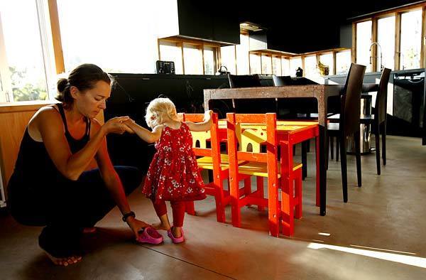
Krystyan Keck helps Zara into her shoes. Keck and Choeff met at Princeton’s graduate School of Architecture. The Brooklyn-born Choeff had spent years in Berlin, where he worked on Daniel Libeskind’s Jewish Museum. Keck, an upstate New York native, worked for Rem Koolhaas’ firm, OMA, in the Netherlands, where Choeff eventually landed as well. They worked on Koolhaas projects, including the Netherlands Embassy in Berlin; the Casa da Musica orchestra hall in Porto, Portugal; and the celebrated McCormick Tribune Campus Center at the Illinois Institute of Technology in Chicago.
In 2000, the lure of sunny weather brought the couple to Los Angeles, where they embraced the region’s history of experimental architecture. They purchased the Venice property in 2003 for $450,000 and embarked on the expansion with a budget of $400,000. (Robert Gauthier / Los Angeles Times)
Advertisement
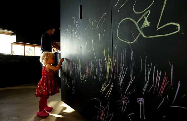
Cabinetry becomes canvas, thanks to chalkboard paint. (Robert Gauthier / Los Angeles Times)
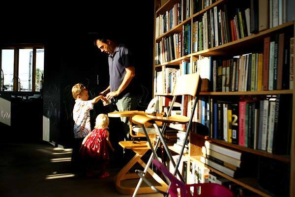
Keck, with Zo, Zara and his built-ins. (Robert Gauthier / Los Angeles Times)
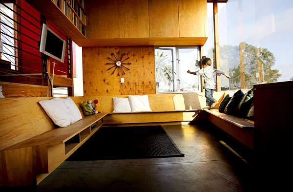
Zo takes a spin around the lounge area. A 5-foot-square sliding-glass window brings in breezes to create an outdoorsy, treehouse feeling. (Robert Gauthier / Los Angeles Times)
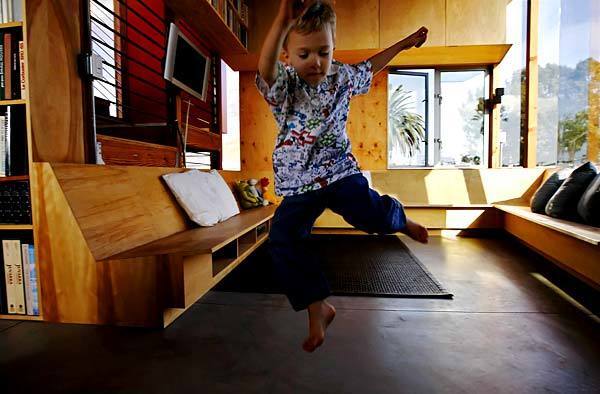
Light, airy and open – a space with room to move. (Robert Gauthier / Los Angeles Times)
Advertisement
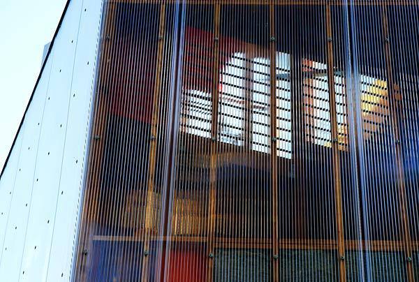
Choeff and Keck sheathed the house in a semi-translucent polycarbonate skin made by the Italian firm Gallina. The covering brings in light and affords additional views, and at sunset, as interior lights come on and the sky turns red, the surface shifts from transparent to almost metallic, with a subtle moire effect. (Robert Gauthier / Los Angeles Times)
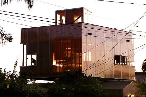
Similarly, the addition’s silhouette seems to change depending on one’s position. At first glance, it may look like a parallelogram, because it mirrors the angle of two bordering streets. But, in fact, it’s a trapezoid, a form determined by the lot, its 15-foot setbacks in front and back and the 3-foot setbacks on the sides. From one angle it looks like a perfectly proportioned cube, but from another it looks like an elongated rectangle.
“It seems to expand as you walk from one side to the other,” Choeff says. A rooftop deck provides even more space. (Robert Gauthier / Los Angeles Times)


