How, exactly, does a ‘Color of the Year’ get chosen?
It happens every year, usually in the fall, sometimes in December. “The color of the year” is announced by a paint company. Or a design website, or a fashion magazine.
The Color Marketing Group recently announced what colors its members believe will be big in 2017, and “Thrive,” a yellow-influenced green, was one of the big winners. (“#Thrive is the Key North American Color for 2017,” the company posted on its Facebook page. “This yellow-influenced green promises to show #endurance #longevity and #health.”)
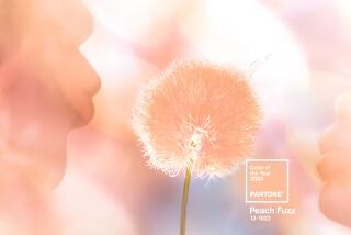
And then there’s Pantone, the design world’s leading color authority, which today announced two colors – “Serenity” and “Rose Quartz”-- as the hottest colors of 2016.
“With the whole greater than its individual parts, joined together Serenity and Rose Quartz demonstrate an inherent balance between a warmer embracing rose tone and the cooler tranquil blue, reflecting connection and wellness as well as a soothing sense of order and peace,” said Leatrice Eiseman, Executive Director of the Pantone Color Institute.
How, exactly, do companies and organizations come up with these colors?
CMG, which is based in Alexandria, VA., is a non-profit that helps pick and predict colors for a variety of products. CMG members (color design professionals including officials from Pantone) gather throughout the year in a series of “ChromaZone” workshops around the world to discuss the future and what color it’s going to be.
Participants come armed with PowerPoints, swatches, test cards and other materials to present their stories about their proposed color choices. Former CMG Mark Woodman says that politics, pop culture, spots, technology and social issues can influence the selection of colors as well.
During CMG’s International Summit last month, 64 colors were selected and broken into groups (16 colors each) that were attached geographic regions: Latin America, Europe, the Asia/Pacific region and North America (which is where “Thrive” promises to be popular--or at least influential).
Woodman says CMG’s color selections amount to “a direction, not dictation.” But industry know how is vital when there are millions at stake on a new launch. (Just ask the manufacturers of Marsala-colored paint, bedding and upholstery, whose sales went through the roof when Pantone named that hue the color of year for 2015.)
That’s something that Sara McLean, Color Marketing Manager at Vernon-based Dunn-Edwards, found out when she was assigned the task of creating paint colors for the company’s new “Then, Now & Forever” collection.
Woodman assisted on that project and recalled how he and McLean spent a whole day tacking up hundreds of 8½ x 11 drawdown test cards on the wall of a former lacquer warehouse -- and then instantly rejected hundreds of them.
Frequently working alone over the five-year life of the project, McLean created 300 new colors at a cost, she says, of about $10 million. About 140 of the colors were attached to a “story” involving the American West, California Missions and architecture. The other “trending” colors were based on classic colors from past collections.
McLean’s research involved everything from scouring art, architecture and design books to visiting museums and gardens. She also paid attention to travel, fashion, food and cocktails, and spoke to historians, designers, architects and clients.
There were months of lab time, as well, with exotic-sounding machines like the “Spectrophotometer” breaking down colors to work on their formulas, and the “SpectraLight” showing what potential paints looked like under various kinds of light. McLean then turned to a thesaurus and French and Spanish dictionaries to come up with names for new colors, including “Gatsby Glitter,” “Cotton Club,” “Palm Springs Splash,” “Aged Whisky” and “Mountain Bluebird.”
Now she has the job of selling the colors to clients, while Woodman and the other trend forecasters are already planning ahead for what we’re going to see on park playgrounds, car doors or kettles in 2018.
“But there are no wrong colors,” Woodman says. “Just colors done wrong.”
ALSO:
Pantone names a pastel pink and a baby blue as the hottest colors of 2016
Homes of the Times: Our Favorite Home Tours
Garden party: Floral wallpapers that will make you forget the drought
More to Read
Inside the business of entertainment
The Wide Shot brings you news, analysis and insights on everything from streaming wars to production — and what it all means for the future.
You may occasionally receive promotional content from the Los Angeles Times.
