Architecture adds an upgrade to affordable housing in Santa Monica
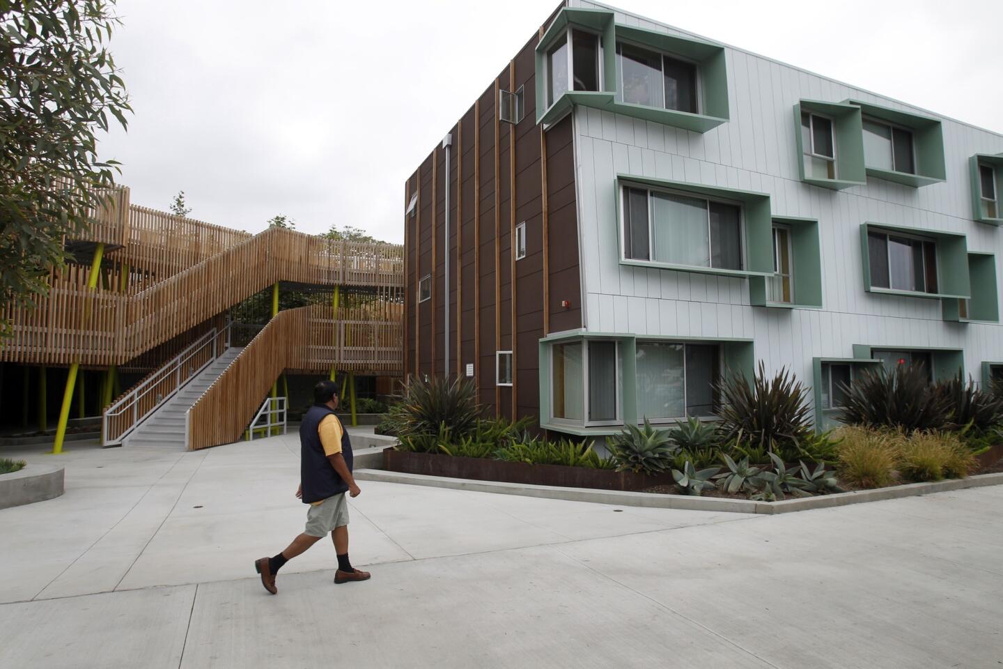
The apartment building at 2602 Broadway in Santa Monica doesn’t scream “affordable housing.” Rather, its proportions and details are more like that of the neighboring 1960s buildings, and that’s because 2602 Broadway takes a cue from those iconic structures, architect Kevin Daly said.
“What we’ve done is take the typical L.A. dingbat, which I would characterize as a four-sided doughnut of a building, and break it apart and move toward the extreme edge of the property,” Daly said. Instead of introducing a radical new form to the block, 2602 Broadway improves on what already works for the neighborhood, he said.
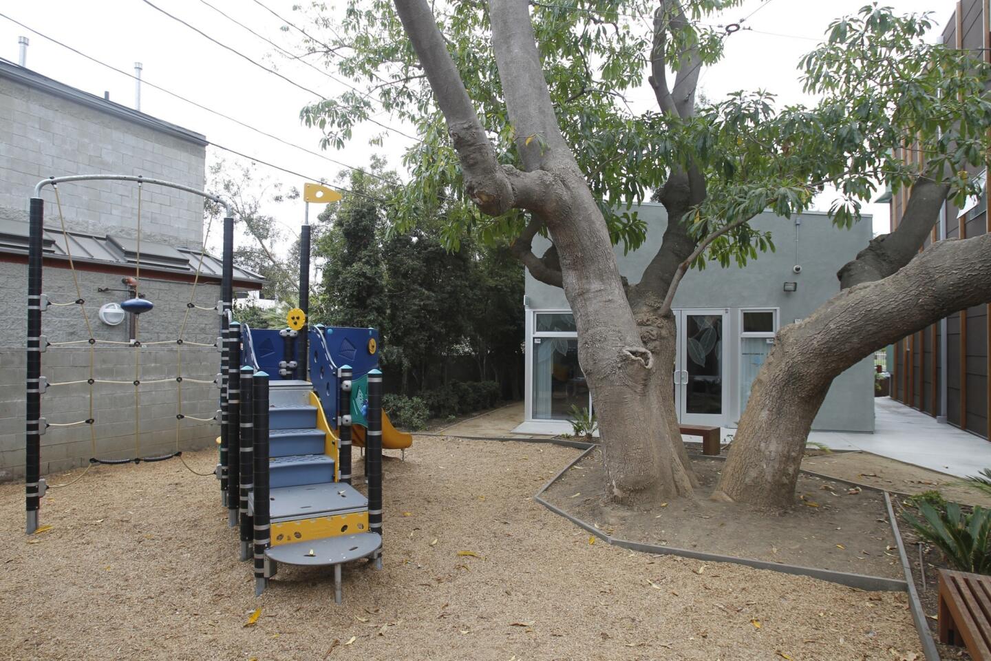
Community Corp. of Santa Monica, a nonprofit that serves as developer and owner of 90 projects in the city, works with local architects such as Daly to transform infill properties or push forward on adaptive reuse. These projects are not only residences but also community landmarks: A Boys’ & Girls’ Club at 2602 Broadway offers after-school activities to local children. Beyond such practical aspirations, one goal of CCSM is to provide housing that enhances how a neighborhood looks, Executive Director Sarah Letts said. “Buildings that both blend in,” she said, “and stand out in a beautiful way.”
PHOTOS: Broadway apartment complex in Santa Monica
Daly wanted to maximize the use of quality materials for the 33-unit complex. He said the key to keeping costs down was to remember that all four walls were not created equal: One side (the “hyper-performance facade,” he said) would always be exposed to the greatest amount of sun, and that’s where he could devote the bulk of the resources.
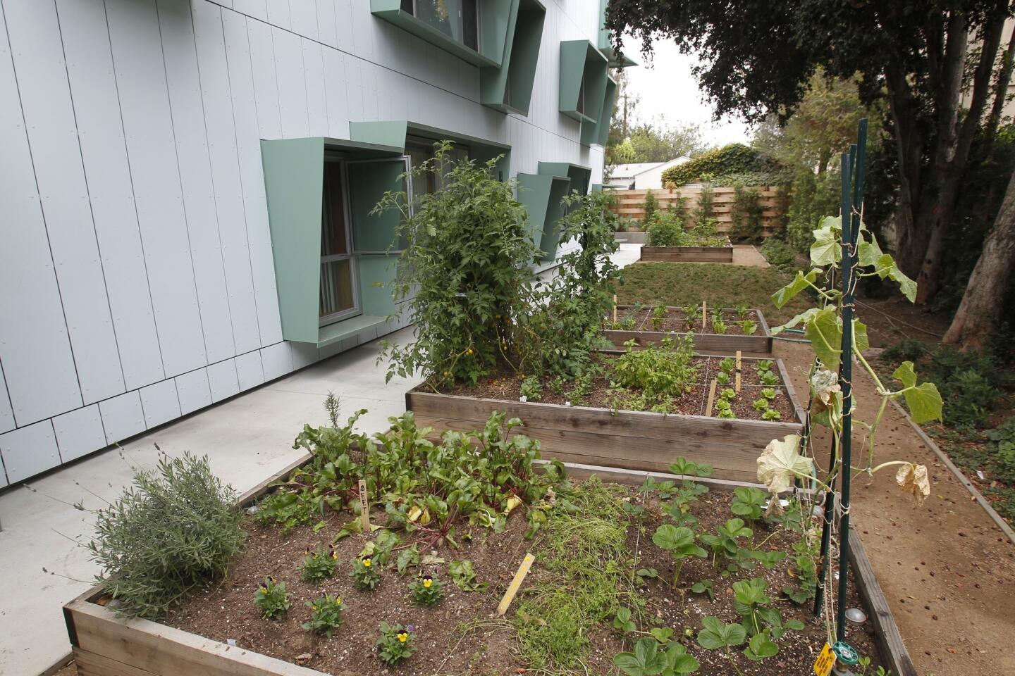
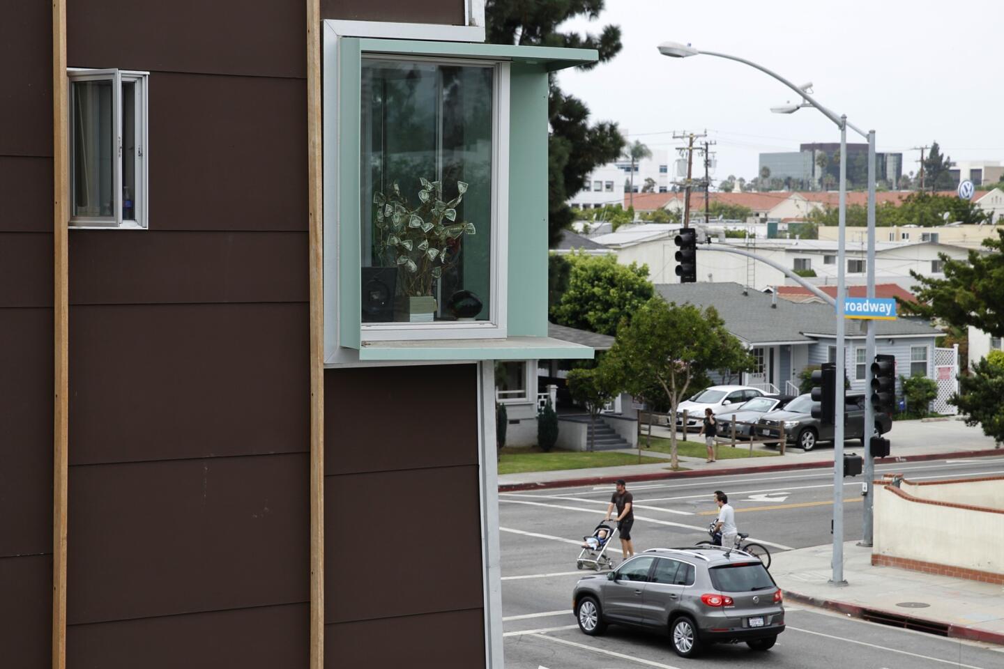
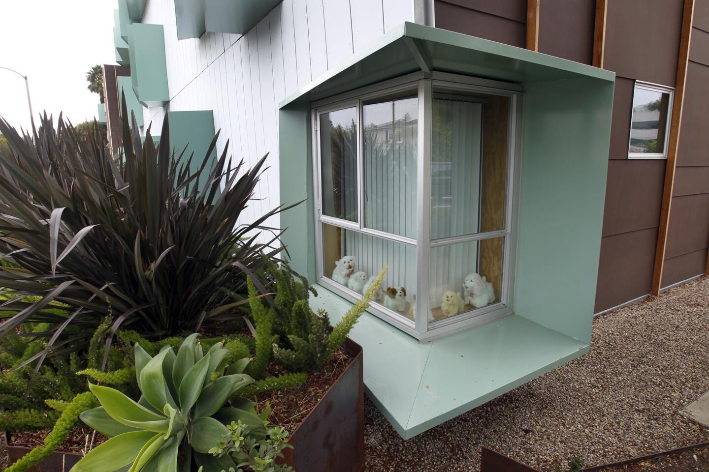
Deep, powder-coated aluminum awnings curve around the sunniest windows, providing shade and preventing interior heat gain. They also add a lovely sculptural element.
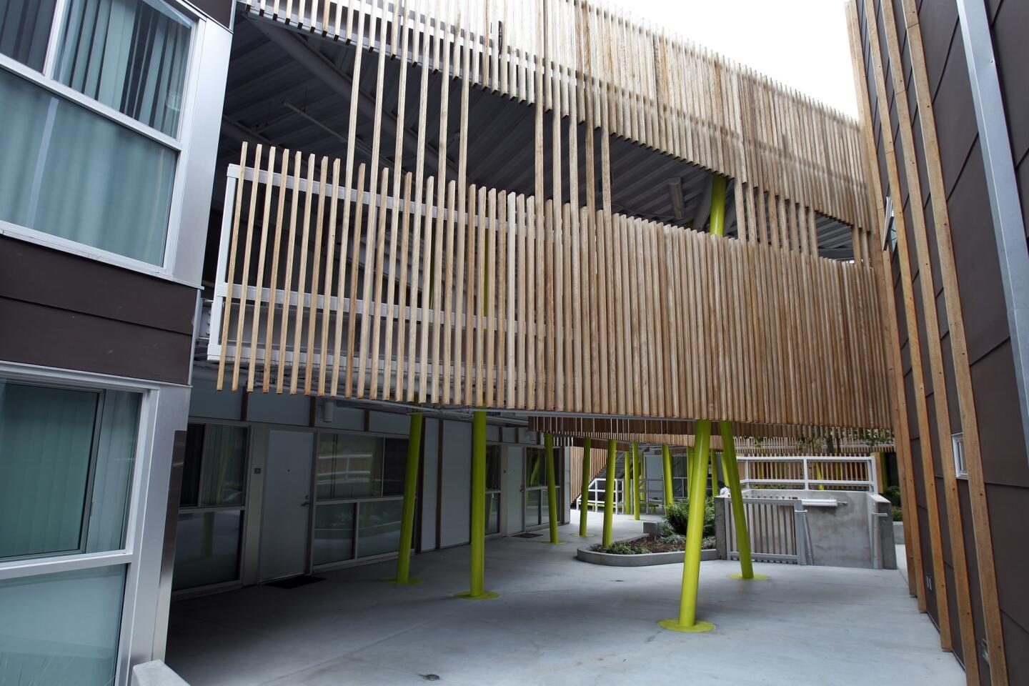
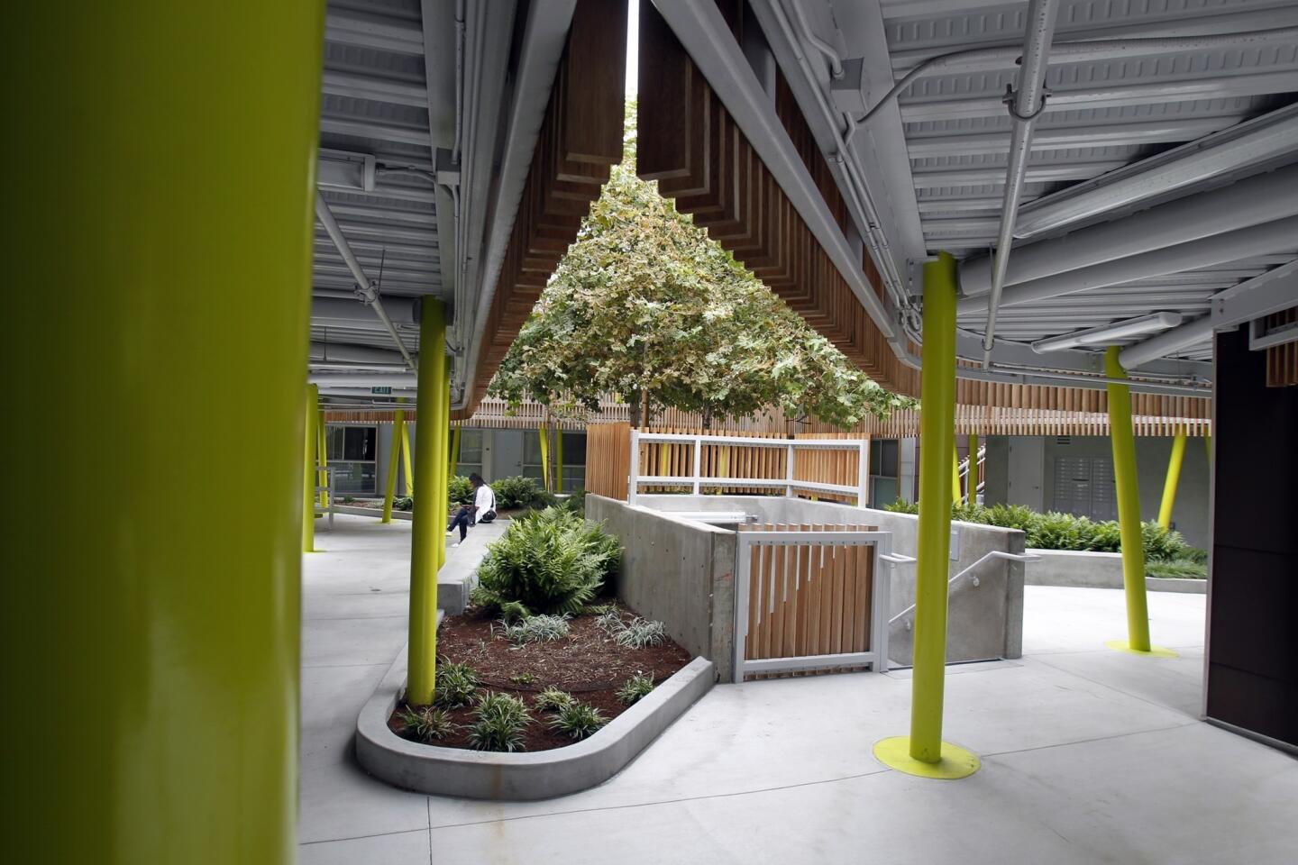
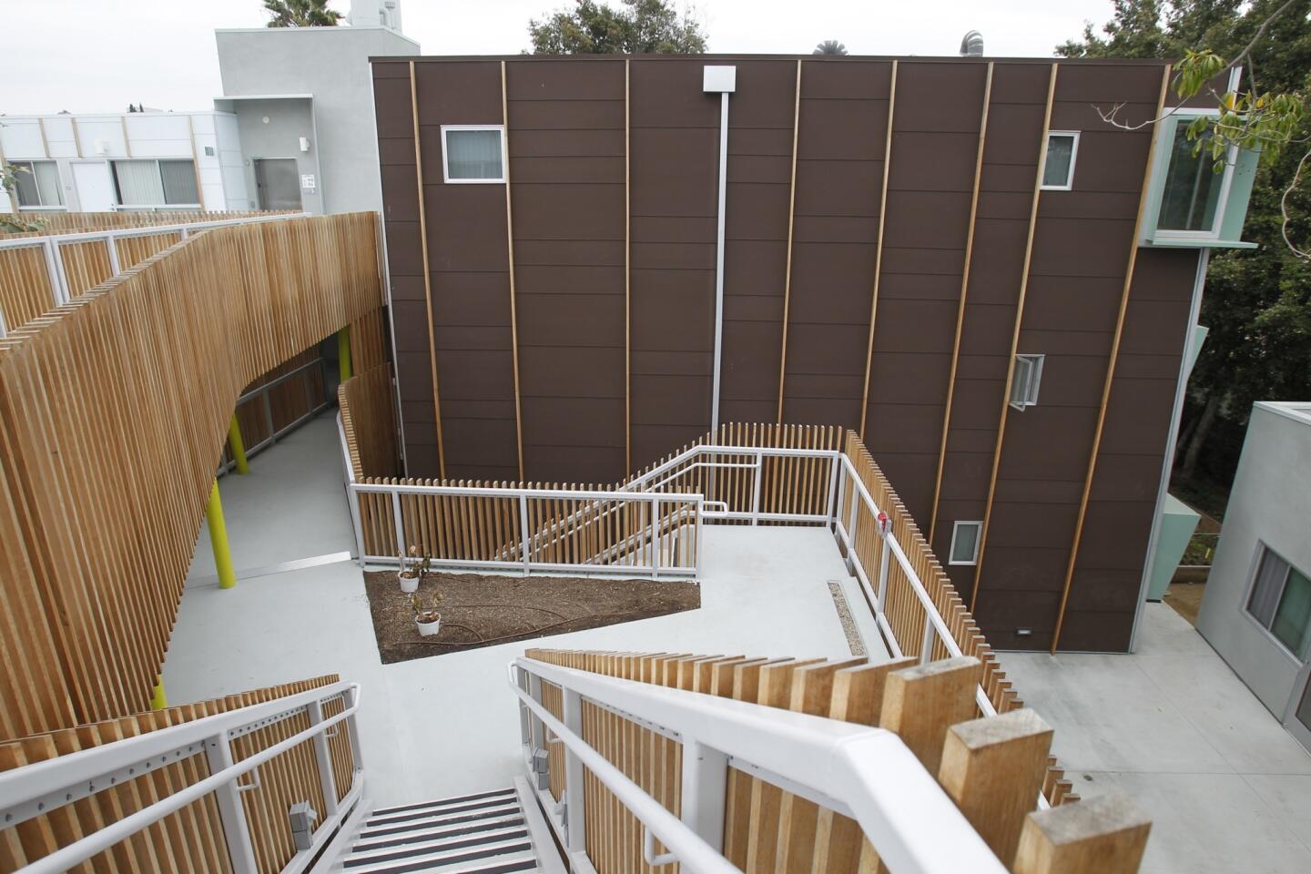
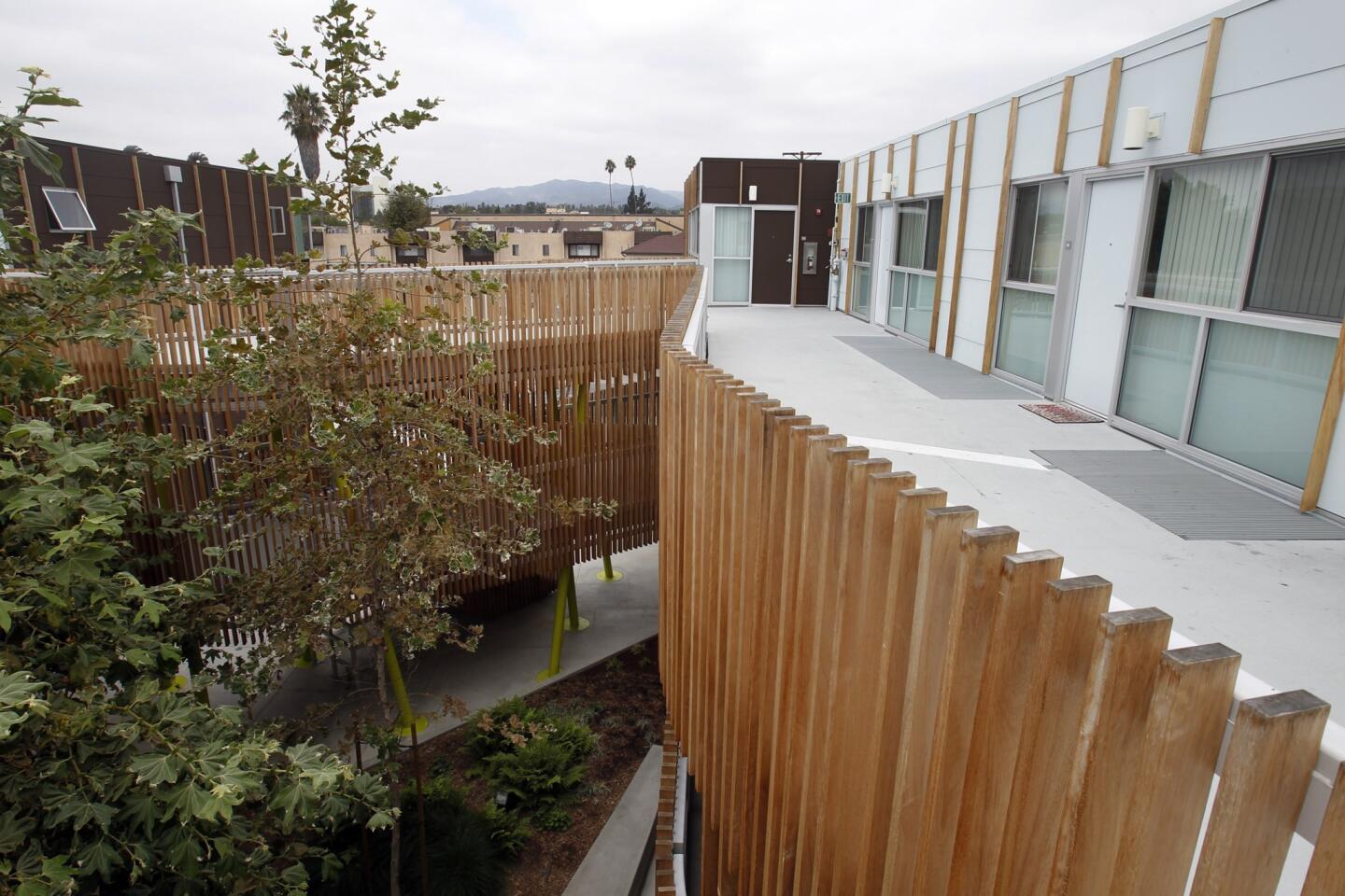
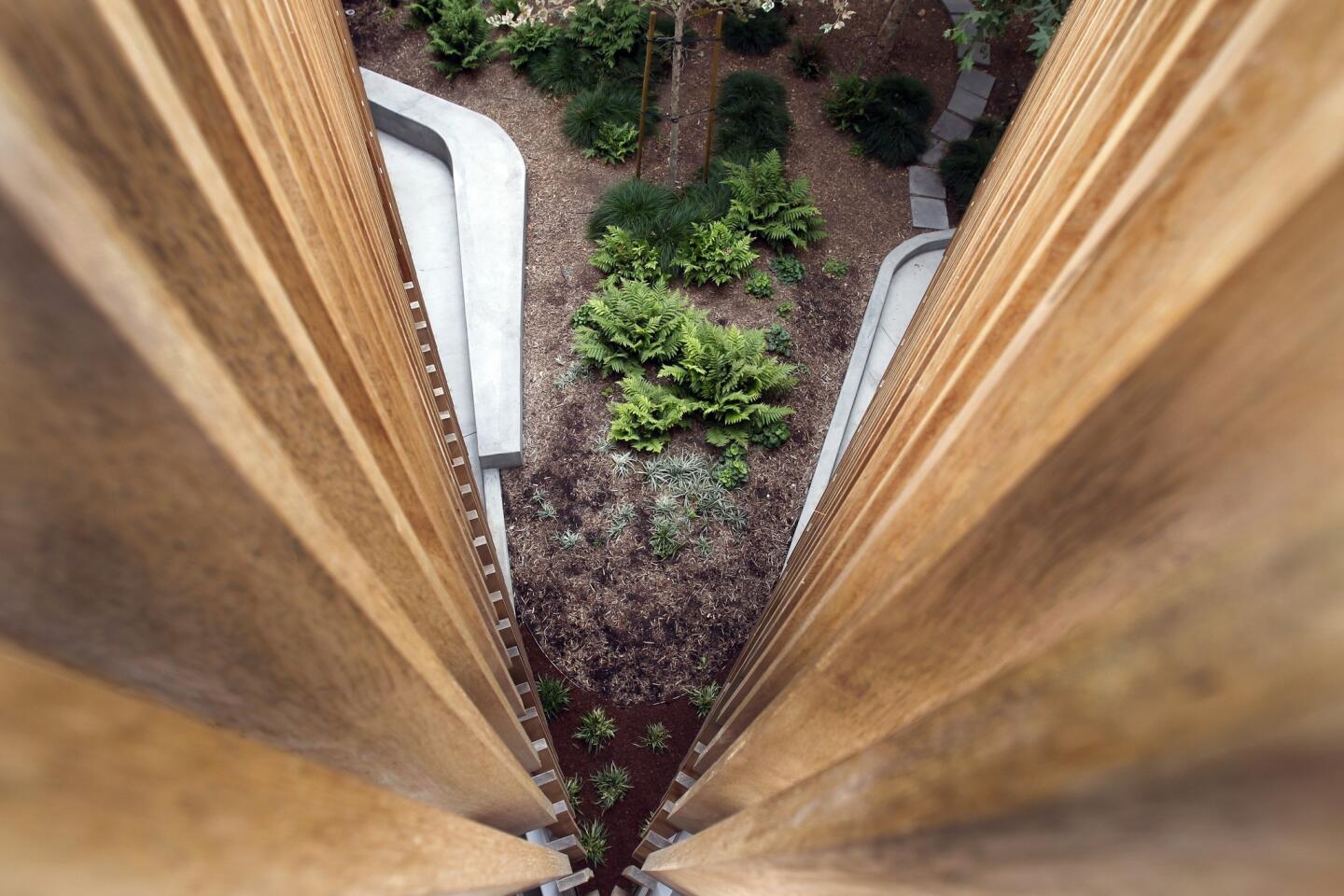
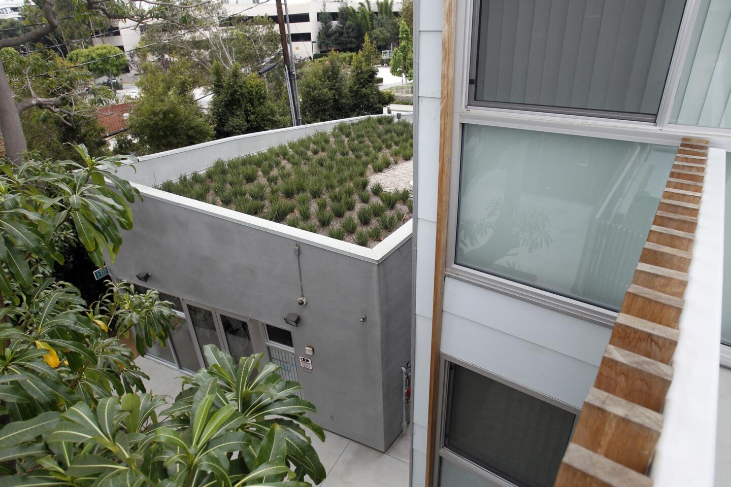
Big environmental moves included leaving a massive quinine tree to shade the lot and installing a cistern in the garden to collect rainwater. A screen made from planks of tornillo — a fast-growing and sustainable hardwood that ages nicely — weaves its way along the walkways that connect four buildings. The staggered openings offer snippets of sightlines in a way that’s almost cinematic, creating a pleasant interior view. But the design also cleverly affords privacy, which encourages residents to have their windows and doors open, Daly said.
With these simple features, Daly hoped to offer a broader definition of affordability — not just in terms of construction costs but also in how easily residents can maintain their homes. The simple lines and sustainable materials are appreciated by resident Marina Guerrero, who lives in one of the two-bedroom units with her husband and two children.
“You can really get creative here with the space,” Guerrero said. “It inspires me.”
Four ideas to borrow from 2602 Broadway:
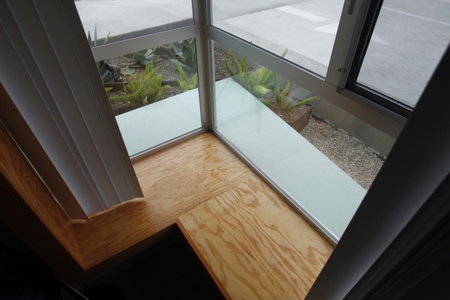
Aluminum window awnings: The clever shading used here was manufactured by Machineous, a custom fabrication company in Gardena. The awnings shade the sunniest sides of the complex, increase privacy and simply look cool. Powder-coated aluminum is affordable and can add a pop of color to an otherwise blank wall. Inside some apartments, the windows actually have built-in seats and storage cabinets.
Tornillo privacy balustrade: Along the walkways, slender vertical planks of the hardwood tornillo are arranged in an undulating, computer-generated pattern. The net effect is fencing that feels more like a decoration than a barrier. Residents can keep windows and doors open without seeing into one another’s living rooms. This type of fence would work well between close dwellings, architect Kevin Daly said.
Cement board exterior cladding: To add texture and color to the exterior, Daly called for durable, affordable HardiePanel vertical siding. The matte finish of the cement board panels can be any color, and they have a texture that’s different from your typical stucco.
Landscaping color accents: Color is key for small spaces, but often homeowners don’t know where to start with a palette. Daly looked to the landscaping by Los Angeles-based Dry Design for cues, pulling shades of bright green and earthy browns that gave the building a sense of nature. The light blue is inspired by a marine-layered Santa Monica sky.
More to Read
Sign up for Essential California
The most important California stories and recommendations in your inbox every morning.
You may occasionally receive promotional content from the Los Angeles Times.
