This house used to look kind of like Darth Vader’s helmet. Look at it now
When architect Christopher Coe first spied Frank Suryan Jr.’s newly purchased home on Naples Island in Long Beach, it reminded him of Darth Vader’s helmet.
Despite its sensational waterfront setting on Alamitos Bay, the home was a throwback from the ’90s. Outside, dark and forbidding seemed to be its theme. Inside, there was glass block everywhere.
Now the home has been saved from the dark side.
It has been transformed into a light-filled, modern residence that took its cues from Suryan’s fond childhood memories of time spent on his father’s fishing boat. Coe, of Los Angeles-based COE Architecture International, completed the project in collaboration with Suryan, who is chairman and chief executive of Lyon Living, a privately held multifamily real estate development company, and interior designer Leslie Dewald of L.B. Muller Design.
This major renovation gave Suryan and Coe a chance to really put their signature styles on a project, without being hampered by pragmatic constraints such as community needs and budgets--considerations that had tempered their ambitions for earlier collaborations for Suryan’s multifamily residential developments.
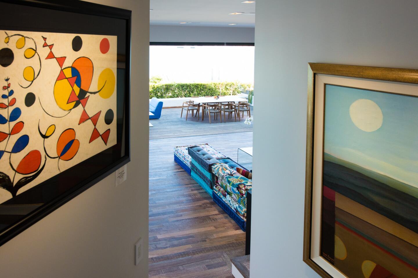
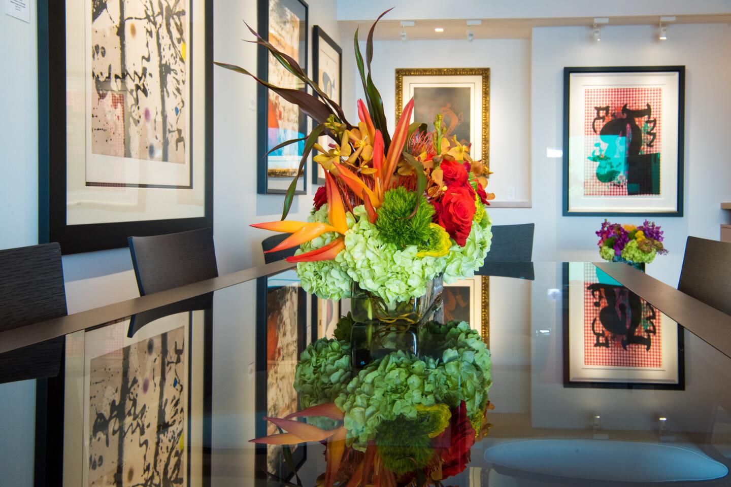
“I just wanted it be something fun and cool, with a vibe similar to that of an art gallery during an opening event,” the homeowner said.
Think: beautiful modern building, great art, cool people, and wine to enliven the night.
Not only did the trio accomplish this, but they’ve also created a waterfront home that stands out for its unapologetically modern architecture yet is elegant enough to stand the test of time.
Here are a few key elements of the project:
First appearances
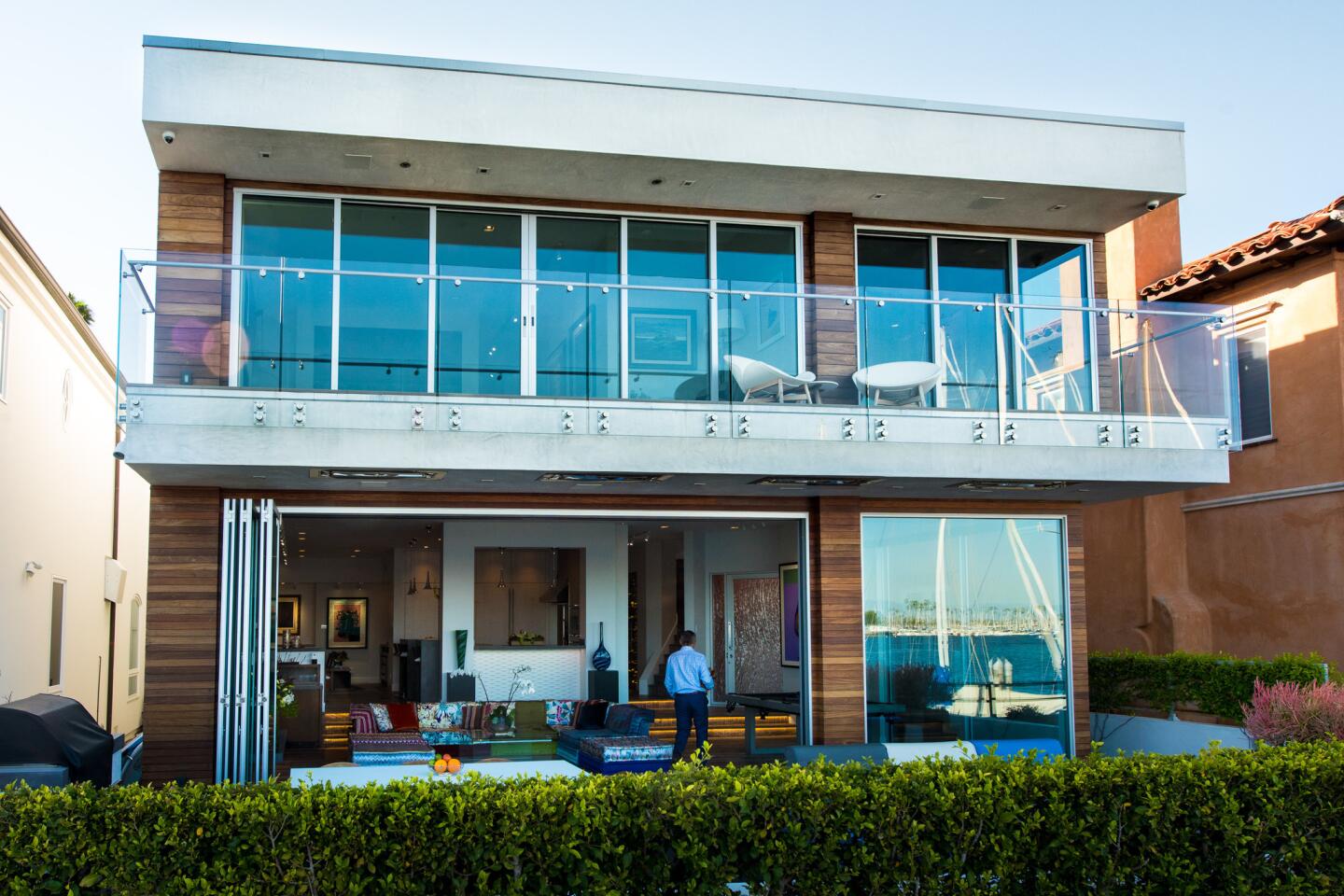
The home’s previous exterior — granite marble cladding and dark-tinted windows — gave it a forbidding feel. But the architect said he envisioned a home that was “reminiscent of a boat, but modern in aesthetic and function.” So he clad the new design in bright, white plaster, like the color of fiberglass boat hulls, added Brazilian ipe wood planking, and used stainless steel and glass for the railings.
Have a seat
The original home had small windows that did nothing to highlight the home’s great water views.
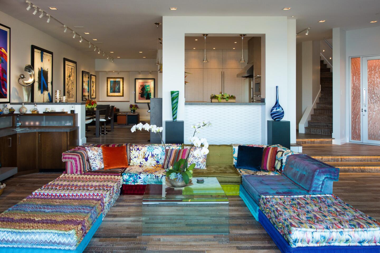
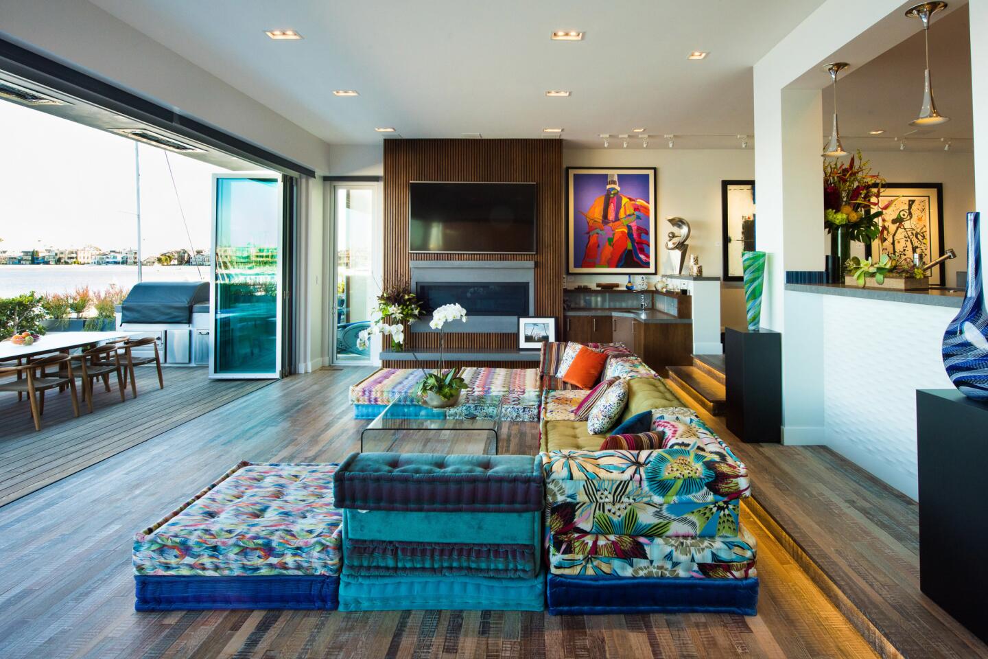
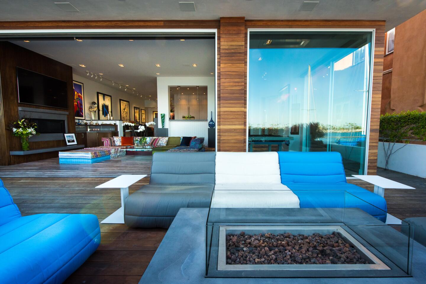
The exterior wall of the living room was removed and replaced with accordion glass doors.
Now the interiors open to the outdoor deck, which faces the water.
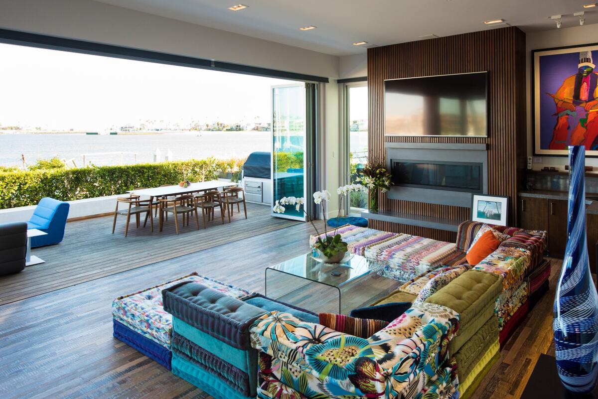
And the new living room.
“I wanted to embrace the fact that this house was on the water,” Suryan said.
Heart of the home
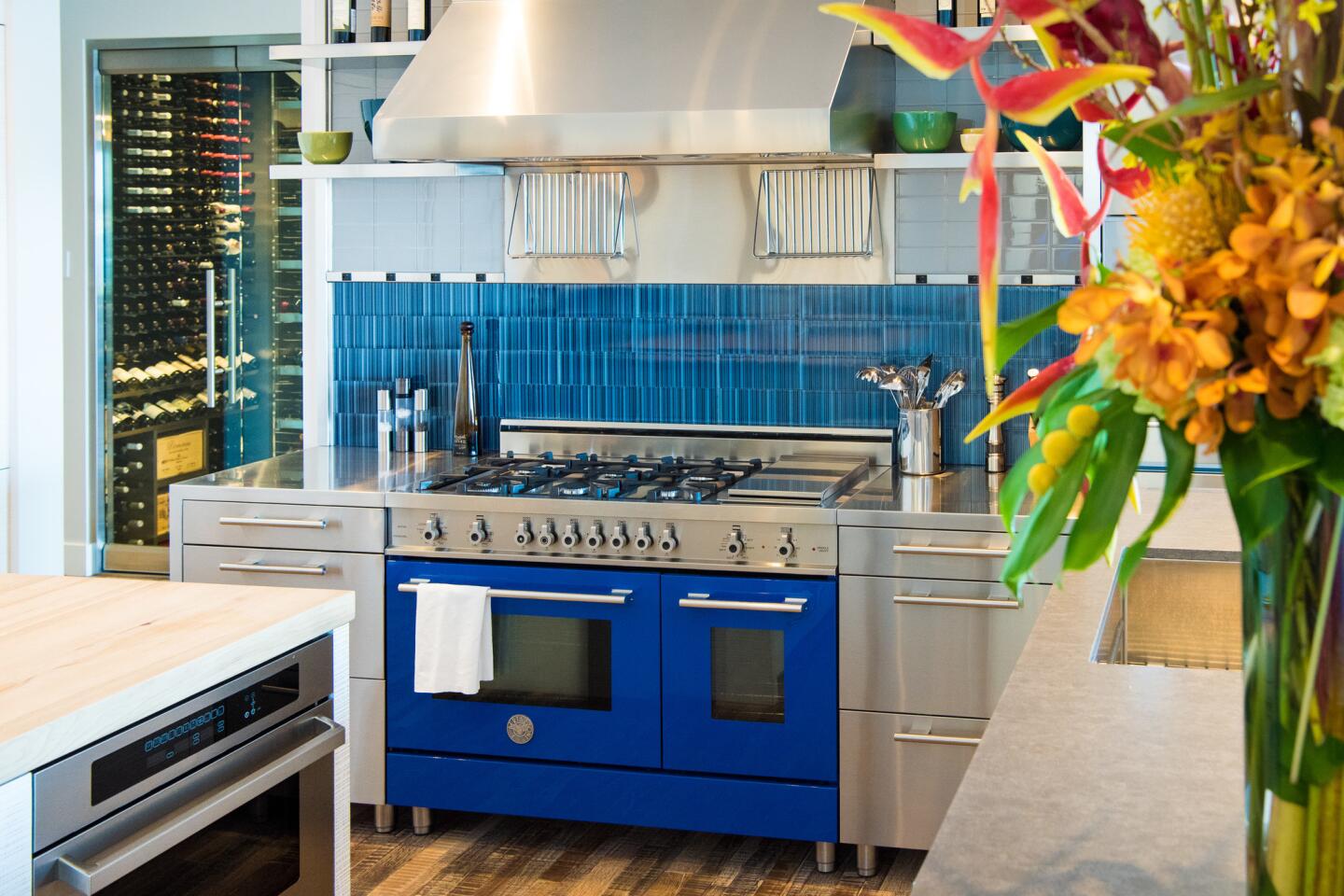
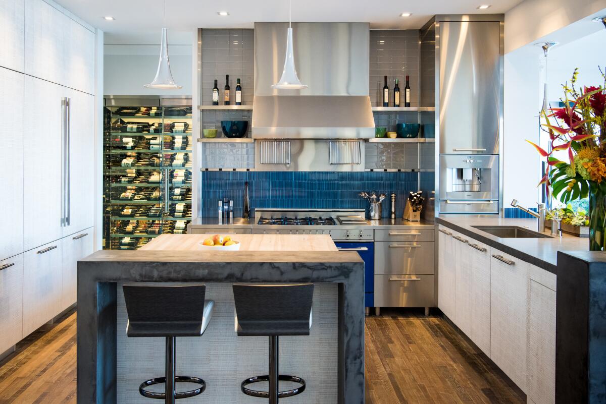
The kitchen — traditionally the most social part of any home — was stuck in the farthest back corner of the original house, and there were no windows.
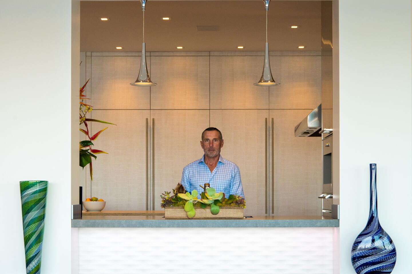
The architect moved the kitchen 20 feet forward and positioned it as a centerpiece. There are also elevated areas for people to stand on to view the water outside, similar to a “deck of the boat, where you can look out over the living room toward the water,” Coe said.
Modern material
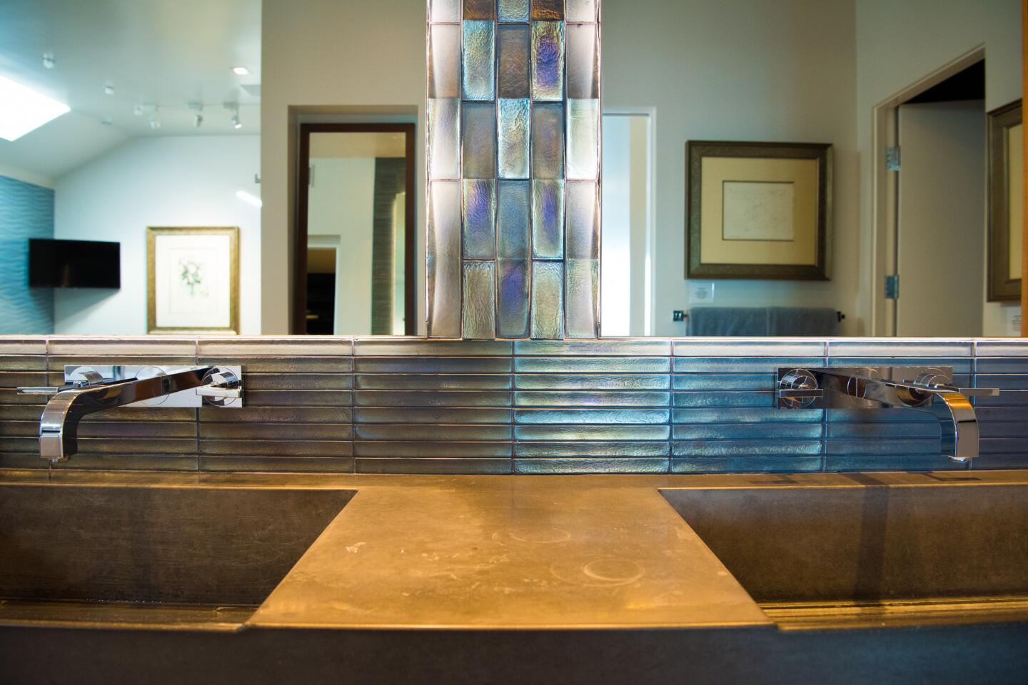
Suryan modernized the look of the home by adding concrete touches throughout. It all started when he became enamored with a concrete pool table he saw. He then found that other items also were available in concrete. Now the material can be found in the home’s waterfall counter tops, living room fireplace and outdoor barbecue, among many other places. “I liked that the concrete had a grayish blue tint that picked up the color of the water,” he said.
Adding an archway
Imposing glass and marble shelving used to separate the kitchen and living room. “You would never see the kitchen from the living room,” Coe said. He wanted to remove all the partitions between living room and kitchen, but the columns supporting the shelves were structural. So he turned the shelving into a frame, preserving its structural purpose while simultaneously giving the space a more open feel.
Get away from it all
The home’s old master bathroom — there are a total of four bathrooms — was stuck in a time warp.
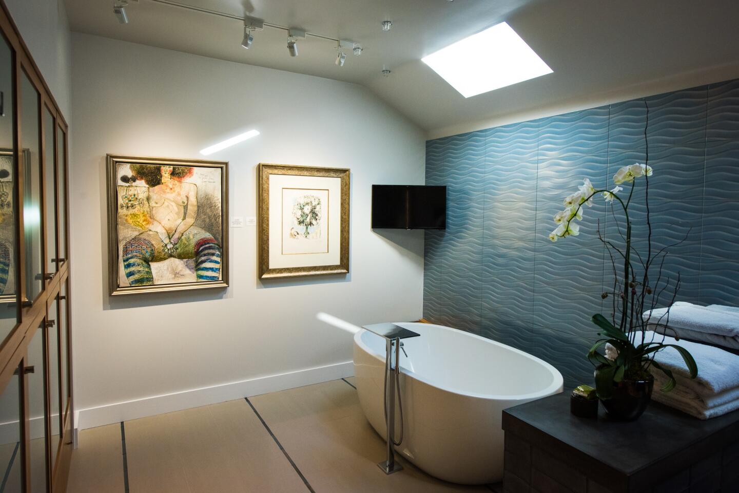
Coe and Dewald brought it into to the 21st century by creating a minimalist escape. Coe kept its original skylights, which brought light into the space, but nixed an overly large cornice by the ceiling.
He also reoriented the bathroom to create a more open feeling. Gone too are glass blocks that made the room feel cramped. They were replaced with a simple glass divider that separates the shower from the rest of the bathroom.
A soaking tub takes the place of an embedded oval tub. Rather than wallpaper, a textured tile in a blue wave pattern echoes the serene water outside.
Room for wine
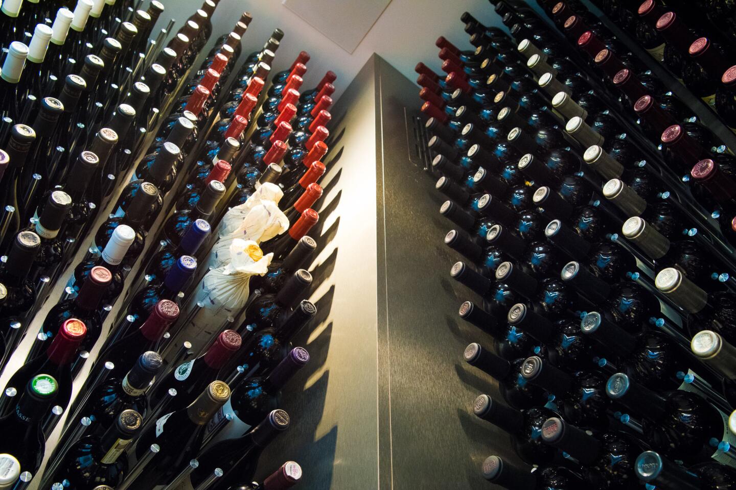
Suryan has a love for wine, so it was essential to find a space for his collection. Coe found the perfect space where a coat closet used to be, underneath the staircase, facing the kitchen.
Now, instead of seeing a blank wall from the kitchen, guests are treated to the attractive sight of wine bottles arranged in a rows.
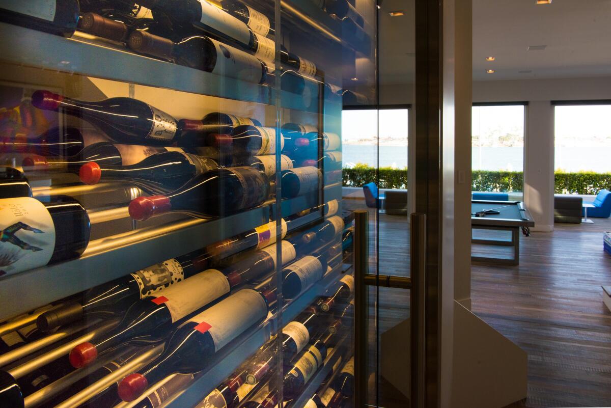
Here’s the other side.
Bigger balcony
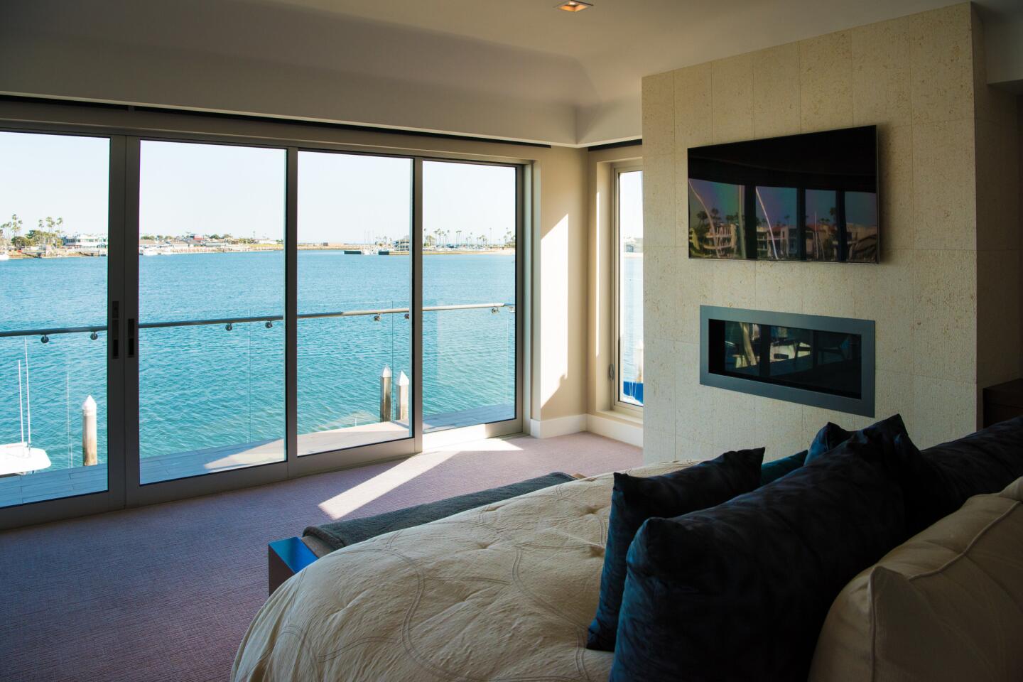
There used to be a halfhearted balcony off the second floor, overlooking the water.
But it didn’t quite reach the master bedroom. Now Suryan and his visitors are able to walk out on an extended balcony that stretches from the study to the master bedroom.
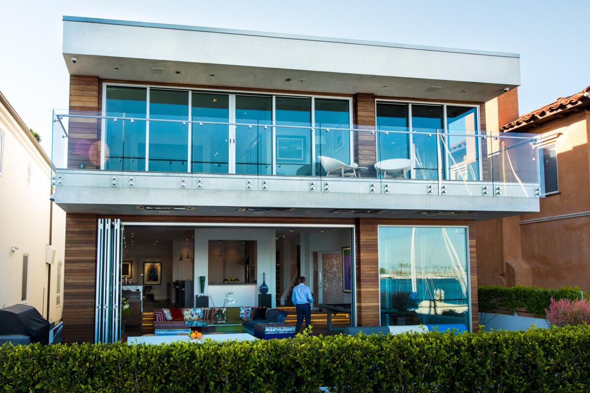
The pair head back inside.
Look down
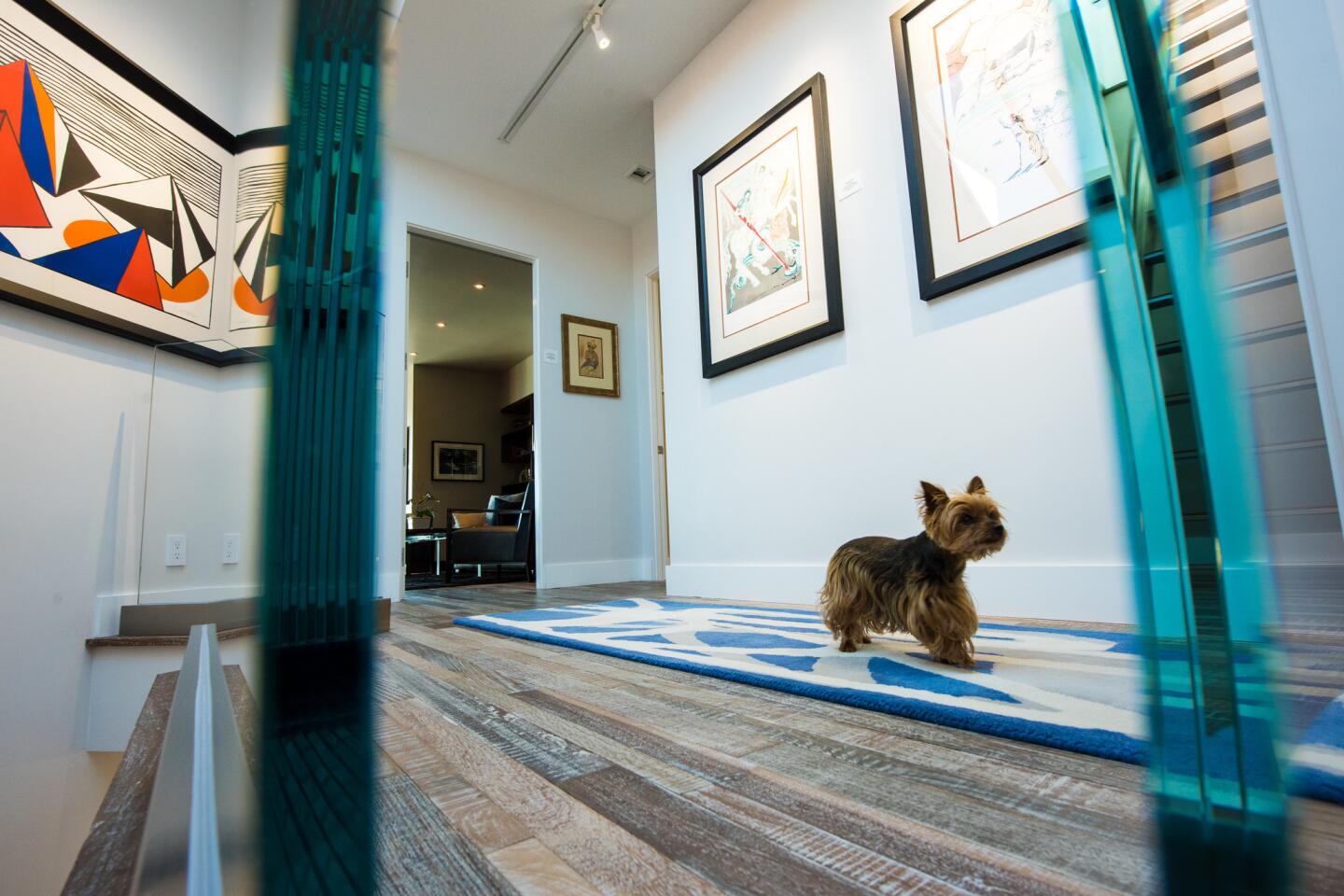
The home originally had lackluster beige carpeting and stone tile that unified the space, but in keeping with the subtle nautical theme, Suryan chose flooring made from wood reclaimed from the hulls of old sailing ships.

