‘Saving Mr. Banks’ costume designer Daniel Orlandi digs deep
Long before Walt Disney’s “Mary Poppins” arrived in theaters in 1964, the studio chief was wooing the story’s author, P.L. Travers, trying to nab the rights to the famed books that eventually became his blockbuster film. It was a bumpy ride, as we see depicted in the Dec. 13 release “Saving Mr. Banks,” that pitted the cranky, obstinate English author (played by Emma Thompson) against the agreeable but resolute Southern California mogul (Tom Hanks).
Travers was tough, and veteran costume designer Daniel Orlandi, who had access to both the Walt Disney Family Museum and the Disney Studio archives, wanted to make sure that aspect came across quickly. “In most scenes, I had Emma carry a big brown alligator bag, kind of like the queen. When I thought in one scene she could go without it, she immediately said, ‘Oh, no, that’s my shield!’ That was P.L Travers. She was substantial and the antithesis of a pushover.”
When you think of a film about Mary Poppins, bright Technicolor hues come to mind. Why did you dress Emma Thompson in darker, warmer colors and hues?
It was more for the story itself, really. We wanted her not to be what they all thought she’d be — this easily bowled-over, older woman — but to have a more formidable, serious look, in stark contrast to the light, relaxed Southern California atmosphere she arrives into. Interestingly, while Travers wanted her trip recorded [on audiotape], she wouldn’t allow photographs to be taken, so we don’t know what she actually wore.
But I wanted her to arrive with her rich wools and her sensible English tweeds in those less-bright fall colors as opposed to the summer colors that the Disney secretaries wore. So I used richer, sophisticated colors such as chestnut, olive, butterscotch, rust and brown. A woman of her stature would also have had a dressmaker, so they were very tailored and fit perfectly.
What was the significance of the silver bracelets she always had on?
Travers always wore silver bracelets in real life, and we had a Georg Jensen original turn-of-the-century piece that I put on Emma. The Disney museum was kind enough to lend it to us, and we were asked, “Please, please make sure nothing happens to it.” I had her wear it almost like a talisman, a protection piece — she wore it with every costume, even wore it with her nightgown. And I also had her wear a ring from her mother (Margaret Goff, played by Ruth Wilson) and father (Travers Goff, played by Colin Farrell). I enjoy those kinds of character interplays; you know, sometimes I feel as a costume designer I’m also a psychologist, getting at the underlying psychological reasons why people and characters are wearing what they wear.
Tom Hanks’ Walt Disney must not have been too difficult, as he was always in a gray suit.
I think it was just the time. Men in those days dressed to go to work, and they would wear suits, very straightforward. Walt had his gray suits. A black suit was for funerals, and so there was basically navy and gray. I remember in one scene we were going to have Walt without his jacket on and Richard Sherman [who co-wrote the music to “Mary Poppins” with his brother, Robert], was there on set and said, “Oh, no, that would have never happened; Walt was always in his suit coat, always.” There are pictures of him in that era in a yellow sweater playing golf, but not for work. Gray suits were his thing.
TIMELINE: The Academy Awards through the years
The flashback costumes were from the turn of the 20th century and had little color; they were all very neutral. Why? Were you trying to show the harshness or bareness of Travers’ early life?
These were working-class people from Australia, so the colors were muted, yes. If they’d been of a higher class, or if it were more formal wear or party clothes, they’d likely have had more color. Bankers wore black suits. It was 1906, but in some ways in Australia it was even earlier in terms of fashion and clothes.
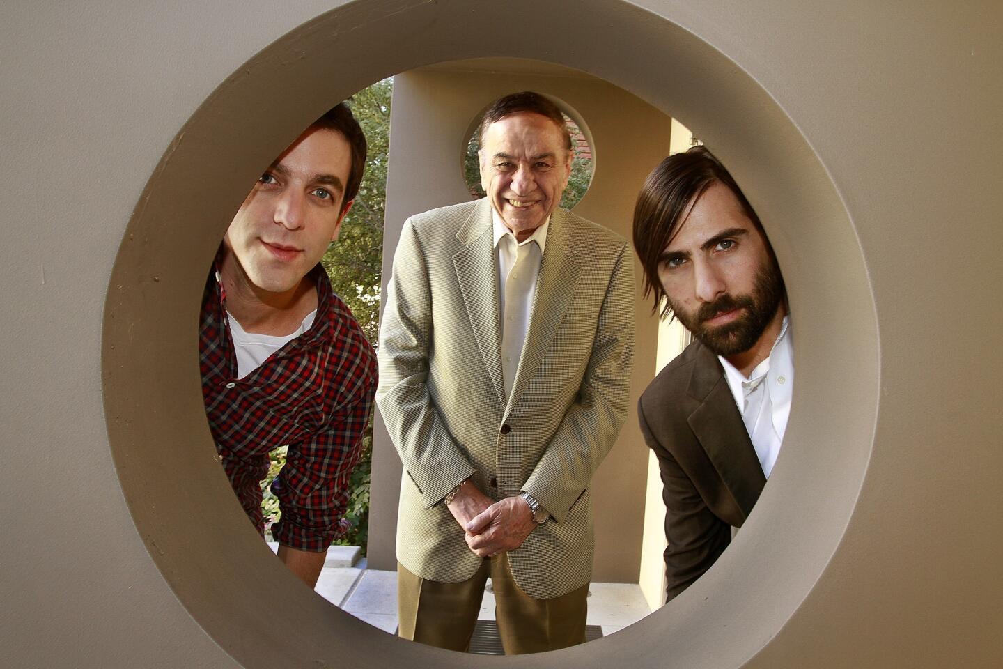
Was that Richard Sherman’s idea about the bright Mary Poppins red sweater for his character (played by Jason Schwartzman)?
That was my idea. I thought, “Wouldn’t it be fun to have a bright red color in the same scene that Travers lets the others know that she doesn’t like the color red and that it’s banned from the film?” Richard Sherman’s character just seemed appropriate. You know there was a great thing that happened at the end of filming in Los Angeles after the shooting of “Let’s Go Fly a Kite,” where Richard sat at the piano and played all the Mary Poppins songs and the whole cast and crew sang along — it was fantastic. My assistant was out, and I called her and said, “Quick, get back here. You’re missing something historic.”
More to Read
Only good movies
Get the Indie Focus newsletter, Mark Olsen's weekly guide to the world of cinema.
You may occasionally receive promotional content from the Los Angeles Times.
