Ugly carpets and green marble: The design of the Los Angeles Times buildings changed along with the city, though not always gracefully
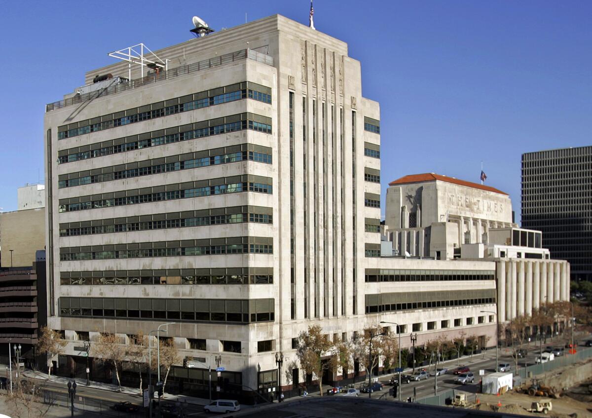
After nearly a century, The Times is moving out of its storied complex in downtown Los Angeles for sleek new digs in El Segundo. When the last of its journalists depart Friday, they will leave behind a brick-and-mortar — or, more accurately, a limestone-and-marble — record of journalism, of this city and of the expansive ambitions of several generations of the Chandler family, including the still-beloved Otis Chandler, who transformed the family’s local political cudgel into the most important journalistic institution west of the Mississippi.
The paper’s move coincides with the L.A. Cultural Heritage Commission’s decision earlier this month to accept an application to consider city monument status for some of The Times’ structures. The Onni Group, the Canadian developer that has owned The Times buildings since 2016, has proposed tearing down a parking structure and the old Times Mirror headquarters, designed by the firm of William Pereira in the 1970s, to make way for a pair of apartment towers. The preservation effort, led by historian and preservationist Richard Schave, could put the brakes on any demolition. (The commission is expected to hear the case Thursday.)
For the record:
1:50 p.m. July 25, 2018CORRECTION: This article reports that The Times’ building complex covers a 16-acre city block. It is only 3.6 acres.
RELATED: Should the old Times Mirror complex become a historic monument? »
“In these buildings,” says Schave, “you have Harry Chandler and his drive for industrial development in prewar Los Angeles. You have Norman Chandler, trying to anticipate what Southern California would be in the postwar years … And in the Pereira edition, you have Otis Chandler, who takes the paper he inherits from his family, this incredibly conservative, narrow-minded paper, and he starts to reflect what Los Angeles really is: a multinational city that requires time and attention.”
“Spring Street” has long been the shorthand for The Times’ location. But the complex is actually a jumble of five conjoined buildings that cover a 16-acre city block between 1st and 2nd streets and Broadway and Spring — what was once the site of a corral for the 1st U.S. Army Camel Corps.
Disregarding the funk of old paper, spilled coffee and perpetual anxiety, a stroll through the labyrinthine warren of buildings is like entering an architectural time machine into several decades of 20th century Los Angeles.
RELATED: 15 films and TV series that filmed at the Los Angeles Times building »
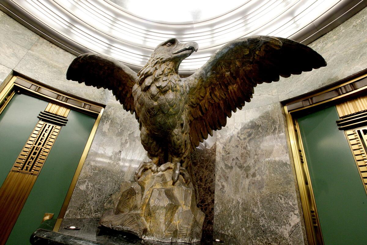
Enter The Times via the main granite doorway on 1st Street and it’s 1935. There, in a soaring Streamline Moderne structure designed by Gordon B. Kaufmann, you will be greeted by visions of green suede marble, bronze accents, a series of 10-foot tall Hugo Ballin murals, with their optimistic depictions of California and newspaper history, and a massive aluminum globe, 5½ feet in diameter, that is capped by a graceful bronze of the Roman god Mercury, the fleet-footed messenger.
Continue to the newsroom on the third floor and you will find yourself in 2012 — greeted by a gray ocean of contemporary corporate modernism that is a tour-de-force of homely: gray cubicles, gray carpet, gray piles of newspapers.
Proceed south along an infinite corridor of gray linoleum and white walls and you’ll land in the old Mirror Building. Designed by Rowland Crawford and completed in 1948, the 10-story tower rises from the rear of the Times complex at Spring and 2nd streets. Echoes of Streamline Moderne elements decorate its front facade, but its flank is all boxy International Style — an architectural mullet: party in the front, business on the side.
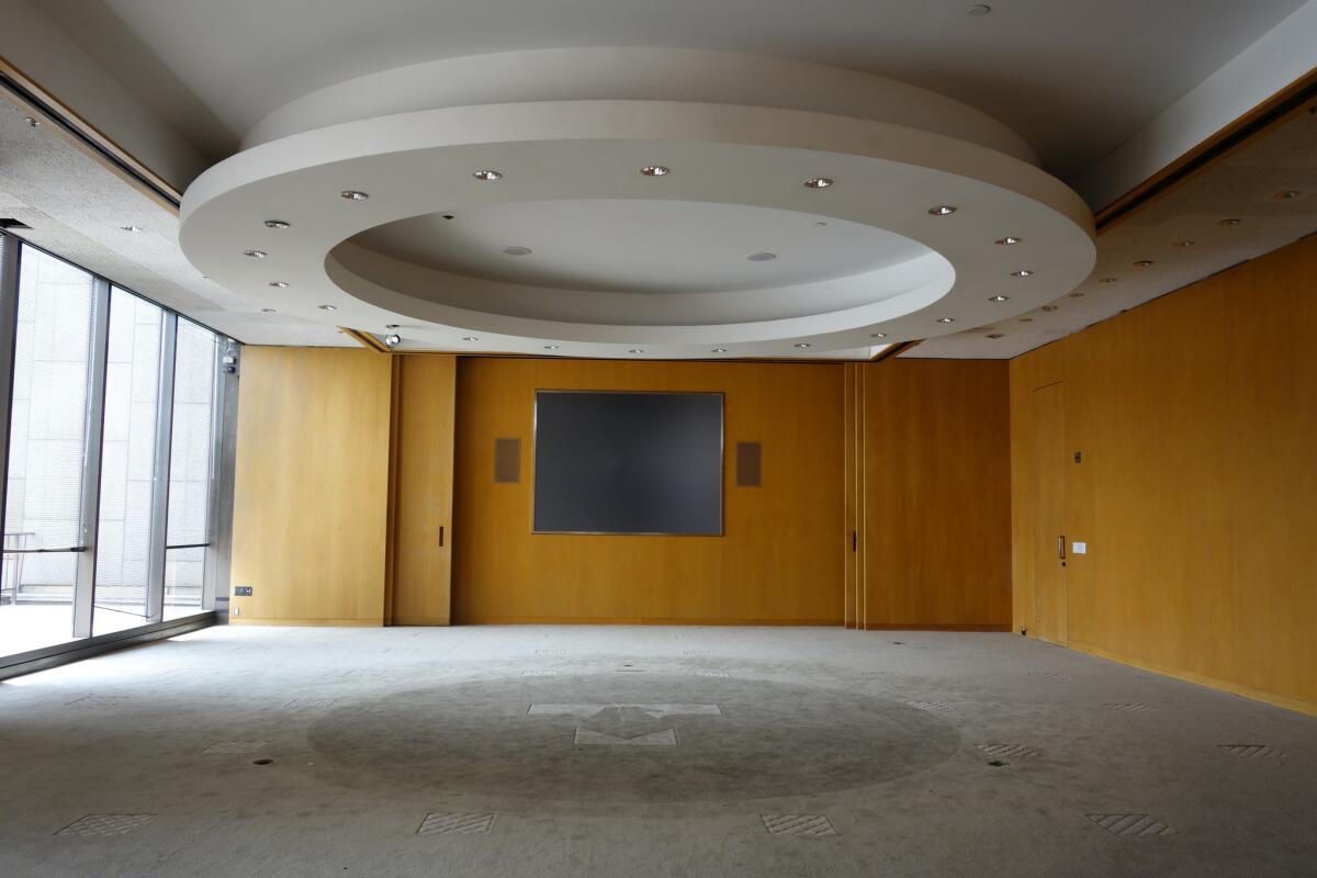
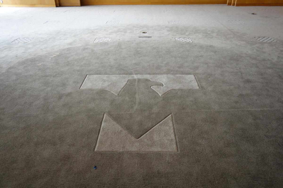
Circle around the block, to the corner of 1st Street and Broadway, and you’ll arrive at the glass-and-granite headquarters of the old Times Mirror Co., once The Times’ parent company. Completed in 1973, the Pereira building contains a glass atrium, oodles of wood paneling and decorative flourishes such as starburst chandeliers and polished aluminum in the ladies’ lounges. It’s a wondrous time capsule of the Late Modern era — down to the board room with the Times Mirror logo etched into the deep-pile carpet.
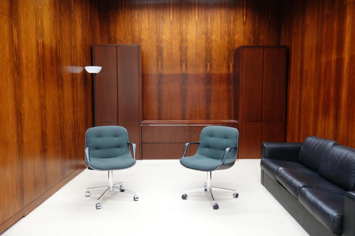
That’s if you can get in to see it. Onni denied requests for access to the building for the purposes of an architectural story. Thankfully, Onni doesn’t appear to have the Escher-esque array of stairwells in the complex adequately mapped, because I was able to slip into Times Mirror and spent an afternoon exploring the wood-paneled boardrooms, postmodern dining rooms and the various glass-walled power suites once decorated with sleek Wassily chairs until I was discovered by Onni’s chief of security, who escorted me out of the building.
You have these funny layers poking through — of, ‘This is what we thought the office of the future would look like in 1945.’
— Christopher Hawthorne, former Times architecture critic
Over the decades, a century’s worth of unsympathetic remodels and retrofits have turned the structures, in particular the Kaufmann building, into disjointed mazes. They have also resulted in a building that gives short shrift to its grandest spaces. Most employees, and most visitors to the Times, for example, access the complex through the entrance to the Mirror Building, at the corner of 2nd and Spring, which is closest to the employee parking lot.
Where once you arrived at The Times through the inspiring 1930s Globe Lobby, now you enter through what is essentially a back door.
“The Globe Lobby, it was no longer the entry to the paper, so most people never saw it,” says Nicolai Ouroussoff, who was The Times architecture critic from 1996 to 2004. “The most beautiful things about the building were shoved into a corner … You could tell that people hadn’t thought about the architecture or how to organize the space for its best use.”
The retrofits have also left the complex with an array of bizarre vestigial spaces.
A printing plant once occupied the low-slung, four-story stretch of the Kaufmann structure. In the 1980s, when printing operations moved to a bigger, more modern space near the 10 Freeway, the area was converted into newsroom space. But it wasn’t done gracefully.
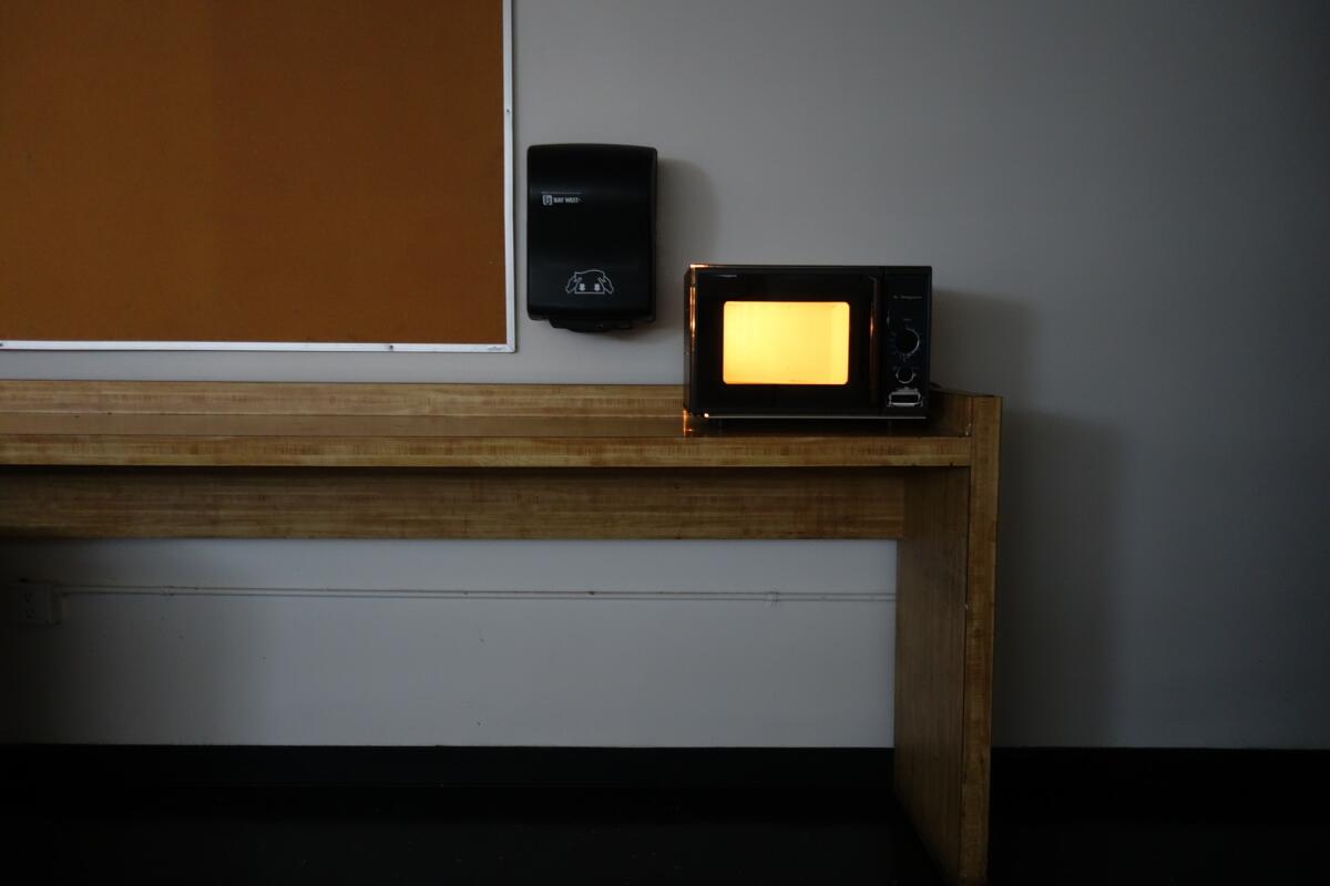
In several places, the floor plates of the Kaufmann building don’t quite line up with the ones in the Mirror Building, which translates to awkward inclines in unlikely places. In other locations, the architecture seems like a plot device from “Being John Malkovich.” Located between the third and fourth floors, in the heart of the building, is a dark and diminutive employee lounge that can only be accessed via a pair of narrow staircases: one that leads up from three and another that descends from four. It contains a sliver of grimy window that offers views of a pile of rooftop ventilation equipment.
This room is likely a holdover from the building’s printing plant days — perhaps an office, or a lounge, situated just above the linotype machines. Currently, it contains a few chairs and a microwave that always seems to be on for no reason.
“All of the renovations and updates were piecemeal over the years, and so you never had one new design aesthetic completely replace another,” says Christopher Hawthorne, who was the paper’s architecture critic for 14 years until this past spring, and who now serves as chief design officer for Mayor Eric Garcetti. “So you have these funny layers poking through — of, ‘This is what we thought the office of the future would look like in 1945.’ ”
And then there’s the lopsided nature of the design.
The Times, over the decades, has spent millions on black granite, Indiana limestone and sparkling mountains of bronze (not to mention a roomful of Picassos) for the public and executive areas of the complex. These give the building, at least in some areas, a sense of solidity.
“It says something about the ways newspapers saw themselves,” says Hawthorne. “They were fixtures that had weight and presence.”
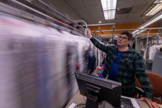
The newsroom, however, at least according to current and past employees, has never felt modern.
In reporting this story, I have seen and heard accounts of red rubberized floor tiles, green carpet with lilac stripes and newsrooms outfitted in mismatched shades of industrial beige. This design un-consciousness appears to go back to The Times’ earliest days. In an essay that Kaufmann wrote for the paper in 1934, he devotes ample word count to the building’s engineering and other design marvels.
Of the newsroom, he says only: “The interior of the building is an architectural expression of utilitarian purposes and as such presumably can be considered by that very much overworked term ‘functional.’ ”
Photos taken over the years reveal newsrooms with bare walls, cluttered desks and a general inattention to anything resembling a design concept.
“It’s how newspapers see themselves as not having pretentions towards being fancy people,” says Hawthorne. “And that’s reflected in the architecture. The face that the building showed the world is very different from the face they showed their own employees.”
In this, The Times is not alone. Newsrooms have a reputation for being rumpled and unkempt — something comedian Seth Meyers lampooned recently in a video spoof titled “Newspaper Movie,” which was rife with gray walls and grim drop ceilings. Until fairly recently, newsroom architecture was the design equivalent of a middle-aged guy wearing a short sleeve shirt and a tie — which for much of the 20th century was exactly who inhabited newsrooms.
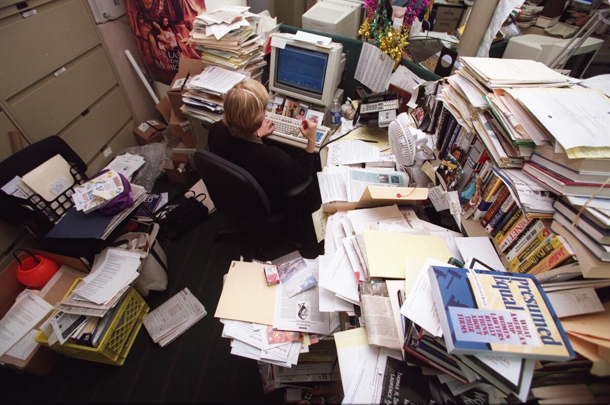
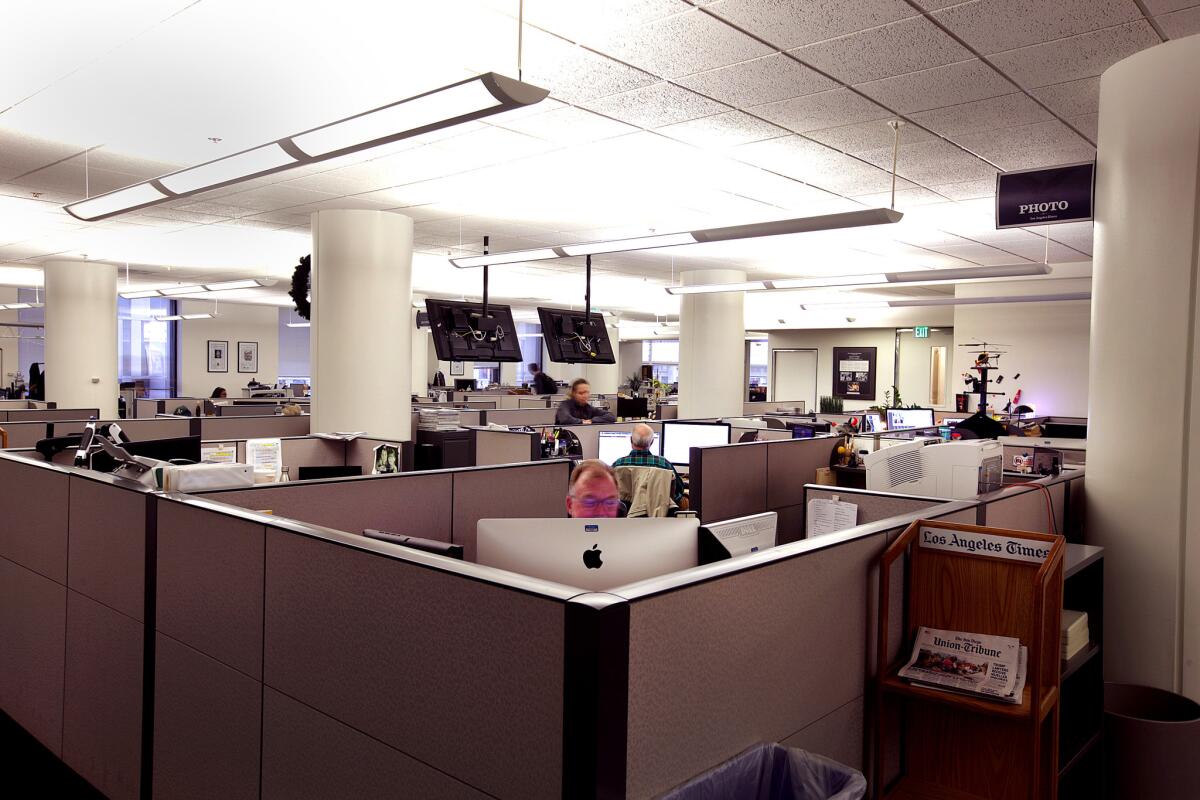
Newsroom architecture was the design equivalent of a middle-aged guy wearing a short sleeve shirt and a tie.
— Carolina A. Miranda
On a warm Sunday afternoon, I catch Darrell Kunitomi packing up Times ephemera for the journey to El Segundo: piles of type-written correspondence and a blow-up of a poster insert from 1897 depicting a cartoonish caballero.
Kunitomi, who works as a communications representative for the company, has been giving tours of the building for 35 years and knows the complex and its history inside and out. (This includes his own piece of history, when he ran into Richard Nixon in the Globe Lobby.)
He leads me to a stairwell on the northern side of the second floor and opens the door. There, we stand on the remnants of a steel plate that once connected the stairwell to a catwalk that hovered over the printing presses.
“You still kind of get the smell of ink in this stairwell,” he remarks nostalgically. “It’s that icky petroleum smell.”
We breathe it in.
That’s something that we are architecturally leaving behind — our connection to the industrial roots of newspapers.
— Ben Welsh, editor, Times data desk
Kunitomi isn’t the only Times employee obsessed with the building’s unusual corners.
Ben Welsh, editor of The Times’ data desk, has worked at the paper for more than a decade — first in the Pereira building and now in the Kaufmann — and he is a devoted explorer of the buildings.
By moving from the historic downtown complex to a renovated 1960 structure in El Segundo once employed by defense contractors, he says that The Times will lose a part of itself.
“There was a power plant down there,” he says. “It was a factory. That’s something that we are architecturally leaving behind — our connection to the industrial roots of newspapers.”
Plus, there’s the physical connection to a site where so much Times history took place.
“I actually am one of the rare fans of the Pereira extension,” he says, laughing. “I get that the exterior is not the most beautiful thing. And some of the offices on the third and fourth floor are pretty bad. They get no light … But the atrium is beautiful, and it’s a rare place you don’t get to go every day.”
And it’s in the Pereira, he adds, “where you can really feel the ghosts of the Chandlers — particularly Dorothy Chandler. You really see her choices there.”
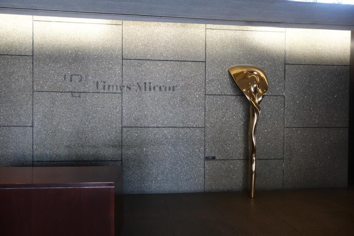
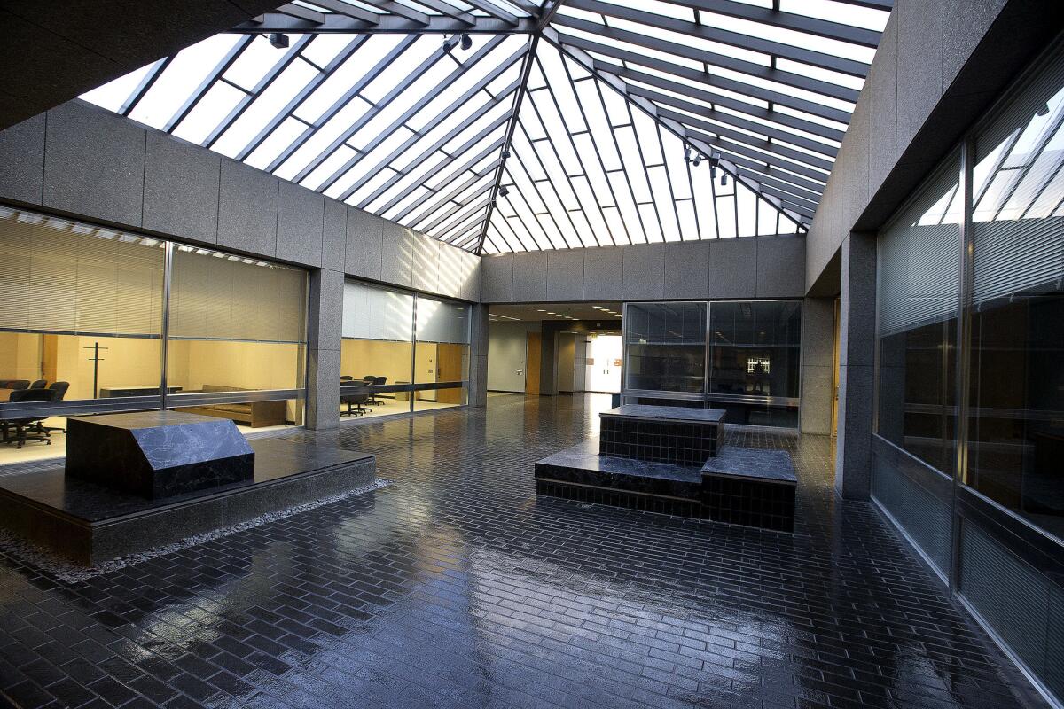
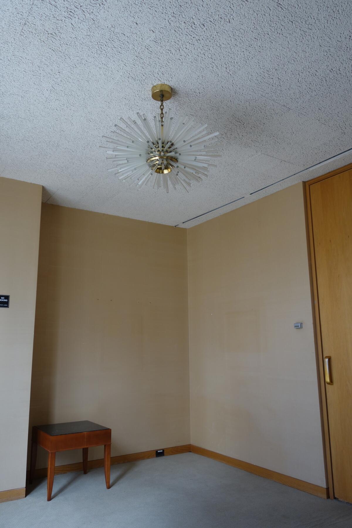
As Schave’s petition for city monument status makes its way through the Cultural Heritage Commission, it will provide an opportunity for Angelenos to debate what The Times and its architecture mean to the city.
Hawthorne says that is something he is watching closely in his new post as design officer.
“In L.A., we tend to be eager to support a tabula rasa solution when something looks out of date or unworkable,” he says. “I want to think more about how old and new can coexist.”
“It’s an imperfect collection of buildings,” he says. “But it’s a good test case. What does it mean to have a building that was designed as a newspaper? That says ‘The Times’ on it? That has a lobby that is all about newspapers? What does it mean to have that turned into a mixed-use building?”
As we prepared to leave, my colleagues took on the mantra that The Times is its people, not the building.
That may be the case. But the building contains our residue: the nicotine, the coffee stains and the long nights on deadline chasing fragments of truth. Certainly, some of that has to be worth saving.
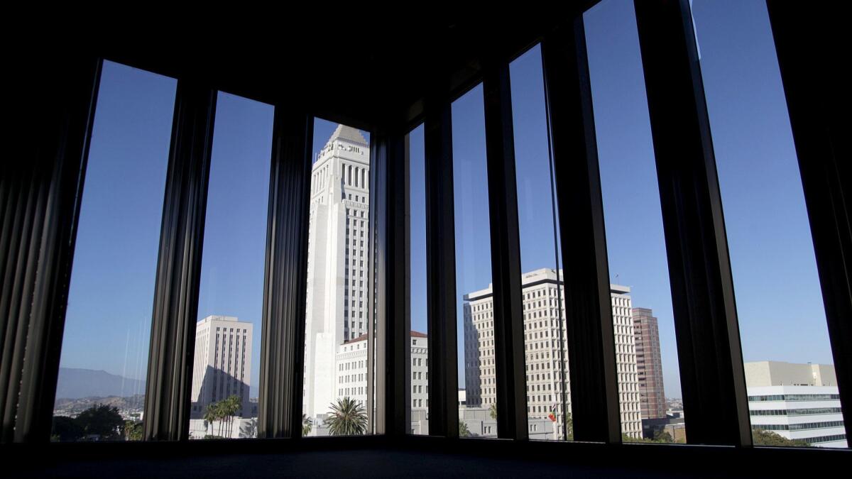
Sign up for our weekly Essential Arts & Culture newsletter »
[email protected] | Twitter: @cmonstah
More to Read
The biggest entertainment stories
Get our big stories about Hollywood, film, television, music, arts, culture and more right in your inbox as soon as they publish.
You may occasionally receive promotional content from the Los Angeles Times.


