Review: Downtown L.A.’s long-delayed federal courthouse is a polished work of civic architecture
Even in the midst of a construction boom, with cranes crowding the skyline and investment dollars pouring in from around the world, what remains perhaps most striking about the landscape of downtown Los Angeles is the sheer amount of emptiness. A remarkable number of huge parcels in seemingly prime locations, many the remnants of postwar urban-renewal campaigns, hold only dirt or parked cars.
The piece of land between Hill Street and Broadway, across the street from The Times, has been among the most conspicuous of these vacant mega-blocks since a state office building there was demolished in 2007. Though an important urban linchpin downtown, a site with some allegiance to both Bunker Hill and the Civic Center, it languished as plans for a federal courthouse were knocked off track by funding disputes in Congress and then a change of architects. I remember watching a family of ducks splash in one of the giant puddles that collected there during one of L.A.’s last rainy winters.
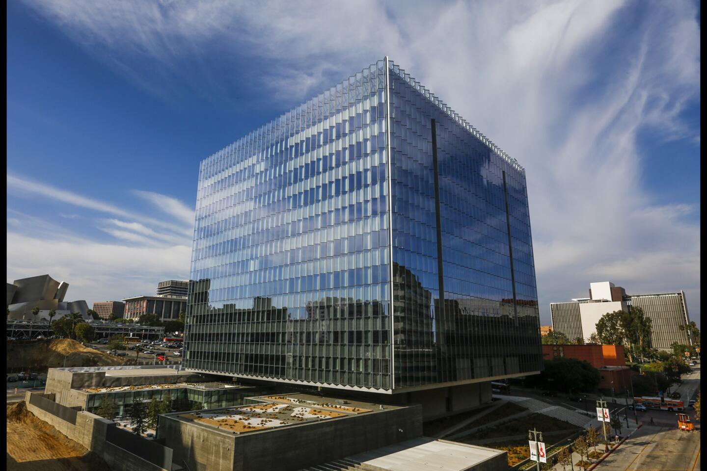
Now that the building is finally complete, with judges moving in this month, the delay is somewhat easier to overlook. The $350-million, 633,000-square-foot courthouse, designed by Skidmore, Owings & Merrill, is an unusually polished work of civic architecture — especially by the standards of Los Angeles, where well-wrought public buildings have been comparatively rare in recent decades.
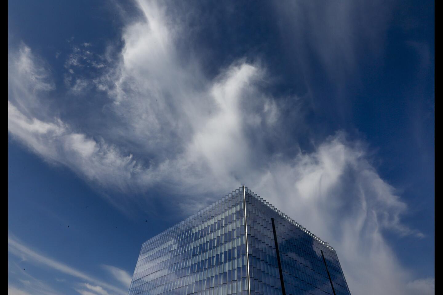
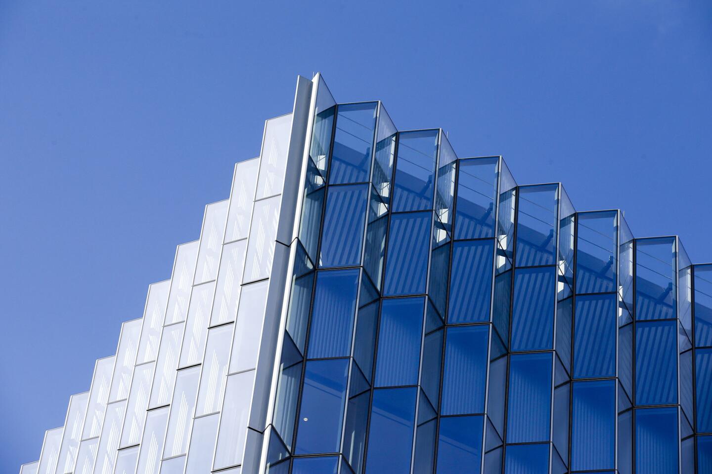
Ten stories high, with broad shoulders and careful posture, it takes the form of a cube sheathed in walls of glass. As architect Craig Hartman (who led the SOM design team alongside Michael Mann, Paul Danna and Jose Palacios) told me during a tour a couple of weeks ago, the symbolism of the cube is meant to be impossible to miss, a representation of solidity, constancy and the rule of law. The largely unadorned materials — concrete and glass on the exterior, terrazzo and white oak inside — reinforce the same message.
If the design’s interest in symbols ended there, the courthouse (built to replace a 1938 facility on North Spring Street) might be little more than a trite expression of familiar virtues. Luckily the architects have managed to explore a very different set of qualities — including flexibility and even deference — in framing the building’s relationship with its urban context and its sloping site.
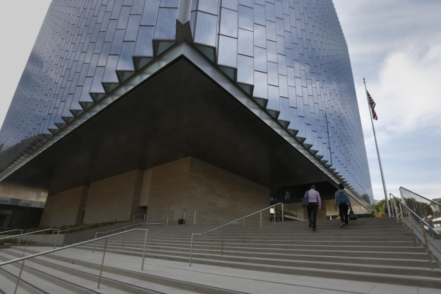
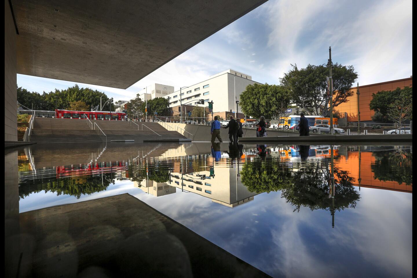
Rather than coming down all the way to the sidewalk, the outer edges of the cube are lifted one full floor above it. This gesture gives the impression that the building is floating above ground level — and that the hillside itself has been allowed to flow across its base, just below the outer facade.
It’s also a move that turns the building’s detachment from the city around it from a liability into a surprising asset. In the years since the attacks on the Oklahoma City federal building (1995) and the World Trade Center (1993 and 2001), courthouses and other government buildings have had to follow strict setback requirements that pull them 50 or even 75 feet back from the outer edges of their sites. This almost always means that they feel anti-urban, standing aloof from their surroundings.
The downtown courthouse, like the Los Angeles Police Department headquarters across the street from The Times in the other direction, is no exception. It shrinks back from the sidewalk on three sides. (The fourth edge, along 2nd Street, contains a strip of land earmarked for a federal office tower.) Polished metal bollards embedded along the sidewalk in front of the courthouse add another protective layer.
The decision to lift the edges of the cube off the ground doesn’t fight this sense of retreat but — in a powerfully counterintuitive gesture — extends, underscores and ultimately wrings some architectural strength from it. There’s no drama in a building that pulls back from the sidewalk. But there’s plenty in one that seems to float in mid-air.
SIGN UP for the free Essential Arts & Culture newsletter »
I don’t want to oversell the architectural gymnastics here. This isn’t some L.A. version of the Rainier Tower that Minoru Yamasaki designed on 5th Avenue in downtown Seattle in 1977, a building that stands on its exceptionally narrow base like a pencil balanced on its tip. Nor does the SOM design try to match the extroversion or exuberance of Walt Disney Concert Hall.
This is a building that wants to look respectable and rational but not staid, one that is fairly conventional on the horizontal plane and takes a significant if measured chance on the vertical one. Still, it’s a chance that pays off.
The other gesture of clever accommodation in SOM’s design is a response to geography instead of topography, the map instead of the slope. It comes in the triangular glass forms that make up the building’s unusual serrated skin.
As anybody who has looked closely at a map of downtown Los Angeles knows, the Civic Center is not laid out on a cardinal grid but is skewed nearly 40 degrees, a vestige of the city’s Spanish origins. Maximizing the use of daylight inside a building, on the other hand, means aligning it on a precise north-south axis.
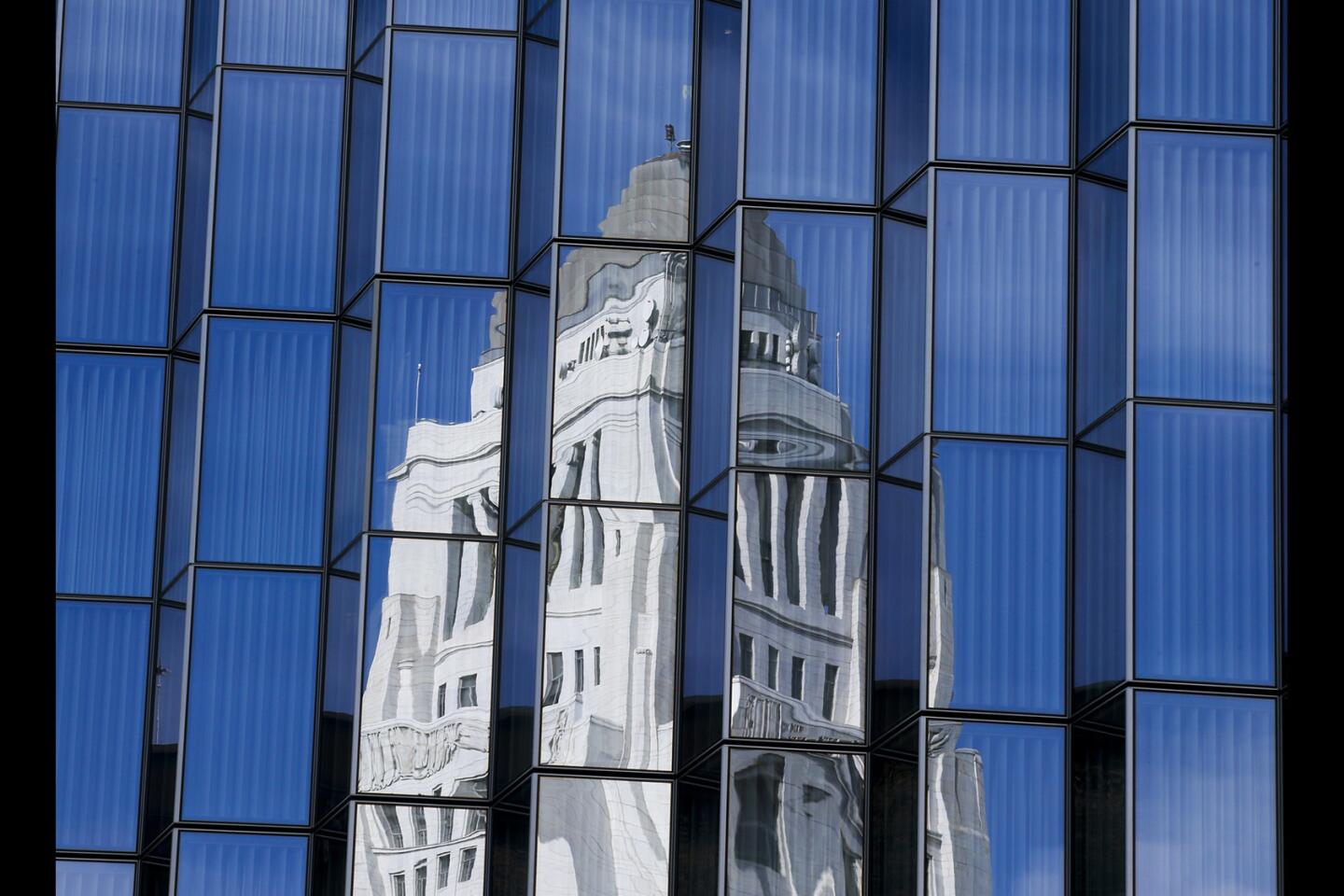
The architects use the courthouse facade to reconcile those competing grids, allowing the building to rise parallel to First Street while also taking full advantage of southern exposure to help light courtrooms and public spaces inside the building. On the sections that get direct sun, the peaked floor-to-ceiling windows are opaque on one side, blocking the most intense light, and transparent on the other, opening up views of surrounding buildings, including Disney Hall and City Hall.
The roof is covered in a solar array expected to generate more than half a million kilowatt hours of electricity on an annual basis, or roughly the amount of energy required to power 50 homes for a year. A storm water cistern big enough to hold 105,000 gallons is hidden beneath the building.
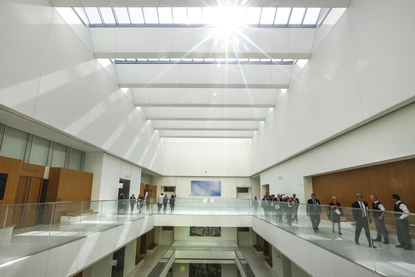
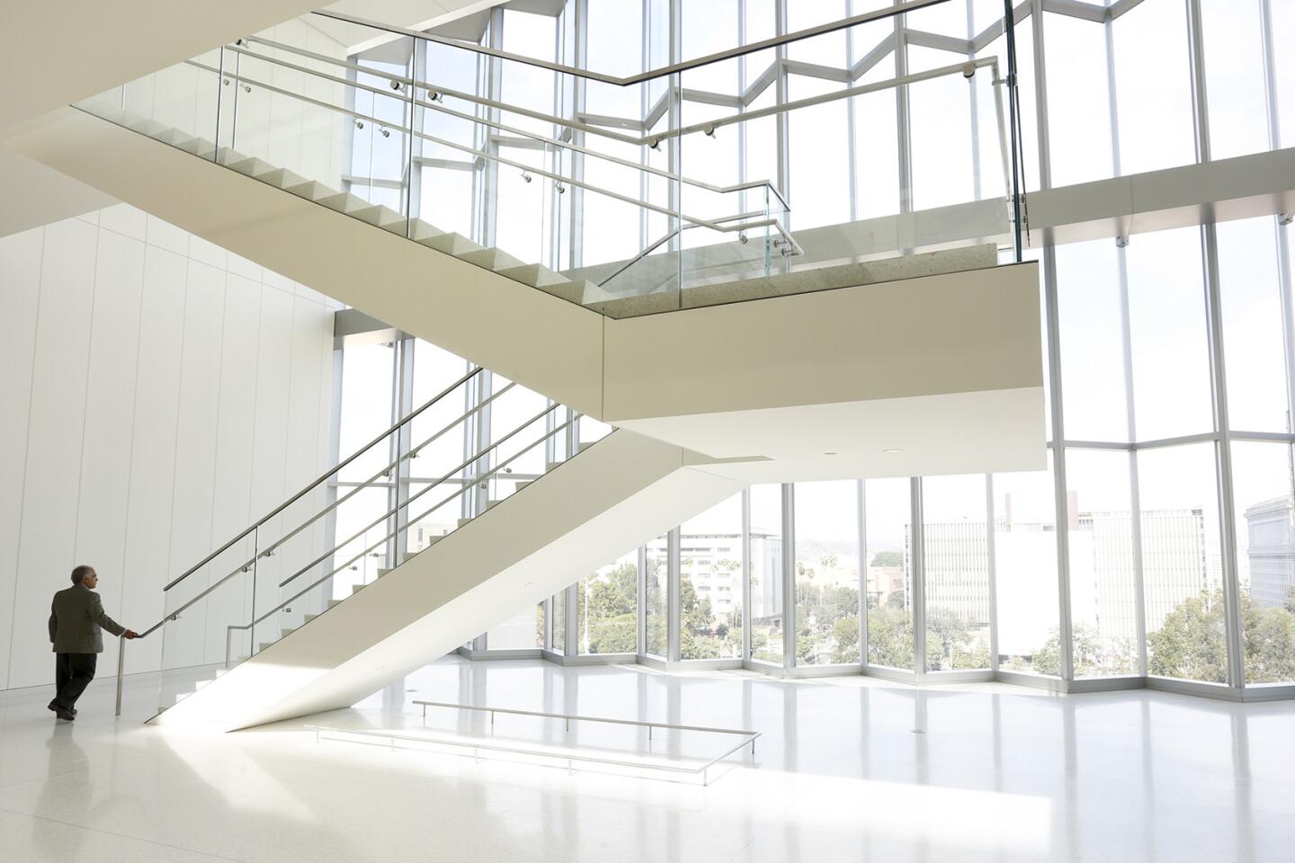
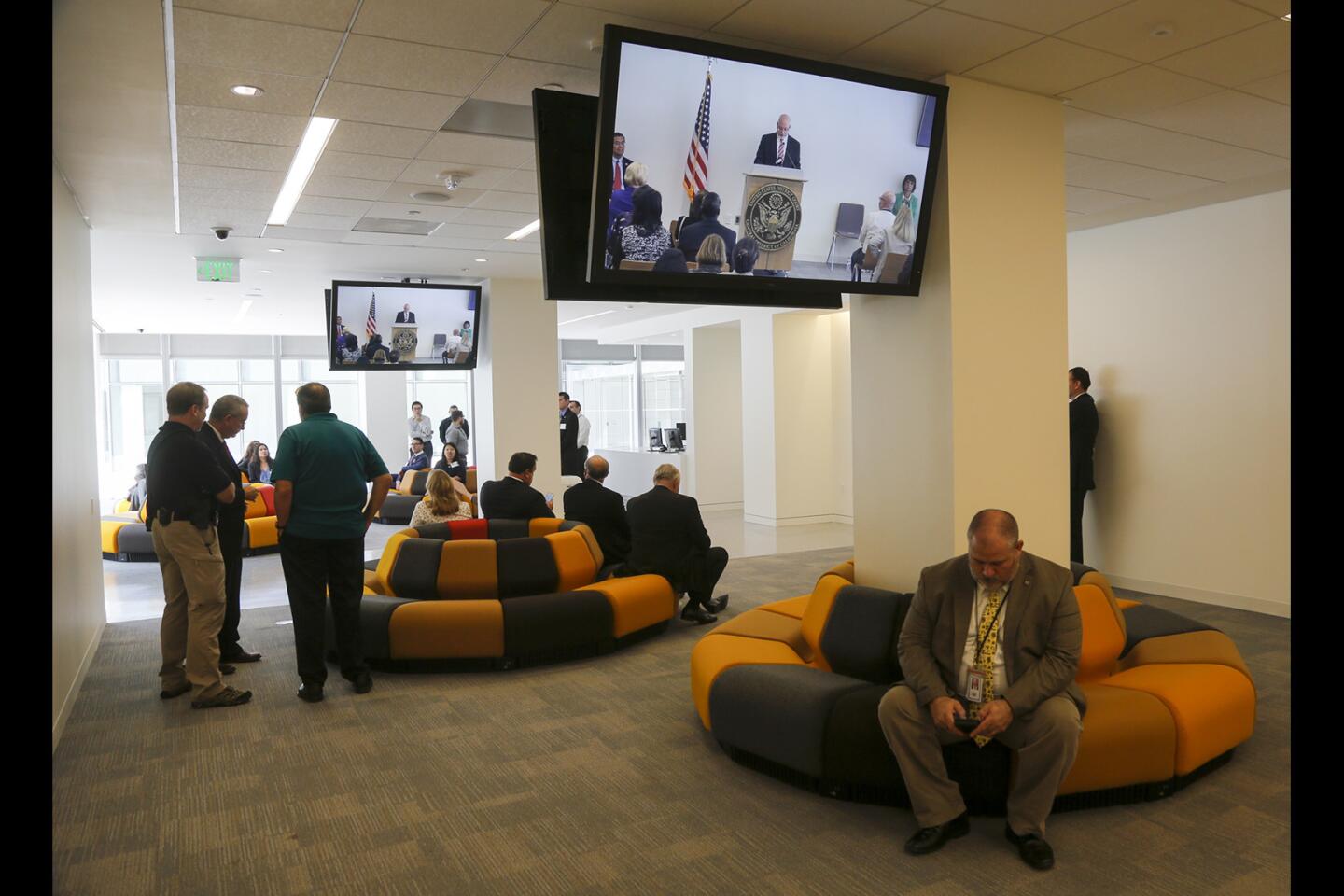
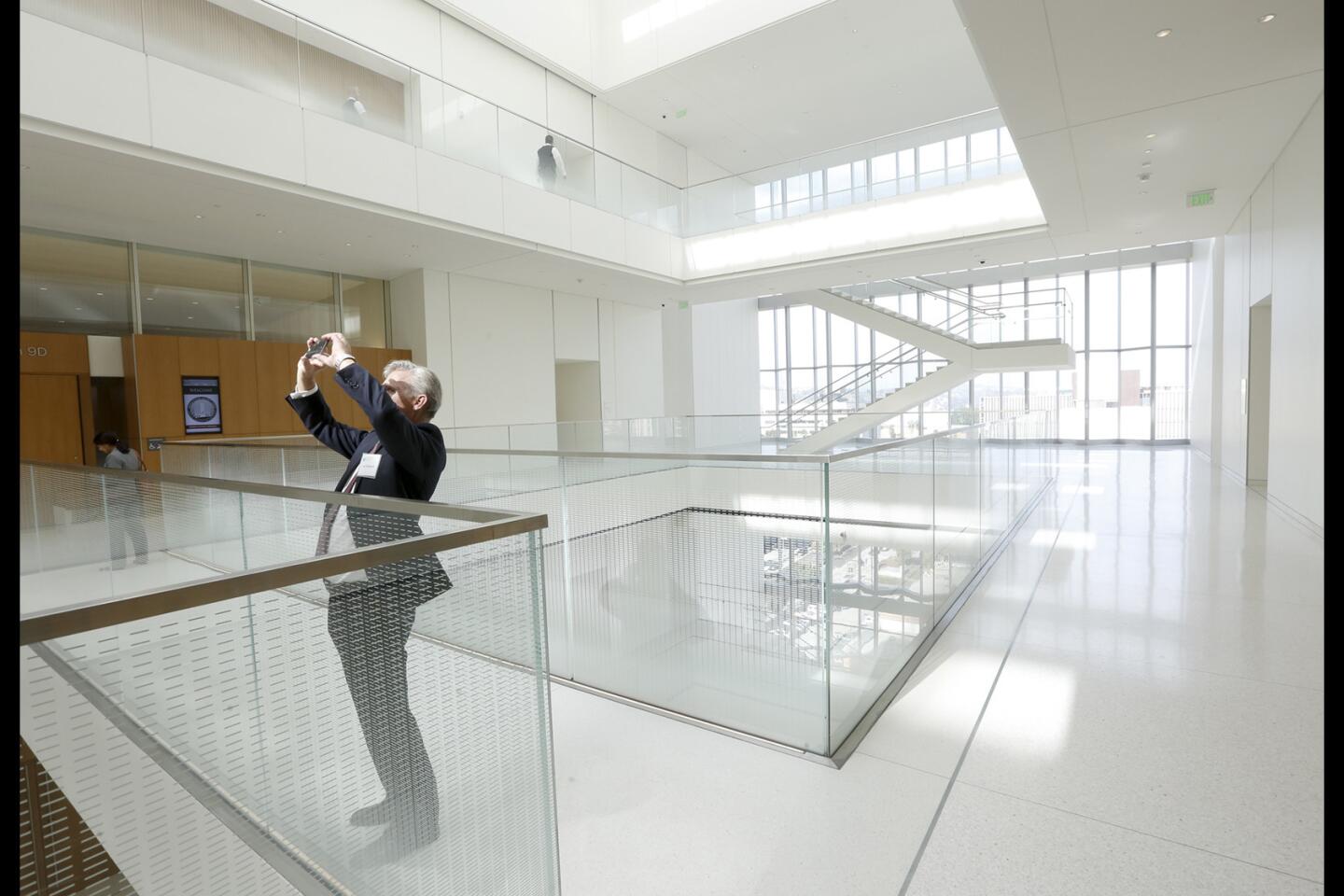
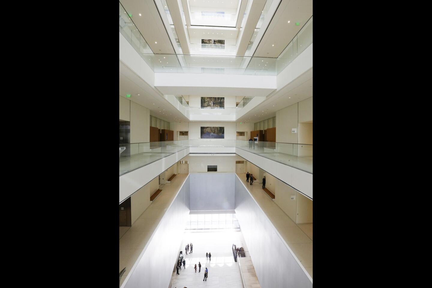
Inside, the courthouse restates the themes expressed on the exterior in a range of ways. Like the facade, the brightly sunlit interior is rational and symmetrical from side to side and more dramatic from bottom to top.
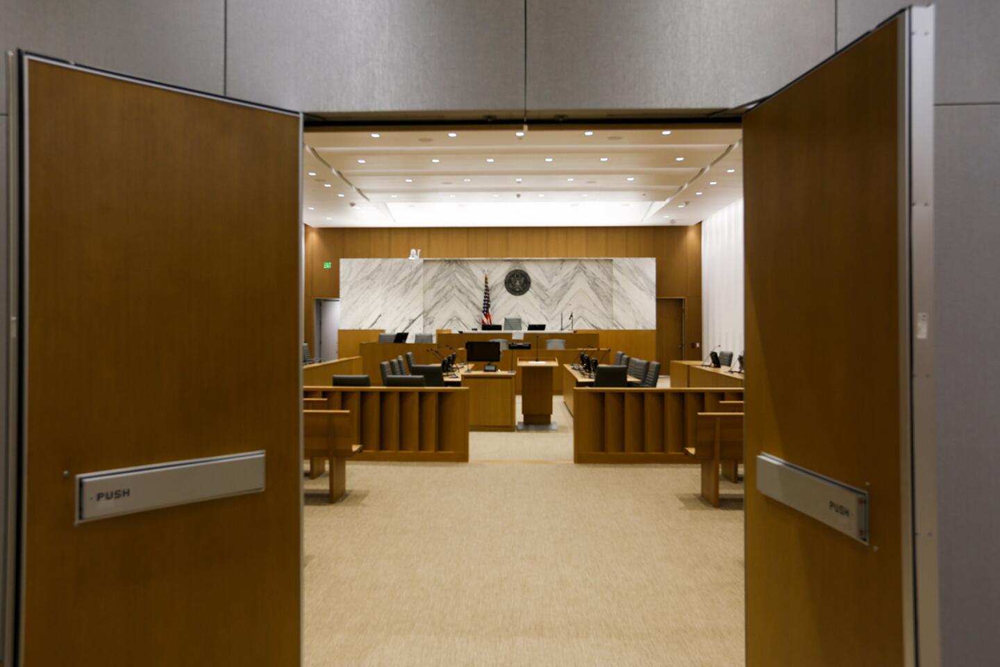
The building’s 24 courtrooms fill two stacks separated by an atrium rising 10 floors through the center of the building. This open space is crossed by sky bridges on each level.
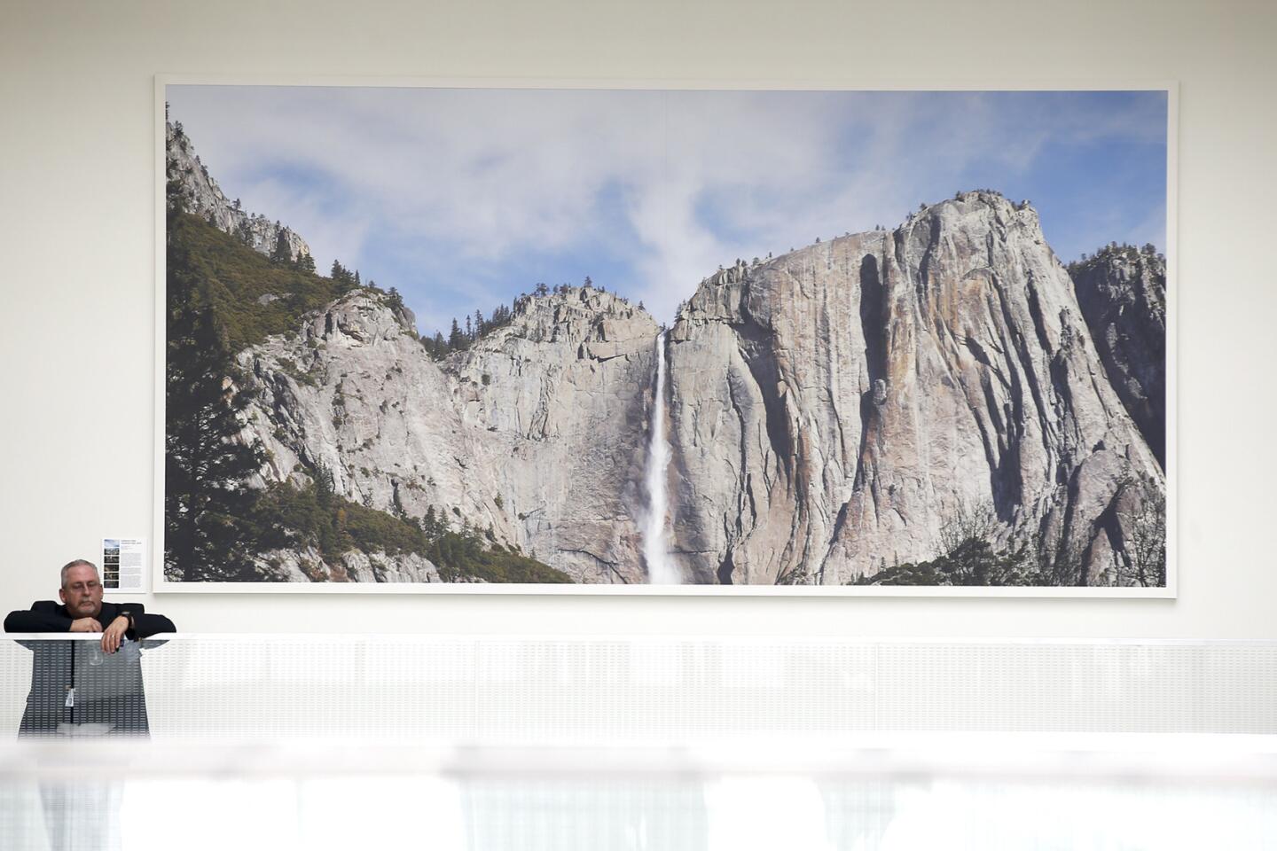
The courtrooms are outfitted in marble and white oak, and all but one are filled with natural light from two directions: from a wall of windows behind the bench and clerestory windows on the opposite side. The north side of the atrium features a superb series of large-scale photographs, “Yosemite Falls” by Catherine Opie.
Like all new federal courthouses, the construction of this one was overseen by the General Services Administration. In 1994, the GSA launched an initiative called the Design Excellence Program in an effort to lift the architectural quality of new federal buildings across the country.
In the years since it has awarded commissions to some of architecture’s most accomplished firms, including Richard Meier & Partners (courthouses in San Diego, Long Island and Phoenix), Morphosis (Eugene, Ore.) and Thomas Phifer & Partners (Salt Lake City).
The downtown L.A. courthouse, as part of the program, went initially to Perkins + Will, which proposed a 17-story tower with a curving, sail-like facade along Broadway. Funding fell into limbo after the project was attacked as wasteful by members of Congress. After (most of) the money came back, the GSA changed course and gave the job to SOM and Clark Construction Group, this time following the design-build method, which aims to be both faster and less expensive than typical construction.
The Design Excellence Program has a generally strong track record. If the buildings have a common flaw it’s a certain tone-deafness about climate and context, a tendency to drop cleaned-lined modernist buildings onto their sites as if they’ve been produced in a factory and parachuted in. The worst offender in this regard is probably Meier’s courthouse in Phoenix, which features a huge glass atrium that makes little sense in the Arizona heat.
At first glance, the SOM courthouse looks similarly standoffish; its cubic form seems to owe more to some Euclidean ideal of architectural symmetry than to a careful study of its surroundings.
That reading of the building falls apart pretty quickly once you make an effort to understand its design on its own terms. I find its Broadway edge, dominated by a giant parking entrance, disappointing at sidewalk level. But on the whole this is a work of architecture surprisingly sensitive to — and keen to engage — the city around it.
Twitter: @HawthorneLAT
ALSO
Cubs vs. Dodgers and the lost history of L.A.’s own Wrigley Field
The design for the Arts District’s first skyscraper
Ride the U.S. Bank Tower’s glass Skyslide with 70 floors of nothingness below you
Design team led by Mia Lehrer picked for new downtown L.A. park
More to Read
The biggest entertainment stories
Get our big stories about Hollywood, film, television, music, arts, culture and more right in your inbox as soon as they publish.
You may occasionally receive promotional content from the Los Angeles Times.
