New UC Davis art museum hints at fresh directions for American architecture
Reporting from DAVIS, Calif. — A small site on the outskirts of this college town near Sacramento, backed up against some train tracks and Interstate 80, is not where you might expect to find a building to boost your faith in the future of American architecture. But UC Davis’ Jan Shrem and Maria Manetti Shrem Museum of Art, which opened to the public last month, is accomplished enough, in its precise and unhurried way, to do just that.
Designed by New York’s Solid Objectives-Idenburg Liu (SO-IL for short), a firm led by the husband-and-wife team of Florian Idenburg and Jing Liu, the $30-million, single-story museum sits a few blocks south of the main Davis campus, next door to the significantly larger Mondavi Center for the Performing Arts.
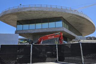
Covering just 30,000 square feet of interior space, a third of that dedicated to galleries, the Manetti Shrem is wrapped in walls of corrugated precast concrete. Its signature element is a white canopy of aluminum beams that emerges from the roof and slopes toward the sidewalk to cover a wide courtyard at the front of the building.
The courtyard will hold performances and installations; digital artworks and films can be shown on sections of the museum’s exterior. On clear days, sunlight passes through the canopy and projects its own dramatic and shifting effects onto the ground and the sides of the building.
Before you even walk inside the museum, in other words, you get a sense that the architects are interested in shaping spaces for public interaction as much as for art. Because this is a teaching museum that includes classrooms and art studios as well as galleries, that elastic and ultimately generous definition of museum architecture is fitting.
SO-IL designed the Manetti Shrem with Karl Backus of the San Francisco office of Bohlin Cywinski Jackson (best known for its work on the Apple stores). But it’s fair to say that its architectural sensibility flows primarily from Idenburg, 42, and Liu, 37, whose work tends to be porous and substantial at the same time, with cubic forms often cloaked or veiled by snug, semi-transparent skins.
The architects, who met while working for the acclaimed Japanese firm SANAA, founded SO-IL in 2008, just as the economy was about to crash and burn. In 2010 they won the annual Young Architects Program competition run by the Museum of Modern Art and PS1 in New York; their design, “Pole Dance,” filled the PS1 courtyard in Queens with sheets of netting held up by 25 skinny, tilting white columns — a fantasia of fishnet communitarianism that the Wall Street Journal called “a serious couple’s fun project.” The pair also designed a small but widely published art gallery in Seoul.
In 2013 (after adding a third partner, Ilias Papageorgiou) they landed their biggest break: beating out the firms WorkAC and Henning Larsen to win a design competition for the Davis museum. The finished building takes its name from its principal donors, one of whom has some experience as an architectural patron. Jan Shrem founded the Clos Pegase winery and in 1987, with post-modernism ascendant, built a neo-Tuscan complex in Calistoga by the architect Michael Graves.
UC Davis has never had a purpose-built art museum, though the accomplished artists who have taught at the university include Robert Arneson, Wayne Thiebaud, William T. Wiley, Ruth Horsting, Roy De Forest and Manuel Neri. Work by those artists and others is included in the opening exhibition, “Out Our Way,” which is on view through March 26.
Among the most encouraging qualities of the design by SO-IL and BCJ is its elusiveness, its ability to shrug off or slip past easy readings. The canopy, with a large opening or oculus in the center, is a case in point: An unusual combination of exuberance and modesty, it’s an architectural gesture that extends the museum’s reach and shrouds the building at the same time.
From the air the canopy’s crosshatched design is an abstraction of the gridded farmland that lies on the far side of the train tracks and freeway. At ground level it draws the museum’s three interior wings — each with a different height — into a loose embrace, one suggesting (in the manner of 1980s projects by Charles Moore or Frank Gehry) a small village as much as a single building.
The key word there is “loose”: This isn’t a forced camaraderie but a series of careful arguments about bringing together making and looking, inside and outside and light and shadow, not to mention giving a single-story museum a surprising amount of vertical personality.
Inside, a lobby with lightly polished concrete floors is lined with a sweeping curve of floor-to-ceiling glass. As you enter, a multipurpose room that can be arranged as an auditorium is off to the left, with classrooms, studios and museum offices straight ahead. To the right are the galleries, which fill rooms of varying sizes and heights and are topped with a ceiling of aluminum mesh, through which mechanical equipment is left visible.
With a couple of exceptions, including an oddly traditional “classroom gallery” with hardwood underfoot, these rooms have the same white walls and concrete floors as the lobby. A small interior courtyard separates the office and gallery wings.
The museum is not a singular or path-breaking work of architecture; its design goals have more to do with manipulating light and shadow and with physical substance — what architects call “materiality” — than any kind of formal novelty. The influence of SANAA’s 2006 Glass Pavilion at the Toledo Museum of Art, a project Idenburg and Liu both worked on, is easy to spot.
Some of the ideas that drive the design turned out to be stronger in concept than execution or were trimmed out for budgetary reasons along the way. (Both fates are common for young architects. For all architects, really.) At ground level the columns holding up the canopy are less graceful than in early versions of the design, which more directly recalled the “Pole Dance” installation. The link between the vertical detailing on the concrete walls and the folds of the white drapery inside is, similarly, easier to see in the original renderings than in the final product.
Though picking the site was not the architects’ responsibility, it’s also disappointing that a museum so interested in welcoming (and even choreographing) foot traffic is separate from the pedestrian heart of the campus. Many visitors are likely to arrive by car, park in the structure next to the museum and drive away as soon as they finish walking through the new building.
Yet taken as a whole the museum offers a range of encouraging signs about the priorities of architecture’s up-and-coming generation. These include a genuine interest in shifting definitions of public space in a digital age and — most important of all — a preference for measured and layered effects over operatic ones.
Over the last couple of decades, many celebrated architects have used the highly mannered facades of their buildings as billboards advertising a set of ideas (often having to do with social or political fragmentation) that the buildings themselves, often generic inside, were rarely interested in pursuing in any depth. The Manetti Shrem suggests that a new approach — more deliberate, tougher to parse, less self-promotional and in the end richer — is finally moving from the edges of the profession toward the center.
Twitter: @HawthorneLAT
ALSO
A vast Louis Kahn retrospective lands at the San Diego Museum of Art
The Crystal Cathedral redesign: Why tasteful updates add up to disappointment
George Lucas’ museum designs for L.A. and S.F.: A first look at competing plans
More to Read
The biggest entertainment stories
Get our big stories about Hollywood, film, television, music, arts, culture and more right in your inbox as soon as they publish.
You may occasionally receive promotional content from the Los Angeles Times.


