Review: The newly opened $4-billion World Trade Center transit hub is overwrought and underwhelming

NEW YORK — It looks like a dove. Or a carcass.
Santiago Calatrava’s World Trade Center transportation hub, whose soaring main hall opened to the public earlier this month, suggests an approach to architectural image-making right on the border between flexible and opportunistic.
God knows there’s more going on here than mere function: At just under $4 billion, or double the original estimate, for a building that serves a small fraction of the travelers who use Grand Central or Pennsylvania Station every day, the transit hub is meant not just to accommodate but nearly consecrate the act of commuting by train.
SIGN UP for the free Gold Standard newsletter >>
Certainly Tuesday’s attacks in Brussels make clear that the transit station remains among the most deeply fraught 21st century building types.
So far the local reaction to the Calatrava design has split along price-value lines, with more than a few writers labeling it a boondoggle and defenders pointing out that future New Yorkers may admire it without thinking about what it cost, just as current ones have no idea what their tax-paying great-great-grandparents spent to put up the Brooklyn Bridge.
The Port Authority of New York and New Jersey, which oversees the World Trade Center site and built the station, has been so chastened by the cost overruns and construction delays that it declined to hold even a modest ribbon-cutting. When a bureaucracy turns down a major opportunity to pat itself on the back, you know things have turned sour. Turned acid, really.

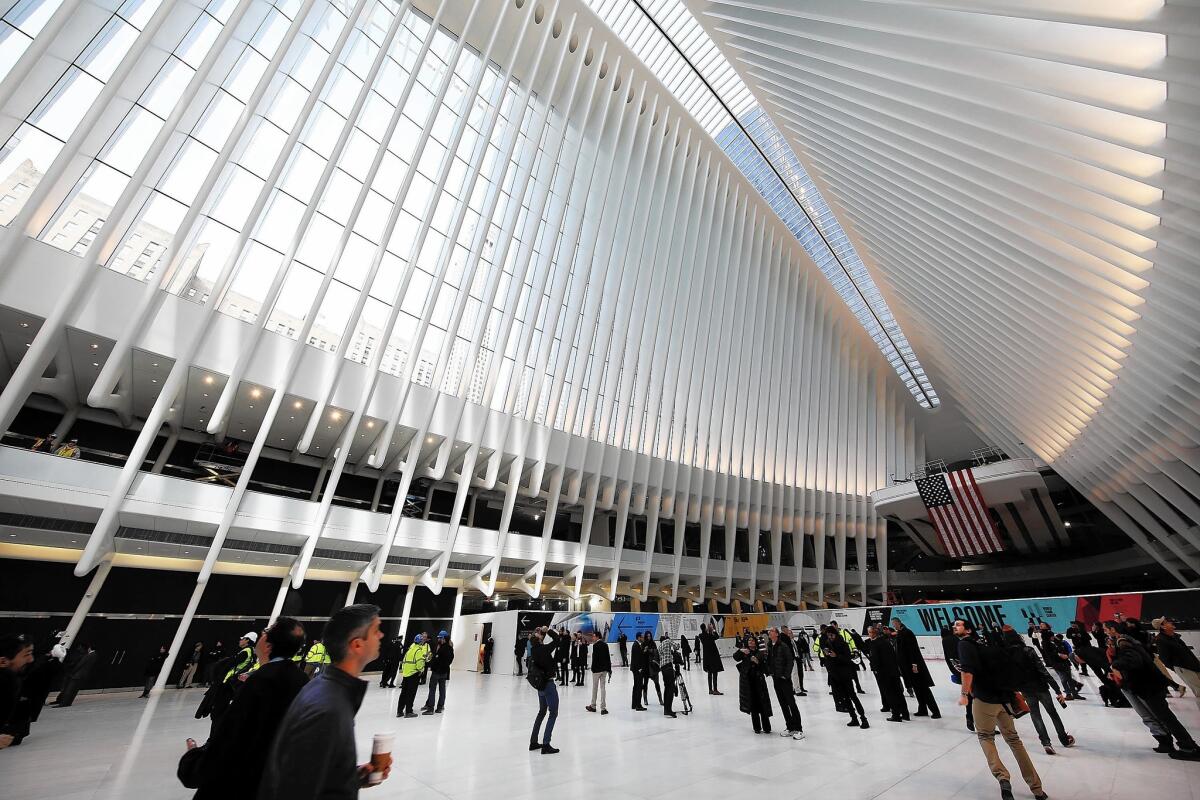
Still, everyone seems to agree that the main hall, which stretches beneath a glass and white-steel roof and which Calatrava calls the Oculus, is beautiful. But I didn’t find it beautiful, at least not in the way that Calatrava’s finest work, fluid and precise, often is. I found it structurally overwrought and emotionally underwhelming, straining for higher meaning, eager to wring some last drops of mournful power from a site that is already crammed with official, semi-official and indirect memorials.
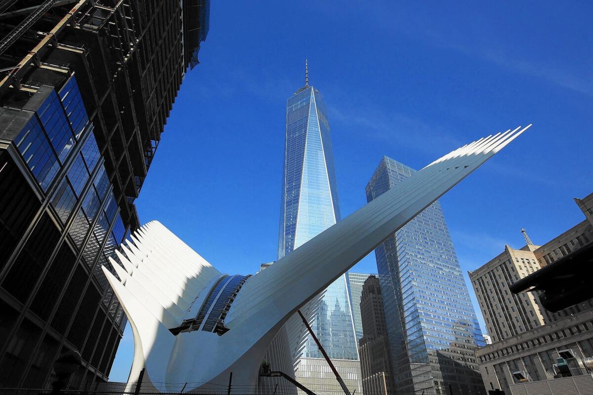
There is no doubt that as you approach the building on foot — especially from the east, in the morning, with the rising sun at your back — the first glimpse of its spreading wings provides a thrill. Even when you notice that those wings have been sliced off on each side in an asymmetrical cut, to make room for an office tower on one side that has already been built and on the other side one that is in the works, the overall effect is pulse-quickening.
Much of that allure fades after you make your way inside the Oculus, which is ringed by shops at ground level and along a mezzanine and lined with a great expanse of white Italian marble. (The shops are due to open later this year.) This is a curious room, with its gargantuan scale and its double-sided symbolism, allowing it from the outside to suggest wings and flight and from the inside bones and death.
It features some familiar Calatrava techniques, in other words, with its symmetrical filigree of repeating white forms set into glass, but draws its real power from an unusual mixture of infrastructural scale and commemorative emotion. The architect, like countless others involved in the rebuilding process before him, saw the remade World Trade Center as a canvas on which to test out some grand ideas about political violence, remembrance and rebirth.
When the Port Authority held a news conference in early 2004 to make Calatrava’s design public, the architect drew a sketch for the assembled reporters of a child releasing a dove. He explained the wings of his station would move, allowing its roof to open dramatically to the sky. To celebrate the groundbreaking the following year, he and his daughter released actual doves.
Over time the number of steel ribs was doubled to armor the station against potential bomb blasts. The wings of the above-ground pavilion grew thicker, coated with fire-retardant material.
The Port Authority decided it would cost too much to make the wings operable. The roof has a narrow skylight that can open, but it’s a far cry from the original drawings.
Many of the interior details remain to be finished. To a large degree the building is a shell of what it will eventually be, at least in practical and retail terms. All the same, it was designed to a marked degree as a shell to begin with — a vast holding pen for sunlight, commuters, shoppers and the full breadth of Calatrava’s vision — which makes the act of reviewing it now seem not just possible but necessary.
When you stand inside the main hall and look up, what strikes you is not the airiness or lightness of the structure, as the exterior view promises, but instead its heaviness.
You are in the belly of the whale, considering its rib cage. The bones are just thick enough to obscure large sections of sky. If you position yourself carefully you can get a view more or less on axis with the thick torso of One World Trade Center, the skyscraper designed by Skidmore, Owings & Merrill and finished in 2014.
Because it took so long to get built, the transit hub is a time-capsule message from the moment, not long after the 2001 attacks, when it dawned on a whole group of architects that the World Trade Center rebuilding process might be a useful springboard for their own ambitions.
It wasn’t, of course: It turned out to be more like a snake pit. Those architectural dreams, as self-serving as many of them were, were quickly battered or swept aside by the plans and timetables of various elected and appointed officials. (Nine different governors, five from New Jersey and four from New York, have had a hand in the rebuilding.) In that sense the fact that the Calatrava hub has opened at all — even in its semi-finished and value-engineered state — has suggested to some the enduring strength of great architecture, of the purity of the quest for aesthetic rather than political glory.
What it really marks is the triumph of architectural disunity at ground zero, which paradoxically ranks among the most aggressively planned patches of real estate in the country. Even as work continues on the transit hub, it is now clear what the rebuilt site will look like. Though there have been some minor victories along the edges, most notably the very fine 7 World Trade Center tower by Skidmore (with James Carpenter) and 4 World Trade by Fumihiko Maki, it’s a deeply dispiriting picture on the whole.
Because every major rebuilding gesture after Daniel Libeskind’s 2003 master plan has undercut or reacted strenuously against the ones that came before, we’re left with a collection of prominent designs — the sunken reflecting pools of Michael Arad’s memorial, the vast and crypt-like underground museum, the stolid One World Trade — that are aggressively mismatched. Each pursues an oversized scale as it jostles for space and attention. Each makes the case that it alone most effectively balances remembrance with resolve.
It’s difficult to say precisely how much of the $4 billion went to the part of the station that emerges above ground in Calatrava’s spiky white crown, as opposed to the platforms and tunnels and links to the subway network that do the infrastructural heavy lifting below.
But it is possible to say what that chunk of the budget paid for: yet another elaborate headstone in the crowded ground zero graveyard, albeit the most delicate and strikingly photogenic of the bunch.
MORE:
Terrorist attacks in Brussels: Full coverage
1 World Trade Center: A high-tech ride symbolizing New York’s resilience
Why does DTLA’s huge new Hauser Wirth & Schimmel art complex underwhelm? It’s a familiar story
‘The Walk’ a dazzling re-creation of daredevil walk between World Trade Center towers
Comic Steve Rannazzisi admits 9/11 lie: ‘A story told by an immature young man’
More to Read
The biggest entertainment stories
Get our big stories about Hollywood, film, television, music, arts, culture and more right in your inbox as soon as they publish.
You may occasionally receive promotional content from the Los Angeles Times.


