The Eli and Edythe Broad Stage
THE NEW Eli and Edythe Broad Stage at Santa Monica College, which will open officially tonight with a program featuring the mezzo-soprano Frederica von Stade, is a happily, even confidently unresolved piece of architecture. Rather than try to smooth over the gaps between its various architectural impulses -- and between its wide-ranging technical and programmatic requirements -- it seems content, for the most part, to leave them on display. It’s not a bad strategy: The design gains some power from its all-over-the-map variety, and in fact it’s in those spaces where it tries to hide its character or engage in a bit of architectural sleight-of-hand that it begins to falter most obviously.
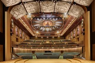
Designed by Santa Monica architect Renzo Zecchetto, the Broad aims for a certain grandness of scale as an object in the cityscape, rising 65 feet at its highest point, but at the same time it is actively humbled by the way it’s set in a sea of parked cars. (It’s the ironclad rule of Southern California civic design -- the car always wins -- though there has been talk of sinking a garage here below ground and laying a park atop it, which is an idea with so much potential that it will probably never happen.) Inside, its impressive 499-seat auditorium -- which will be asked to handle an eclectic range of performances, including spoken word, art song, orchestral programs and dance -- aspires to both the formal intimacy of an 18th century Italian opera house and the high-tech functionality of a college lecture hall.
On Oct. 26, the Baroque orchestra Musica Angelica will take the stage. Two weeks later, on Nov. 9, it’ll be the KCRW political program “Left, Right & Center.” In March, the Los Angeles Ballet is booked for three performances. Audiences will likely love the variety, but the stage itself may get whiplash.
It is on the exterior, though, that the design’s multiple personalities really assert themselves. The building’s most attention-grabbing facade, facing east toward a miniature park by landscape architect Pamela Burton, owes a pretty clear debt to the Argentine Rafael Viñoly and architects like him. A canopy faced in composite-wood panels soars over the entry doors, and above that rises a glass tower. The effect is a bit of formal boldness mixed with buttery, handsome good manners.
The western facade, meanwhile, which holds much of the building’s mechanical equipment, is like an enthused mash-up of Charles Moore and Frank Gehry. A stacked mini-mountain of white, wood-paneled and gray-stone boxes, it has a remarkable geometric appeal. On this side the building seems -- all of a sudden -- to have real character, real idiosyncratic charisma. And though it is, in its way, just as derivative architecturally as the east side, it has a lot more to say. Call it the triumph of the back-of-house.
Most visitors will approach the building from the south, right where these two very different design vocabularies come together. The oversized canopy edges around from the east, the stone wraps around from the west, and a smallish vertical window -- a glass seam -- makes a rather unpersuasive attempt to hold them together. The effect is not so much the rupture or tension that Thom Mayne (or Gehry, for that matter) might go for or the fully resolved look a Modernist might seek but instead something less emotional: the meeting of two people who don’t dislike one another but don’t have much meaningful to say to one another either. A flat handshake.
Zecchetto worked for Moore for 10 years, which explains a lot about the design: not just its patently Moore-like moments but also its willingness to live with contradiction and compromise and its interest in visual complexity and spatial variety. But draped over that sensibility is another, quite different one: an ambition in the direction of polished, upscale good looks, which is about as far from the Moore philosophy as an architect can get. It is always dangerous to guess along these lines, but it seems likely that the architect prefers the western facade while his clients are prouder of the one to the east.
In the double-height lobby -- cooled by operable windows on its western side, which open to bring in breezes off the ocean -- both approaches are again visible. Mahogany veneer walls and polished-stone flooring suggest respectability. But there is also exposed board-form concrete here, along with fiberboard paneling: basic materials unapologetically displayed. And if you look up you will find a remarkable combination of light and dark spaces, regular and eccentric geometry. On a recent morning, sun streamed into the lobby’s upper reaches and then was splintered into a complex display of light and shadow.
The size and prominence of the lobby in relation to the building as a whole offers an implicit critique of Gehry’s Walt Disney Concert Hall. Gehry made a point of denying visitors to Disney Hall a central, soaring lobby with a grand staircase, using his design to argue that such a space is inappropriate -- too formal, too predictable -- for Los Angeles. But many of the hall’s patrons still complain bitterly about that aspect of Disney, finding it alienating.
Dale Franzen, the Broad Stage’s artistic director and the driving force, along with actor Dustin Hoffman and the Broads, to get it built, was not going to have any of that anti-lobby lobby business here. A former operatic soprano, she has made sure that the focus is on audience and performer, leaving little room for the architecture itself to make a separate statement in the way that Gehry’s does. When you walk into the lobby, you know exactly where the stairs are. You know where you can get a drink at intermission and which way to walk to find your seat. The space is attractive in its own right, but more notably it is straightforward in its layout, matter-of-fact in its priorities.
Franzen and Zecchetto both make an eloquent case that the Broad Stage was designed from the inside out, that they devoted their energy to making sure the central auditorium succeeded and then wrapped the larger spaces of the building around it. (There is also a smaller black-box theater, called the Edye Second Space, in the existing Santa Monica College building that Zecchetto’s hall attaches itself to.) But we don’t experience buildings from the inside out. We experience them from the city in -- and to pretend otherwise can be dangerous to a piece of architecture’s relationship to the world around it.
And so, finally, to the auditorium itself. It is a plush, impressive room, shallow and surprisingly tall. There is no central aisle, an absence that Hoffman reportedly pushed for, saying that performers prefer looking out at an unbroken mass of faces. The walls to the sides of the stage, clad in mahogany and faux-Venetian plaster, peel away dramatically in several directions, like the leaves of an artichoke. These peels not only help bounce sound back to the audience -- the acoustical design was handled by Jaffe Holden Acoustics -- but create distinct pockets of space, on the front opening up room for intimate boxes on the second level and on the back leaving areas for acoustical drapes and lighting. In the auditorium, for the first time, Zecchetto’s architecture looks suitably theatrical.
Because Santa Monica College is a public institution, the Broad Stage construction followed a low-bid process, and there are times when it shows. Some of the mahogany detailing is noticeably imprecise, and one wonders, looking at that and other flaws, how well the building will age. Such worries don’t apply where the design is more honest about needing to be sturdy and to hold up to a continual parade of feet. Wherever the building takes steps to look more expensive and resolved than it is, in other words, its appeal begins to fray.
Perhaps the most provocative statement the Broad Stage makes, though, has to do with the relationship between the Westside and the rest of the Los Angeles region. Both Franzen and Zecchetto proudly refer to the building as a new landmark for Santa Monica, bemoaning how difficult it has become to get from the Westside to Disney Hall or other points east, particularly in time for an 8 o’clock curtain. This notion will undoubtedly sound entirely practical to Westsiders; to the rest of us, it is yet another sign of the growing Balkanization of the L.A. area as traffic, gas prices and an underdeveloped transit system make the boundaries between one side of town and the other look more formidable than ever. One man’s neighborhood amenity is another’s sign of how planning foibles and gridlock are splintering an already scattershot metropolis.
christopher.hawthorne @latimes.com
More to Read
The biggest entertainment stories
Get our big stories about Hollywood, film, television, music, arts, culture and more right in your inbox as soon as they publish.
You may occasionally receive promotional content from the Los Angeles Times.


