Column: An identity crisis for American architecture?
If there was one obvious criterion guiding the design of the new Museum of the American Revolution in Philadelphia, which opened to the public in April near the eastern edge of Independence National Historical Park, it was that the building had to embody a certain Americanness: It had to look as though it belonged in a group of buildings hugely important to the country’s early history, including Independence Hall, Carpenters’ Hall and the Merchants’ Exchange.
But what is Americanness in 2017? What does it mean to say that a building “belongs” in that sort of rich architectural and historical context? How noticeably should that sense of belonging evolve over time?
For the New York firm that designed the museum, Robert A.M. Stern Architects, responding to questions like those has become routine, the consistency of its answers a kind of professional calling card. Its resume includes the
Like much of his work, Stern’s Philadelphia museum is an endorsement of American continuity, of the idea that what contemporary buildings chiefly owe to the city is a commitment to a larger urban fabric and a sense of shared history. In more specific terms, the design is a vote for the ongoing appeal of Georgian architecture, a key style in Colonial and post-Colonial America. There are also hints of the stripped classicism that marks the Bush Center.
The museum was originally planned for Valley Forge, Penn., before seemingly endless negotiations with the National Park Service persuaded its chief patrons, Marguerite and Gerry Lenfest, to build it in the heart of Philadelphia instead. It sits at the corner of Chestnut and 3rd streets, three blocks east of Independence Hall and directly across 3rd from Samuel Blodgett’s neoclassical First Bank of the United States (1797). Rising behind the museum is the U.S. Custom House, a 17-story tower from 1934 by the Philadelphia firm Ritter & Shay.
The exterior of Stern’s building is mostly red brick, with accents in granite and limestone. The upper floors are set back from 3rd Street, as if to suggest a compromise between the horizontal bank, with its broad colonnade pushing right up to the sidewalk, and the vertical Custom House.
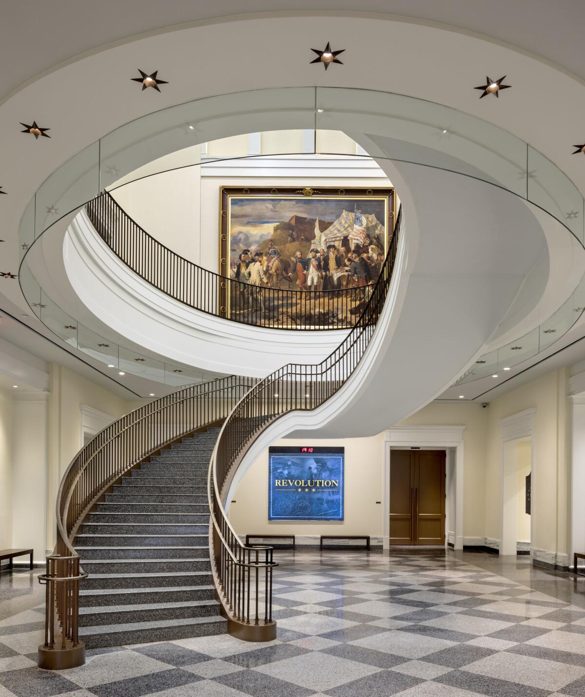
A bronze-painted domed entry pavilion leads to a rotunda with polished terrazzo floors, which in turn opens onto an atrium anchored by a grand staircase. Galleries covering 18,000 square feet fill the second floor. (Among the most important objects in the 3,000-piece collection is the field tent George Washington used as a portable wartime office.) The third level is reserved for offices and a private event space.

Inga Saffron, the architecture critic for the Philadelphia Inquirer, has written forcefully (and I think persuasively) about the museum’s architectural faults, calling it “stodgy” and “overblown.” I’m more interested in looking behind the red-brick curtain, in trying to uncover some of the assumptions that give rise to a work of architecture like this one.
It would be a mistake to say that a museum dedicated to exploring the roots of the American Revolution has some obligation to be explicitly revolutionary in its architecture — that it should suggest upheaval, radicalism or rupture in its very shape. But there’s a significant gap between that architectural attitude and the one embodied by Stern’s design, which assumes that the most important questions about national identity have long been settled. What’s really missing from the museum’s architecture, perfectly well-turned but also perfectly complacent, is any noticeable sense of curiosity.
I’ve had a similar reaction to a number of prominent new public and civic buildings in recent years, perhaps most notably RTKL Associates’ giant Capitol Visitor Center in Washington, D.C. (The only powerful exception I can think of is the Smithsonian’s National Museum of African-American History and Culture, a building whose architecture is at once a complicated expression of African American identity and a critique of the white-marble monuments that surround it on the Mall.) In the rest of American culture, meanwhile, every single part of the national identity seems up for grabs, in unpredictable and meaningful if also often traumatic ways.
I hope that the larger point I’m trying to make is clear by now: Even as it would be encouraging to see the leaders of institutions like the Museum of the American Revolution take a chance on a new generation of firms, we desperately need a new definition of Americanness in our architecture, a new set of guidelines to measure (or argue for, or question) our fidelity to a set of collective ideals.
Earlier generations of American architects and critics have voiced similar complaints — only to have a bracing example of new thinking appear seemingly out of nowhere. As I toured the museum, I kept thinking back to my visit last year to another part of Philadelphia, the Chestnut Hill section, to see the house that 39-year-old
I find it more interesting for its exploration of national identity. It packs into 1,986 square feet more ideas about American culture and history — patriotic, ironic, complicated ideas —than Stern manages in a building 60 times as big. Benjamin Franklin, the Shakers, Gertrude Stein and Andy Warhol are all squeezed in there together.
Building Type is Christopher Hawthorne’s weekly column on architecture and cities. Look for future installments every Thursday at latimes.com/arts.
Twitter: @HawthorneLAT
MORE BUILDING TYPE:
New York's rising trend of 'supertall' towers
'Unpacking,' a perfect and perfectly overused metaphor
The architecture of moviegoing: Can the multiplex stay in the picture?
The biggest entertainment stories
Get our big stories about Hollywood, film, television, music, arts, culture and more right in your inbox as soon as they publish.
You may occasionally receive promotional content from the Los Angeles Times.


