For LACMA’s ‘old’ buildings, no time like the present
A couple of major ironies are folded into the title of the big new architecture exhibition at the Los Angeles County Museum of Art, “The Presence of the Past: Peter Zumthor Reconsiders LACMA.”
The first irony is that the title itself rings with echoes of architectural history. In 1980, when Paolo Portoghesi curated the first Venice Architecture Biennale, he called his show “The Presence of the Past,” and he used it to explore the rising interest in history and ornament among the talented emerging architects of the day, including Frank Gehry and Arata Isozaki.
The second irony is a more obvious and cutting one, especially for preservationists and architectural historians in Los Angeles.
PHOTOS: A fresh perspective on LACMA’s ‘old’ buildings
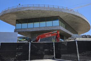
A main goal of the exhibition is to build support for a dramatic $650-million plan by Zumthor, the acclaimed Swiss architect, to remake LACMA. And making room for a massive, undulating new structure by Zumthor along Wilshire Boulevard would require knocking down four of the oldest buildings on the museum’s campus, including three designed in the early 1960s by prominent L.A. modernist William Pereira.
So much, those preservationists might mutter, for the presence of the past.
I’m already on record as an early supporter of Zumthor’s plan, which I think has the potential to be the most thrilling piece of civic architecture built in Los Angeles since Gehry’s Walt Disney Concert Hall. But I also think we owe it to the older LACMA buildings, as they face possible demolition, to understand them as deeply as we can — to recover a clear sense of what their architects hoped they would say to and about Los Angeles.
And so earlier this month, I spent the bulk of three (very hot) weekdays in and around the three Pereira buildings and a 1986 addition by the New York firm Hardy Holzman Pfeiffer Associates (HHPA). I studied the details of the four buildings and the ways they’d been modified over the years.
I read, took notes and sent emails while sitting at one of the small round tables in Times Mirror Court, a 40,000-square-foot plaza between the Pereira and HHPA buildings. I walked over to Renzo Piano’s Resnick Pavilion, where the “Presence of the Past” is installed, to look at the Zumthor proposal, then back to the eastern side of the campus to see how the new building would fit on the site.
PHOTOS: Arts and culture in pictures by The Times
What did I discover? For starters, that the potentially doomed buildings work better as an ensemble than individually. Also, surprisingly, that the 1986 addition, originally the Robert O. Anderson building and now called the Art of the Americas wing, is a piece of architecture with more verve — and a better sense of humor — than I’d realized.
The story of the original LACMA buildings goes back to Exposition Park, near USC, where the Los Angeles County Museum of History, Science and Art opened in 1913. It was no coincidence — to get back to the symbolism of names — that the museum listed “art” after “history” and “science.” Important paintings were tough to find in the original museum.
Over time, it expanded its art holdings, a process that accelerated once William Randolph Hearst became a major donor in the 1940s. By 1956, Richard Fargo Brown, who would become LACMA’s first director, was pushing L.A. County officials to consider a new, separate site for an art museum.
After the county agreed to donate seven acres on Wilshire immediately west of the La Brea Tar Pits, the search for an architect began. Brown favored German modernist Ludwig Mies van der Rohe, perhaps the most esteemed architect in the world at the time.
Howard Ahmanson, the project’s lead donor, liked Edward Durell Stone, an American. The board also considered Philip Johnson, Gordon Bunshaft, Eero Saarinen and Edward Larrabee Barnes before choosing the supremely well-connected Pereira, who in the course of a prolific career also designed the master plan for UC Irvine and San Francisco’s Transamerica Pyramid.
Pereira’s design for LACMA consisted of three separate and largely windowless buildings; faced in split-face marble tile, they were set back from Wilshire and lifted above a series of reflecting pools. The biggest, the Ahamanson Building, was to the west of a central plaza, with the Lytton Gallery — renamed the Hammer Building in 1968 — to the north and the Bing Center to the east.
Time magazine called the new museum the “temple on the tar pits.” Stylistically, it was typical of 1960s civic architecture in America. It was faithful to the basic rules of modernism — flat roofs, spare forms, lean silhouettes — but it also reflected growing impatience among leading architects with the strict rules of the International Style.
As with Stone, Saarinen or World Trade Center architect Minoru Yamasaki, Pereira was looking in the 1960s to establish a new direction for modernism, one in which some limited ornament and nods to history were no longer taboo. The most obvious reflection of this attitude in the LACMA buildings comes in the slender concrete columns that give rhythm to their exteriors.
On the whole, however, Pereira’s work was always more careful, less fluid or decorative, than buildings by those other architects.
His design for LACMA, to be sure, said something important about postwar Los Angeles, a city growing comfortable with the idea that it was — or could be — a major cultural capital. As with the Music Center downtown, designed by Welton Becket using a similarly elastic brand of modernism, LACMA was meant to be a grown-up and well-appointed piece of architecture, lightly gilded inside but rather sober as it faced the city.
PHOTOS: A fresh perspective on LACMA’s ‘old’ buildings
There were some practical problems from the start with Pereira’s design. Tar started seeping into the reflecting pools not long after the museum opened, and they were later drained and covered over.
Culturally, the buildings were an odd fit for the California of the 1960s — particularly the late 1960s. A photograph taken in 1968 showing artists and architects (including Ed Ruscha, Judy Chicago, Larry Bell and a mustachioed Gehry) on the wide stone steps of the new museum looks a bit like a sit-in, with Pereira’s LACMA doing a pretty good imitation of UC Berkeley in the Clark Kerr era.
Pereira’s firm was brought back to make minor additions to LACMA in later years, including a rather anonymous building connecting the Ahmanson and Hammer wings. But when the museum embarked on a major expansion in the early 1980s, the architecture of the 1960s was looking not just dated but also decidedly short on nerve. The interest in history and ornament that Pereira’s LACMA hints at had by then blossomed fully into postmodern quotation.
Hardy Holzman Pfeiffer — founded in part by architect Hugh Hardy, who like Robert Venturi and Charles Moore picked up his interest in history while studying at Princeton in the 1950s — had by the late 1970s emerged as a go-to firm for museums looking to remake or add to older buildings. It turned Andrew Carnegie’s mansion on Fifth Avenue in Manhattan into the Cooper-Hewitt, a branch of the Smithsonian dedicated to design, and updated Cass Gilbert’s 1904 St. Louis Art Museum.
The firm’s LACMA building is more aggressive than deferential toward Pereira. Directly into the open space the older architect had left between his buildings and Wilshire Boulevard, HHPA inserted a large new wing covering 115,000 square feet — stomping onto the LACMA campus, as art critic Robert Hughes put it, “like the giant foot in Monty Python.”
PHOTOS: Arts and culture in pictures by The Times
On its long southern edge, stretching more than 300 feet along Wilshire, it is huge and blank, something of a cipher on the streetscape, clad in Minnesota limestone and horizontal bands of green terra cotta. Facing the Ahmanson building, it is wrapped in a combination of white porcelain-covered steel panels and glass brick.
The building was part of a larger HHPA master plan for the museum that was never fully implemented. It called for recladding all three Pereira buildings in the same white panels that cover the Americas wing, something that was ultimately done on just one part of the Hammer building.
Undisciplined and gregarious where the older buildings were precise and self-censoring, gulping where Pereira sipped, the 1986 addition is full of references to the Art Deco L.A. architecture of the 1930s — most noticeably in its terra-cotta detailing and curving handrails — and by extension to Hollywood glamour.
Inside, it is more restrained. Its galleries are laid out with a nod to the Beaux Arts, unfolding on the third and fourth floors in a pattern known as enfilade, offering axial views down long straight lines of galleries opening one to the next. HHPA also created a new courtyard — a kind of interior street partly covered with peaked shade structures — in the open space between the museum’s four buildings.
Perhaps because there is free Wi-Fi at LACMA now, or because there is a good café, Coffee + Milk, and a museum bookshop at the base of the Hammer wing, that courtyard has become a very lively public space. The week I was hanging out there happened to mark the final days of the giant Stanley Kubrick retrospective in the courtyard-level galleries of the Americas building, and crowds from that show continually spilled out onto the plaza.
This is the part of the old LACMA that we will probably mourn most if the Zumthor plan moves forward. Oddly enough, the courtyard seems to succeed as a result of HHPA’s refusal to respect the symmetry and spaciousness of the 1965 plan; by pushing right up near the Hammer building, the Americas wing creates a narrow, contained and fully animated open space.
The Pereira buildings, meanwhile, strike me after my immersive experiment at LACMA pretty much as they always have: as handsome, reticent and rather dull. The atrium of the Ahmanson wing, now anchored by Tony Smith’s “Smoke” sculpture, is a remarkable space. The galleries, sleek, workaday and rather dark, are less memorable.
In the end, it was really only the 1986 Americas wing that surprised me. Granted, it is something of a chaotic piece of architecture: an unwieldy bundle of attitude, a pile of historical references that never fully cohere. Grown drab over 25 years of operation, it needs a good scrubbing, something LACMA is unlikely to give it while trying to raise money to replace it.
But it is also charismatic and energetic in ways I hadn’t noticed. I like the smaller of its two elevators, which has a shiny metal interior and looks like a cross between a ship’s cabin and a space capsule. I like the views it gives of the tar pits and the Hollywood Hills.
And perhaps most of all, I like its sense of humor. It is a cheeky, charismatically unserious building in the way it insists on slicing at a sharp angle from the courtyard toward Wilshire, deliberately upending the careful geometry of the Pereira ensemble; in the soft, quilted look of its white panels, suggesting a Richard Meier grid stuffed with down.
PHOTOS: Hollywood stars on stage
The building doesn’t have a lot of defenders these days. Some preservationists have in fact argued that LACMA should remake itself by demolishing only the 1986 building and restoring the Pereira buildings to something resembling their original state.
But we should be careful about writing off the Americas wing altogether, even as we try to be clear-eyed about its flaws. As with many buildings around its age — 25 or 30 years old — it has fallen into a kind of preservation black hole. It will never look more dated or less attractive to the general public than it does now.
In architecture, though, there is a very fine line between a building that is unfashionable and one that is ripe for rediscovery. A 1980s revival is already picking up speed among younger architects and critics. Five years from now, that building will have many more fans than it does now.
This look at the buildings wasn’t meant as a final referendum on their fate. I am steering clear of definitive statements. Finding qualities to admire in the HHPA building hasn’t lessened my appreciation for Zumthor’s architecture.
I will say that Zumthor works very slowly. And that LACMA’s director, Michael Govan, has a good deal of fund-raising to do before he brings in the first bulldozer. There is time for Los Angeles to get to know these buildings — or know them again — before we decide how much sense it makes to knock them down in favor of something new.
More to Read
The biggest entertainment stories
Get our big stories about Hollywood, film, television, music, arts, culture and more right in your inbox as soon as they publish.
You may occasionally receive promotional content from the Los Angeles Times.


