LACMA’s future unfurls in Peter Zumthor’s design
Imagine you are heading east on Wilshire Boulevard, in a car or on foot. As you approach Wilshire and Fairfax Avenue, you see the rounded, gilded corner of the former May Co. building and Renzo Piano’s travertine-wrapped Broad Contemporary Art Museum, with its wide shoulders and careful posture.
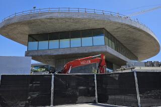
Then, just past the huddled lampposts that make up Chris Burden’s “Urban Light” installation, something entirely different heaves into view: an undulating building of glass and dark-gray concrete, its single story lifted more than 30 feet into the air atop seven separate legs, each containing a staircase. At its eastern end, the building extends out over one edge of the La Brea Tar Pits.
This is the architectural future awaiting the Los Angeles County Museum of Art, if Museum Director Michael Govan and the 70-year-old Swiss architect Peter Zumthor have their way: A powerfully unorthodox new building stretching more than 700 feet along Wilshire.
GRAPHIC: On the chopping block at LACMA
The design — which the museum will unveil in an exhibition opening June 9 called “The Presence of the Past: Peter Zumthor Reconsiders LACMA” — arrives at a crucial time for the city. Los Angeles has produced so few important buildings in the last seven or eight years that it is in real danger of losing its reputation as a center for innovative architecture.
And L.A. has never been known, in any case, for experimental civic architecture. With the exception of Frank Gehry’s Walt Disney Concert Hall and a handful of other projects, most of our architectural breakthroughs have been private houses.
Bracingly forward-looking, Zumthor’s design for LACMA would give the city a much-needed jolt of architectural energy.
Quite a bit of work remains to turn his vision into built form. Although Govan and Zumthor have spent nearly five years on the project, the design is still conceptual, likely several years away from breaking ground.
Govan will have to win support for knocking down LACMA’s original campus by William Pereira, completed in 1965, and a 1986 addition by Hardy Holzman Pfeiffer Associates to make room for Zumthor’s building. The Natural History Museum, which oversees the tar pits, will have to agree to let LACMA cantilever its new galleries out over the black pools.
And Govan will need to raise $650 million — at least $450 million to build the new structure, with the rest earmarked for a contingency fund and other uses. He argues that the aging Pereira and Hardy buildings will soon need as much as $300 million in upgrades and restoration work if the museum keeps them.
CRITICS’ PICKS: What to watch, where to go, what to eat and more
The new structure would also be more efficient than the existing ones; Govan estimates it could cost $5 million less per year to operate.
However the financial math comes out, there is no mistaking the allure of Zumthor’s preliminary design for the building. At once fluid and dense, it has drawn from the architect an ease and expressiveness new — or at least rare — in his work.
Most of Zumthor’s buildings are lean, vertical and compact, hewn from rich and tactile materials and careful not to waste any space or motion. The horizontal LACMA design spreads freely across its broad site.
Seen from above, the design, which the architect has nicknamed “the Black Flower,” has a liquid, flowing appeal that seems closer in spirit to a building by the Brazilian architect Oscar Niemeyer or a collage by the modern artist Jean Arp than to Zumthor’s existing architecture.
This overhead view, powerfully simple and graphic, suggests a black droplet on the Miracle Mile landscape. Given that dark, inkblot form, it is also hard not to think of the project as a kind of Rorschach test for LACMA donors and the museum’s board — a way to test their enthusiasm for costly but stirringly ambitious new architecture.
Perhaps the strongest element of the design is the extent to which it reflects contemporary Los Angeles, a city that Zumthor, on repeated visits to meet with Govan over the last several years, has carefully studied. Like L.A., the proposed building is open and tolerant. It has no single main entrance or front staircase.
PHOTOS: Arts and culture in pictures by The Times
The opposite of doctrinaire, the design, mysterious without being aloof, invites multiple readings; visitors will be able to move through it in dozens of different ways, taking a new route each time.
Zumthor gave me a detailed look at the proposal last month when I visited his studio in a small Swiss mountain town called Haldenstein.
The studio is located in a restored two-story wooden building. Thanks to the LACMA commission, along with some other new projects, his work has spilled over into his house next door, a low-slung concrete box of Zumthor’s own design.
In a long, narrow room just off the kitchen were at least a dozen large models of the LACMA project, soon to be shipped off to the museum. Hand-drawn sketches and computer-generated diagrams of the LACMA design were taped to the walls and windows.
What the drawings show is an energetic rethinking of the architecture of the encyclopedic museum. In essence, Govan hopes to use the Zumthor plan to reject the notion of the grand civic museum as cultural Parthenon, carefully symmetrical and looking down magisterially at the city around it.
Zumthor’s building would slide right up against the Wilshire Boulevard sidewalk. Pedestrians would be able to walk right under it from the boulevard into or across the museum campus.
Inside, despite the essential flatness of the building, the galleries would fill a variety of spaces, from a sunken room to show LACMA’s prized 16th century Ardabil Carpet to rooms for European painting and sculpture with soaring ceilings 30 or 35 feet high. The roof would be almost entirely covered with solar panels.
PHOTOS: LACMA Art + Film Gala 2012
The new galleries would include 170,000 to 200,000 square feet of exhibition space. That’s at least 45,000 square feet more than are contained in the buildings they’d replace, according to LACMA figures.
Closer in shape to an amoeba than the late-Modernist boxes that Pereira delivered to Wilshire Boulevard nearly 50 years ago, the new building would reach tentacles to the northwest and northeast and toward the tar pits, while pulling back to accommodate Bruce Goff’s Pavilion for Japanese Art.
From certain angles the building’s seven legs, which Zumthor calls “pods” or “cores,” may give it the look of a huge, lumbering animal pulling itself out of the tar pits, still dripping with oil. But from others the new structure will appear largely transparent, open at ground level and wrapped in glass above.
The legs, which will also contain ground-level storage for artworks visible to the public behind glass, are an ingenious solution to a major challenge for Zumthor.
Most of his architecture is modestly sized and carefully attuned to the scale of the human body. In many of his projects there is a single, often rather heavy front door and a carefully choreographed entry sequence. The buildings compel you to pay detailed attention to their weight and materials and how they’re made.
How to translate that kind of architecture to the vastly greater scale of the LACMA project was from the outset a dilemma for Zumthor.
“Small museums are great,” he told me. “Big museums are a drag.”
But the seven staircases suggest one way to bridge the gap. Zumthor wants each one to be different in scale and character; each will be small enough to allow him to control the way visitors first come into physical contact with his architecture.
As Zumthor and Govan now envision the design, each of the staircases will take visitors directly to a gallery holding one of the key artworks in the LACMA collection. One stair might lead to Tony Smith’s “Smoke,” another to the Ardabil Carpet.
The galleries themselves would be largely boxy and rectilinear, playing against the fluidity of the building’s container. A continuous walkway would run along the outside of the building, giving views of the Hollywood Hills and Wilshire Boulevard through floor-to-ceiling glass.
Space along the perimeter walkway, which Zumthor calls a “circular gallery,” would contain rotating exhibitions. The walkway would pull back from the edge of the building to make room for terraces at certain points, including on the west side of the new building, where a restaurant might include outdoor seating overlooking “Urban Light” and the rest of the campus.
Still a work in progress, the design is full of gestures that are more speculative, even searching, than fully formed. One crucial element that remains under-developed is how it will feel to walk beneath the museum’s raised main floor — and how the underside of the building will be clad or look as seen from the ground. (In such a large, dark piece of architecture it will be important to keep that space from feeling cave-like.) The plan so far has little to say about landscape architecture.
The greatest achievement of the new galleries could come in their treatment of light. In his two major museum projects, the 2007 Kolumba Museum in Cologne, Germany, and the 1997 Kunsthaus in Bregenz, Austria, Zumthor handles light brilliantly.
Many of Kolumba’s galleries are illuminated from above by tall light wells that produce a church-like, almost sacred light. The four-story Kunsthaus, meanwhile, is a marvel of high-tech light engineering, bringing light in from the side of the building so that even galleries in the middle of the museum give the strong impression of being naturally illuminated from above.
Zumthor and Govan haven’t settled on a final lighting strategy, but the architect’s track record gives reason for optimism. And Zumthor has become productively obsessed with the peculiar, diffuse light in Los Angeles — what William Faulkner in his 1935 short story “Golden Land” called the “high soft almost nebulous California haze.”
It seems fair to hope that Zumthor might ultimately do for the relationship between architecture and light in Los Angeles what Gehry, in the acoustically brilliant Disney Hall, did for the one between architecture and sound.
MORE
TONYS 2013: Nominees, photos and full coverage of the awards
CHEAT SHEET: Spring Arts Preview
PHOTOS: Arts and culture in pictures
More to Read
The biggest entertainment stories
Get our big stories about Hollywood, film, television, music, arts, culture and more right in your inbox as soon as they publish.
You may occasionally receive promotional content from the Los Angeles Times.


