L.A. museum seating ranked: Getty, LACMA, MOCA, Broad, Hammer - Los Angeles Times
Advertisement

The first-ever L.A. museum seating report card — from the brutal to the glam

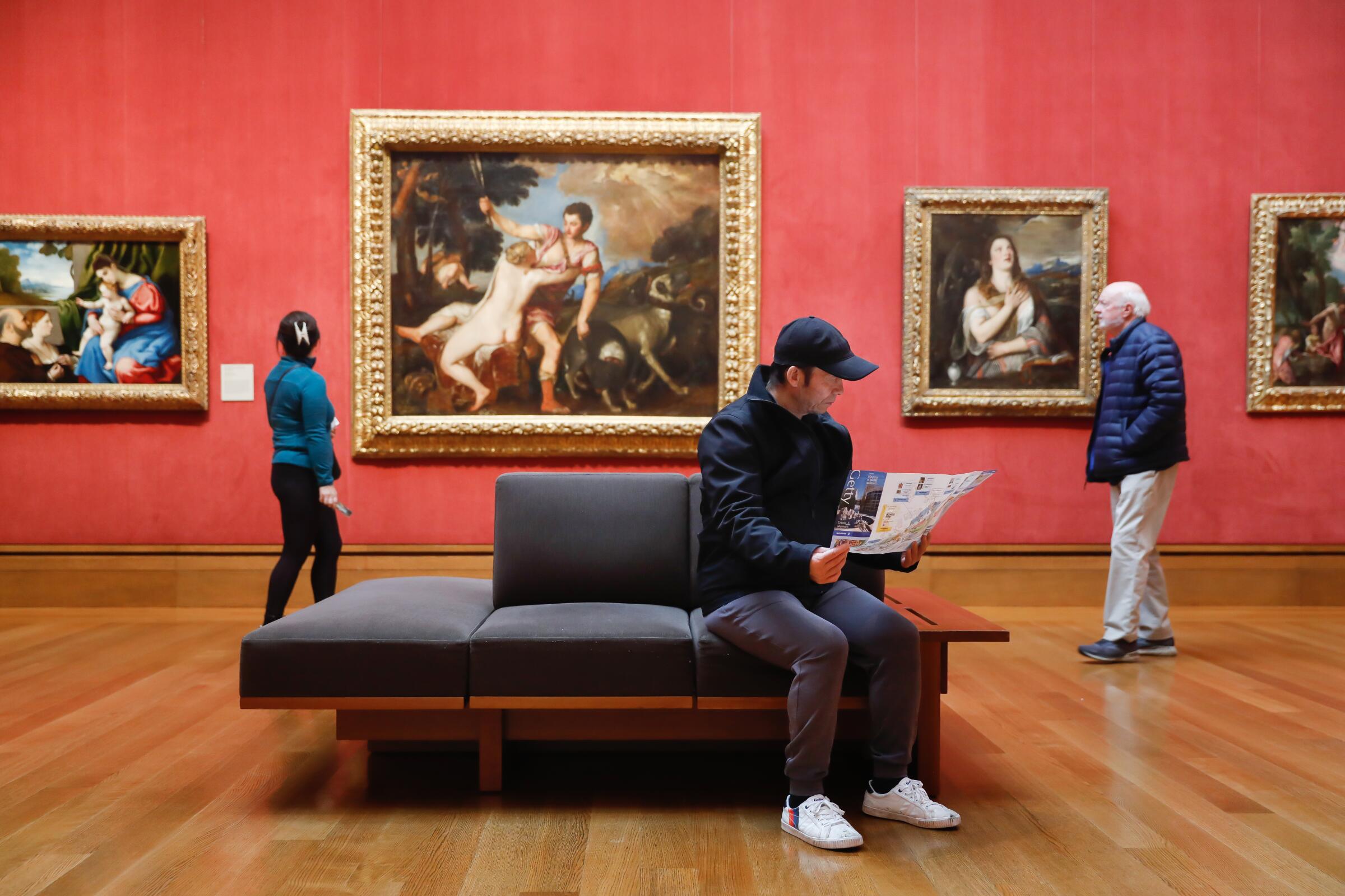
A young man reads a program while sitting on a museum bench in a gallery with red walls hung with Renaissance paintings.
Wei Xin Yang, visiting from Toronto, looks over a museum map while sitting on a bench at the Getty.
(Christina House / Los Angeles Times)
Share via
1

When French novelist Marie-Henri Beyle — better known as Stendhal — paid a visit to the Basilica di Santa Croce in Florence, Italy, in the early 1800s, he became so overcome with emotion after gazing upon Volterrano’s “Sybils” that he not only experienced palpitations of the heart, “The well-spring of life was dried up within me, and I walked in constant fear of falling to the ground.”

Thankfully, there was a bench nearby. Otherwise he might have never written “The Red and the Black.”

The humble museum bench does it all. It provides a place to rest, admire a perplexing painting, ogle the crowd or check DMs. Experiencing a bout of Stendhal syndrome? Cue the bench. Benches also help make museums more accessible to people of all mobility levels. New York-based artist and accessibility activist Shannon Finnegan has made work related to this, including bright blue benches inscribed with text that reads, “This exhibition has asked me to stand for too long. Sit if you agree.”

Advertisement

Triptychs, BMWs, colonial art and comic books all figured into recent solo shows by Umar Rashid and Frieda Toranza Jaeger at MoMA PS1

March 20, 2023

Now that I’m at the age when I grunt when I stand, I have become deeply appreciative of benches. But all benches are not created equal. Some beckon the sitter with backrests and velvety upholstery; others offer all the comfort of a Calvinist pew, demanding that you sit ramrod straight — apparently the ideal posture for experiencing the wrath of God or contemporary video artists.

How do museum benches in the Greater Los Angeles area rate? In this highly scientific, first-ever report card on museum seating, I sit and tell:
2

Immediately, no

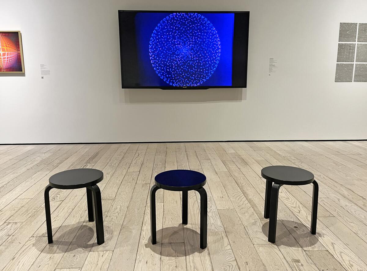
A view of a gallery shows three small black stools in front of a TV monitor displaying a small geometric pattern.
Little stools await the discomfort of the viewer in “Coded: Art Enters the Computer Age, 1952-1982” at the Los Angeles County Museum of Art.
(Carolina A. Miranda / Los Angeles Times)

Seating for video works is a perpetual problem in museums. In many cases, you’re groping around a pitch-black room in search of that one bench in a sea of empty space. Or you’re perched on a stool while tethered to a monitor via headset. A recent jaunt through the galleries at the Los Angeles County Museum of Art revealed the latter setup (sans headsets). It’s the sort of seating that feels like you’ve just been yelled at for misbehaving in class.

For the record, LACMA isn’t the only museum to employ these diminutive stools. A recent video art exhibition at the Hammer Museum featured similar seating. If this is going to be the aesthetic of video presentation, perhaps it’s time to consider emailing Vimeo links instead? I will happily watch those from the comfort of my couch.

Advertisement

Grade: F

3

Fifty shades of gray

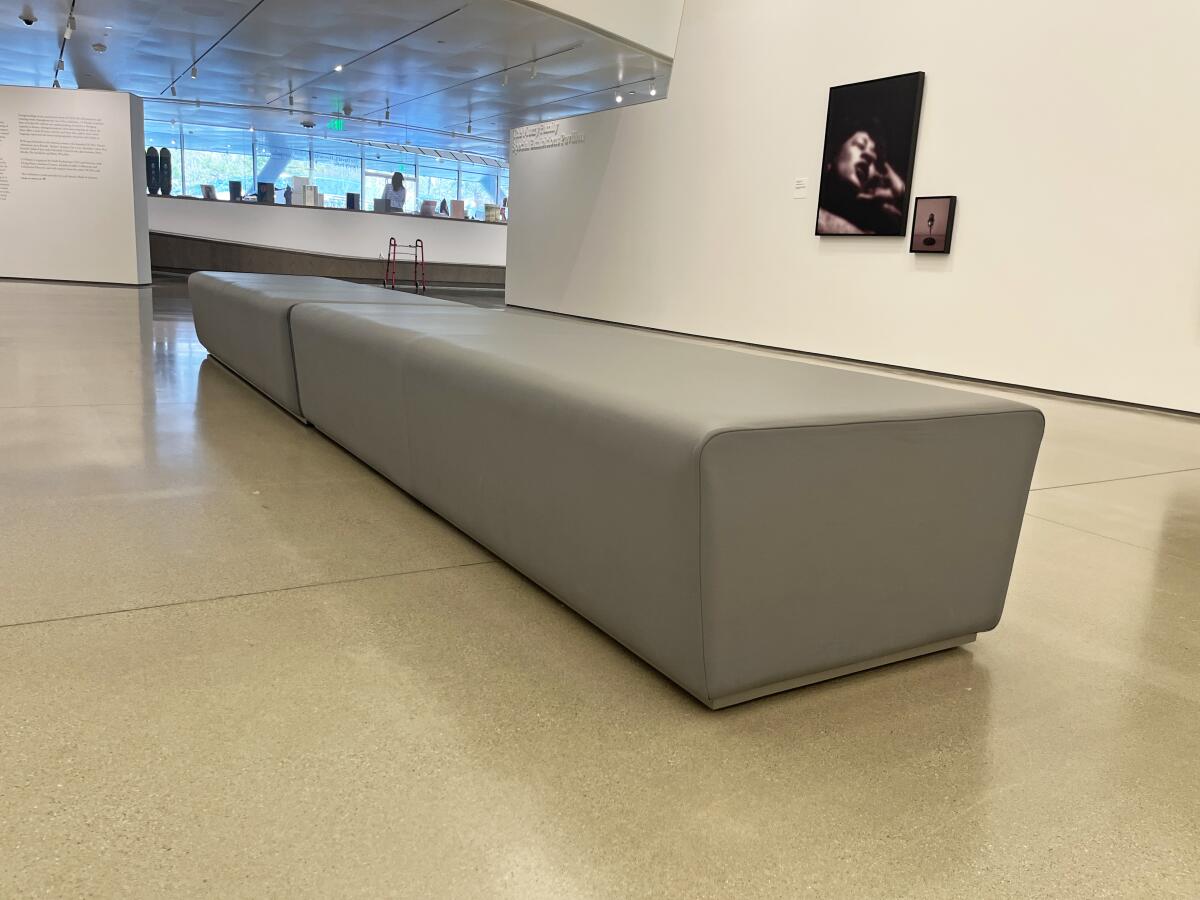
A pair of rubbery gray benches end to end in a white-walled museum gallery.
Benches in the permanent collection galleries at the Orange County Museum of Art.
(Carolina A. Miranda / Los Angeles Times)

At some point, the art world had a meeting — to which I wasn’t invited — and decided that house-flipper gray would be the default color of museum benches. There is a lot of gray out there, “the color of soldiers and battleships” and “the color of the death of trees,” to quote essayist Meghan Flaherty (who, unlike me, is really into gray).

Gray comes in all kinds of textures and tones at L.A.-area museums, including upholstered gray benches with slender-yet-firm cushions (LACMA and the Hammer) and solid rubbery prisms (the Broad and the Orange County Museum of Art). Though not necessarily uncomfortable, they offer all the visual delight of the skies over a British coalmining town during the Thatcher era.

Grade: C, because these benches don’t even try to fail

4

Brutal bench

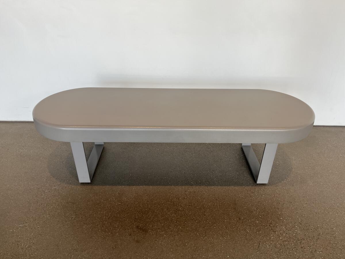
A gray plastic bench on two legs is topped with a seat in the shape of an oval.
A plastic bench at the Academy Museum of Motion Pictures.
(Carolina A. Miranda / Los Angeles Times)

Of all the gray museum benches in the Greater Los Angeles area, I had to highlight this dire piece of industrial seating, several of which can be found in the public areas of the Academy Museum of Motion Pictures. Manufactured from the coldest, hardest plastic known to man, they look as if they may have been ordered out of a jailhouse furniture catalog.

Grade: D

5

Rustic chic, art world style

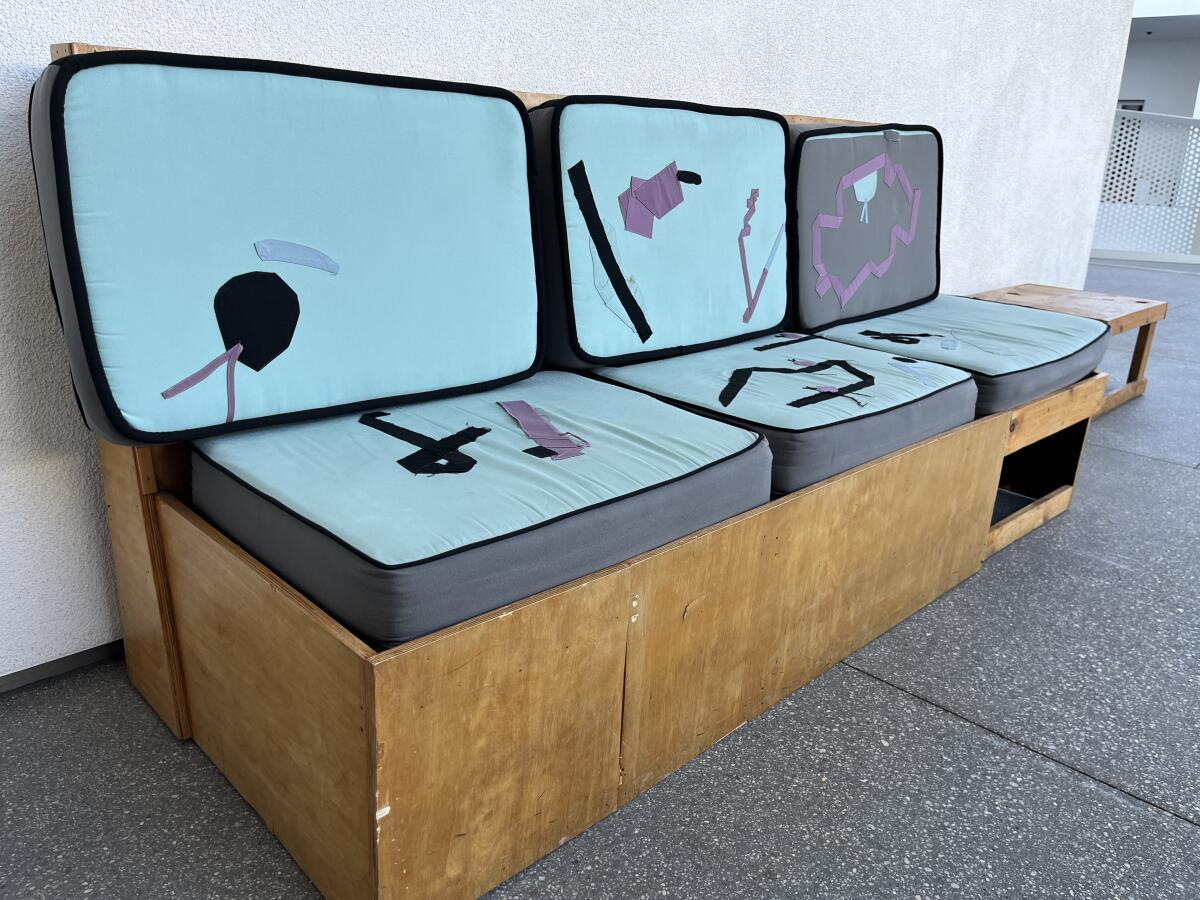
A sofa made from reclaimed wood is topped with light blue cushions with abstract elements sewn on.
A bench designed by artists Chris Johanson and Johanna Jackson at UCLA’s Hammer Museum.
(Carolina A. Miranda / Los Angeles Times)

Advertisement

The Hammer Museum is business in the back, party in the front. Inside the galleries, you’ll find dull benches in gray. But in the lounge areas, the museum has inserted quirk and color with handmade furnishings by artist duo Johanna Jackson and Chris Johanson. These one-of-a-kind pieces are fabricated with reclaimed wood and are often asymmetrical in design, featuring hand-sewn cushions with abstract shapes quilted onto the surface. The craft vibe is so bold they might make you forget that you’re sitting in a museum housed in a former petroleum tower.

Grade: A- for style; B+ for comfort

6

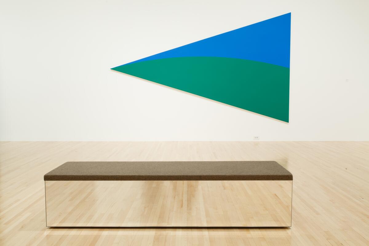
Mirror, mirror on the floor

A mirrored bench topped with carpet in a wood floor gallery where a blue/green painting of a triangle hangs.
The mirrored bench designed by Isaac Resnikoff and Lizz Wasserman of Project Room for the Museum of Contemporary Art.
(Paley Fairman)

Museum benches can be minimal without being dreary. Thank the Museum of Contemporary Art for commissioning a bench that is sleek and unobtrusive yet still has a sense of panache. Created by Lizz Wasserman and Isaac Resnikoff of the collaborative design group Project Room, the MOCA Bench features vertical surfaces clad in mirrored panels. These have the effect of reflecting the museum’s wood floors and making the bench feel transparent. The best part? If you really like it, Project Room will make one for you.

Grade: A

7

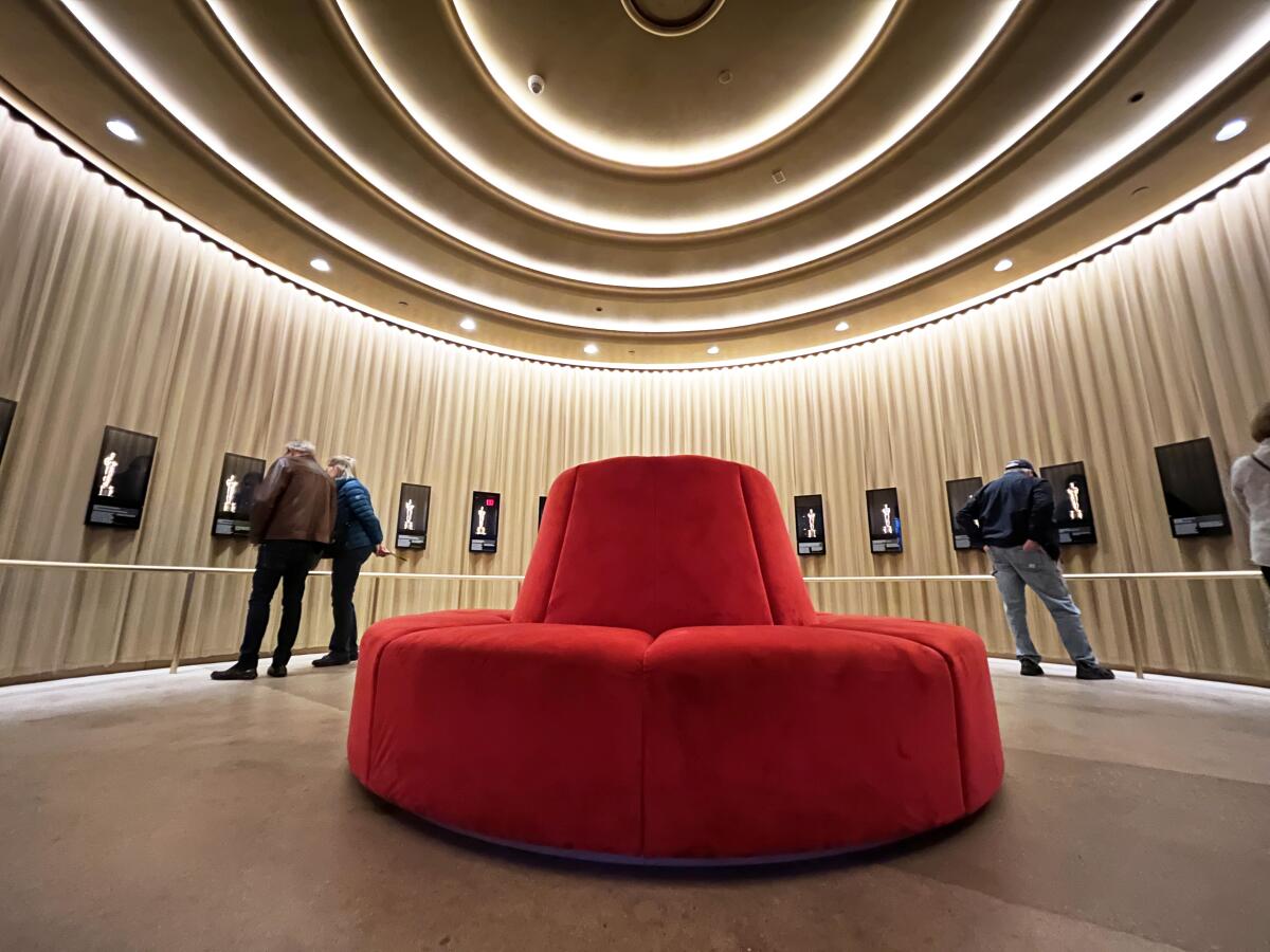
Viva glam

A circular red settee wrapped in a velveteen fabric is seen at the center of a circular gallery with golden walls.
At the Academy Museum, a circular settee brings glamour to a gallery display of Oscar statuettes.
(Carolina A. Miranda / Los Angeles Times)

The Academy Museum makes up for its carceral benches with a dramatic circular, cherry-red banquette that sits inside the curving gallery that holds historic Oscar statuettes. Designed by the team at Why — the L.A. architectural studio founded by Kulapat Yantrasast, which worked on the museum’s installation design — the seating not only evokes the form of the room, it brings a dash of vintage department store glam to a Streamline Moderne building that once housed a May Co. department store. The fabulous settee is, unfortunately, a one-off, but it is very inviting.

Advertisement

Grade: A

8

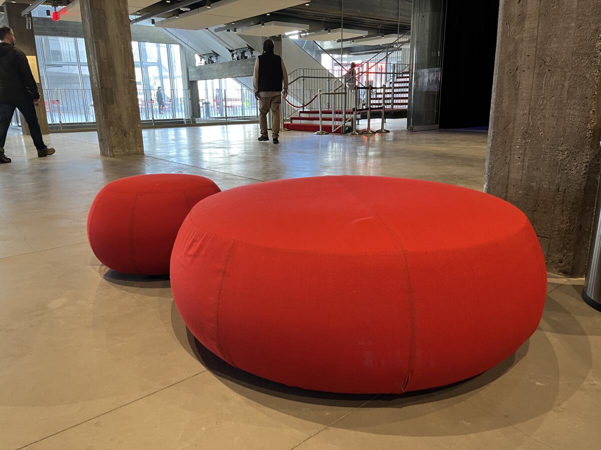
Red all over

A pair of red poufs for sitting are seen in the concrete lobby of the Academy Museum.
Red poufs accentuate the polished concrete lobby at the Academy Museum of Motion Pictures.
(Carolina A. Miranda / Los Angeles Times)

Red is a signature color for the Academy Museum (red carpet!) as well as for Renzo Piano, the architect whose firm revamped the old May Co. building into a functioning museum. Dotting the lobby, therefore, are a series of cherry red poufs requested (but not designed) by Piano’s firm. These bring a splash of color to this chilly industrial space, which is largely concrete. When I first laid eyes on these, I was doubtful about the support they might offer. But their firm construction makes them a popular perch for lounging.

Grade: B

9

Into the wood

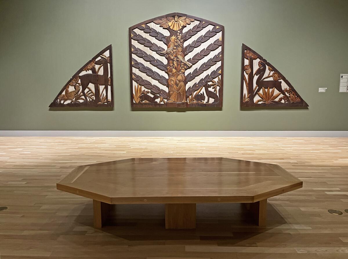
A polished hexagonal wood bench sits before a pipe organ screen carved from redwood bearing images of fauna and flora.
A wooden bench sits before Sargent Claude Johnson’s 1937 screen for a pipe organ at the Huntington Library.
(Carolina A. Miranda / Los Angeles Times)

As new museums increasingly turn to concrete as a gallery material, I find myself comforted by spaces rendered in warm wood. I am therefore a fan of the hexagonal wooden bench (even if it’s hard) before the stylized pipe organ screen by Sargent Claude Johnson (1888-1967) in the Virginia Steele Scott Galleries of American Art at the Huntington Library, Art Museum and Botanical Gardens. Here, the bench’s form and material pair handsomely with the carved redwood screen by Johnson, one of the first Black visual artists from California to be recognized at a national level.

Grade: A-

10

Best in show!

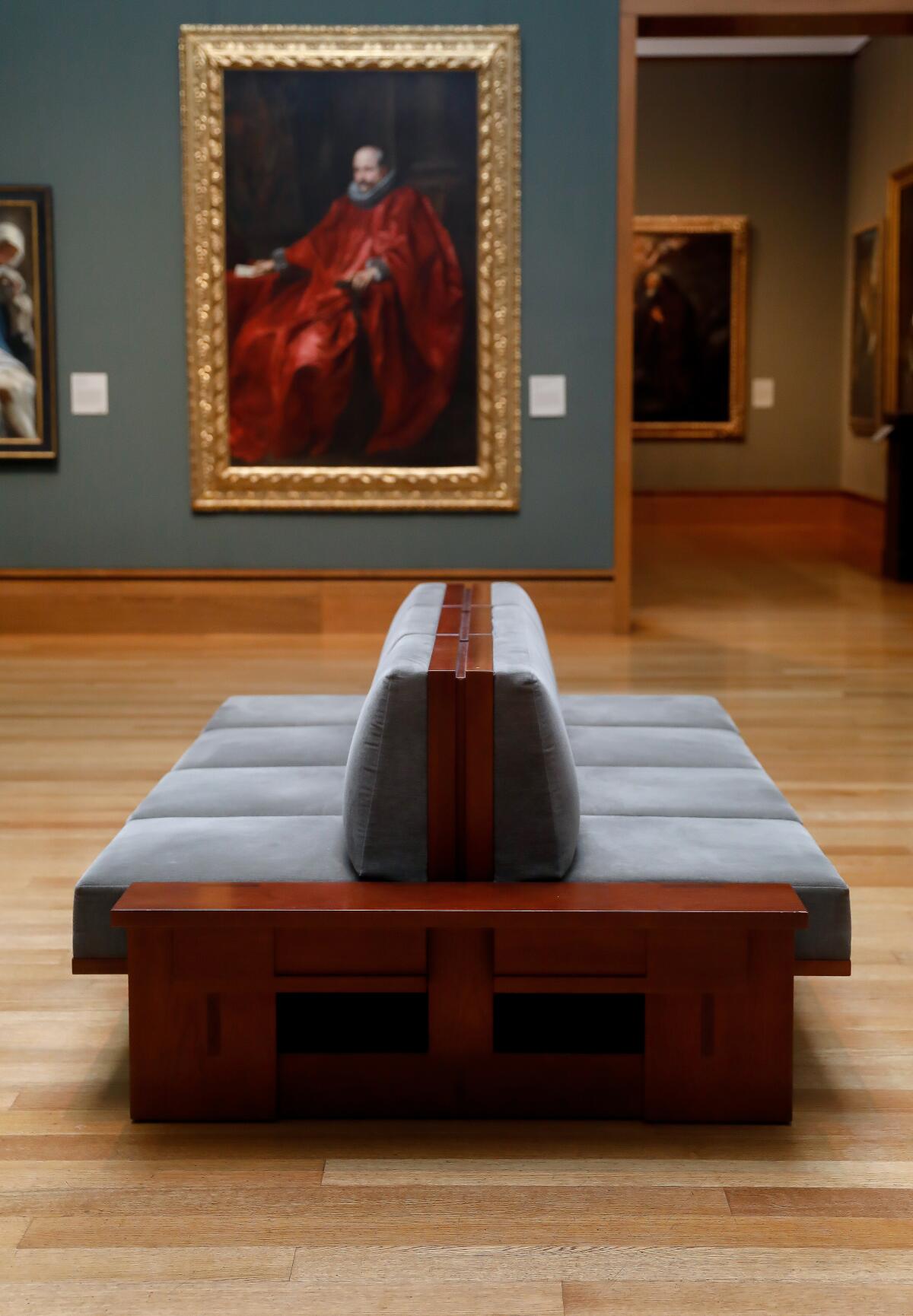
A bench with a hard back and velvety cushions in a gallery with green walls and a portrait of a man in red.
We have a winner: The benches in the permanent collection areas at the Getty Center are sturdy, comfortable and elegant.
(Christina House / Los Angeles Times)

Advertisement

Firm cushions. A soft yet supportive backrest that is kind to even the creakiest back. A small wooden shelf on which to rest your bag. The Getty Museum takes the gold for best overall bench design. (It always helps to have an almost $8-billion endowment.) Its wooden banquettes are topped with cushions upholstered in handsome, earth-toned pile and their sturdiness makes them easy to get in and out of. And the bench isn’t a one-off: These are thoughtfully staggered around the permanent collection galleries. 10/10 would read the Sunday paper and drink my dirty horchata on this hospitable bench.

Grade: A++

11

Extra credit

Two exhibitions currently on view in L.A. come with seating installed by the artist — and while these will last only for the life of their respective shows, they deserve a mention:

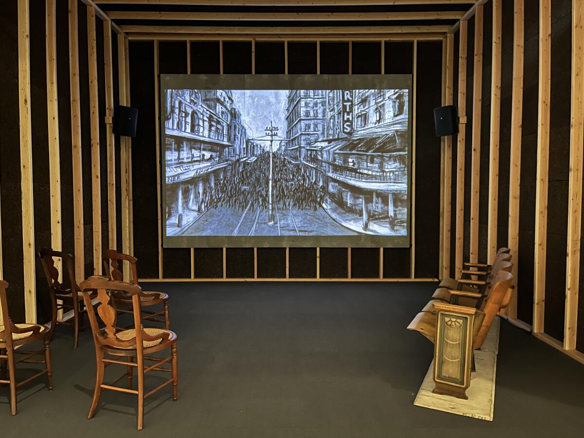
A stop-motion film is shown inside a wooden structure featuring seating that includes vintage chairs and theater seats.
A viewing environment for William Kentridge’s “Drawings for Projection” at the Broad museum.
(Carolina A. Miranda / Los Angeles Times)

At the Broad museum, artist William Kentridge, currently the subject of the solo exhibition “In Praise of Shadows,” along with the show’s exhibition designer, Sabine Theunissen, have not only created environments for watching video, they have supplied seating too. This includes an array of vintage chairs and stools, and in the case of one viewing chamber, antique theater seats. Extra points for artists who recycle and supply hard-back seats.

Grade: B+

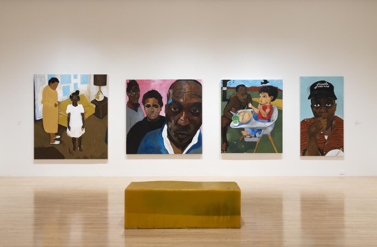
A view of a gallery shows a bright yellow bench before a row of four paintings that feature Henry Taylor and his family.
Henry Taylor created custom benches for his solo show “Henry Taylor: B Side” at the Museum of Contemporary Art.
(Jeff McLane / MOCA)

For his solo show at the Museum of Contemporary Art, L.A. painter Henry Taylor fabricated his own benches — and they resemble giant blocks of government cheese. Their yellow-orange hue and rubbery texture scream commodity food and within them he has embedded objects such as screws, scraps of paper and afro picks. This is less a seat than a sculpture you sit on, one that evokes the social and economic chasms in U.S. society — a good spot to meditate on who our finest institutions embrace and who they leave out.

Advertisement

Grade: A

Advertisement