These sets are more than a place to tell a story. They are the hero of the story.
Movies transport us, moving us through extraordinary locations, cities, streets, even inside creatively crafted homes and vehicles. But some films hold still, keeping their story largely inside a single location. And when that happens, this “hero” set has to carry a big load by explaining character and grounding the story.
The Envelope spoke with three production designers about shouldering that responsibility in “One Night in Miami,” “Sound of Metal” and “The Father” — and got to know the most important nonspeaking character in each film.
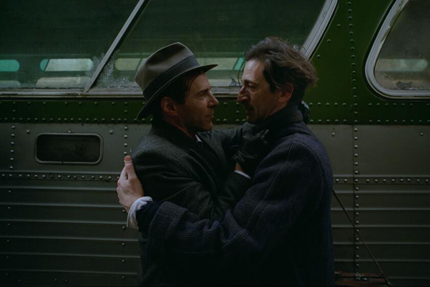
‘One Night in Miami’
Our hero: A suite in 1964 Miami’s Hampton House
Room with a view: “We hope that our hotel room is constantly evolving throughout the film, that it feels like a sun-filled house of worship in one scene, a musician’s inspiration in another, a friendly setting for a whiskey and ice cream after-party, or a sober heartbreaking vessel of truth in another,” says producer Jess Wu Calder.
Practical matters: The actual Hampton House is now a historic site, but that doesn’t mean the hotel suite in the film is an exact replica, explains production designer Barry Robison. The set had to be roomy for both characters and cameras and flexible to get the shots director Regina King needed. A wooden screen room divider that could be removed as necessary for camera angles “allows characters to be in the room but also not in the room,” says Robison, who employed an old soap-opera shooting trick by creating camera “ports” in the walls that could be covered by a mirror or picture. This allowed the camera to film while not being in the room with the actors. “It was a less intrusive device,” he says.
In addition, set colors were critical to King. “She wanted her actors with different shades of skin to all look good in the room,” so Robison brought in wood tones and green shades. Finally, audiences may wonder why the room isn’t wall-to-wall carpet. “With the heat and humidity in Miami, rugs would mold and mildew,” he says. “Laying down linoleum meant we could control the pattern from room to room.”
Space odyssey: “I like to think that what we did was more a dream-reality impression,” says Robison.
‘Sound of Metal’
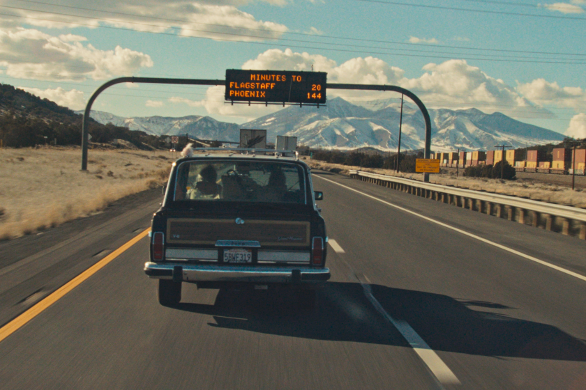
Our hero: An Airstream camper trailer
Room with a view: “The Airstream is a bubble for our two characters, Ruben and Lou,” says director Darius Marder. “It’s a place of safety and dreams and creation. It is the character of his relationship with Lou.”
Practical matters: After purchasing the Airstream, Marder and production designer Jeremy Woodward drove around in it to get a sense of how they could transform the interior. “Darius’ script is pretty gutsy, because it doesn’t explain a lot of things,” says Woodward. So, they invented story that never fully gets explained on screen: There’s a working recording studio inside the RV, with everything from the cabinetry to the vintage wallpaper built as if Ruben himself had put it together. “I’m always bothered when you see [Batman’s] Batcave and it’s so removed from the means of production that would have been available to a person building a Batcave,” says Woodward.
“Polish and slickness in the Airstream would have been a fairy tale, so everything was done with a jigsaw and a drill.” Seats at the front of the vehicle also provide a window into the couple: Ruben’s faces forward, Lou’s backward. “It’s so beautiful, because they’re the inverse of each other when you look at them,” says Marder. “They fit together in a picturesque image of codependence.”
Space odyssey: After shooting, Woodward loved the RV so much he “wrestled a consortium” of friends and relatives into purchasing it. “These days, it lives on the beach in Rhode Island,” says Woodward. “That Airstream is living its best life now.”
‘The Father’
Our hero: A London apartment. Or maybe a second London apartment. Or maybe a hospital wing. Or …
Room with a view: “The apartment metamorphosizes throughout the film, so in a way we’re going to new places,” says director Florian Zeller. “I wanted to be as subtle as possible, just to create something uncomfortable without being too obvious.”
Practical matters: Given that the apartment’s layout is meant to mirror the perceptions of octogenarian Anthony’s deteriorating mind, production designer Peter Francis had a unique task: The layout would remain the same, but the flat the main character lives in shifts in time and space — sometimes it’s his daughter’s apartment, sometimes it’s a hospital, sometimes it’s a care home.
“To me, Anthony is in the care home the whole time, but what he’s seeing are memories,” says Francis. “The architecture stays the same, but the coloring and dressing changes.” The idea was to layer Anthony’s home with detailed furniture, objets d’art, and cool blue walls — but then to shift slightly as the story progressed. His daughter Anne’s flat has pastel colors and is packed with books. By the time the film shifts into the more obvious changes, the audience should understand that the visuals are fluid. The only anchor piece is a painting above the fireplace, painted by a character who has passed away, an image that mirrors the final shot of the film. “The set is the third character in the film,” says Francis.
Space odyssey: “Everyone takes away something different from the film,” says the designer. “That’s fine. I’d rather it wasn’t too obvious — but enough to make them question what they’re seeing.”
More to Read
From the Oscars to the Emmys.
Get the Envelope newsletter for exclusive awards season coverage, behind-the-scenes stories from the Envelope podcast and columnist Glenn Whipp’s must-read analysis.
You may occasionally receive promotional content from the Los Angeles Times.
