More tangles in LACMA design?
Renzo Piano has earned a reputation in recent years as architecture’s great problem-solver. Let other architects upend convention, revel in colliding forms or tax the talents of the world’s most famous structural engineers. Renzo Piano Building Workshop is the firm you hire when what you need from your architect is clarity, craftsmanship and refinement.
But the latest version of the architect’s scheme for the Los Angeles County Museum of Art suggests that in this case, the combination of a tight budget and an ill-matched collection of existing buildings is severely testing those skills.
Sure, the two crisp axes at the heart of Piano’s plan from the beginning have been strengthened. Elsewhere, though, the updated design shows Piano casting about for inspiration. He is drawing from L.A.’s midcentury architecture and from its car and billboard culture.
He is even circling back to the 1977 Pompidou Center in Paris, the colorfully insouciant modern-art museum he designed with Richard Rogers.
This is more than “fine-tuning,” to use Piano’s term. This is a talented architect still working to loosen the last knots in LACMA’s architectural tangle. The result is a scheme that promises to include not only the sense of lightness and supreme composure that have marked Piano’s recent triumphs but also pop gestures, exuberant colors and some architectural sleight of hand, all meant to distract visitors from the less lovely sections of the museum campus.
In the plan’s biggest change, the series of colored fabric scrims designed to cover the new and existing museum buildings along Wilshire Boulevard have been replaced by billboard-like banners, some of them 70 feet high and nearly 200 feet long. The screens, which will be replaced every six months or so, will not only promote LACMA exhibitions but also operate as huge canvases. Piano hopes the museum will hire a curator to oversee the banners and commission pieces from leading L.A. artists (then sell them once they’re taken down, a cynic might point out).
“I’ll call Ed Ruscha myself,” the architect said Thursday.
The screens represent Piano’s third attempt to lend visual unity to the Wilshire facade. As recently as last summer, he was calling for more muted -- and, apparently, more expensive -- fabric scrims in yellow, red and blue.
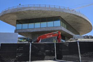
The updated design also shows further refinement of the plan’s two new buildings: the 60,000-square-foot Broad Contemporary Art Museum, or BCAM, and a low-slung entry hall next door. The structures will fill in the gap-toothed smile the museum has flashed along Wilshire since its parking garage was demolished last year.
The BCAM building, H-shaped in the plan, will be clad in light-colored travertine, with bright red stairs and escalators crawling, Pompidou-like, over its exterior.
Piano hopes the adjacent entry pavilion, wrapped in glass, will appear not only light on its feet but also virtually unburdened by structural requirements, like the Case Study houses of the 1950s.
“The idea with the Case Study program was, ‘Can you make a house with nothing -- no structure, no weight?’ ” he said. “We’re trying to do the same here -- to produce a pavilion that is as light and transparent as possible.”
In borrowing from billboard culture and midcentury L.A. architecture, Piano is using references that every Southern Californian should respond to, at least subconsciously. He’s also acknowledging that the museum’s impossibly long horizontal presence on Wilshire practically demands elements designed to be seen from a moving car.
But having spent the last 30 years moving steadily away from the radical forms of the Pompidou, Piano is just about the last architect in the world you would expect to see pitting high culture against low or permanent against temporary. And as these latest designs show, it’s not a role in which Piano, particularly at this stage in his career, feels entirely comfortable.
There is a sense of architectural inevitability that suffuses Piano’s best buildings: You move through them thinking, “Of course that roofline, that window, that type of stone belongs in that spot.”
At LACMA, it has been evident in those two axes, which will slice right through the accumulated muck of the museum campus. But in the rest of the design, particularly along Wilshire, it has yet to appear.
More to Read
The biggest entertainment stories
Get our big stories about Hollywood, film, television, music, arts, culture and more right in your inbox as soon as they publish.
You may occasionally receive promotional content from the Los Angeles Times.


