Five Simple Pieces : A Young Architect Designs Her Own Cost-Efficient House in Pacific Palisades
Designed to make the most of a relatively small hillside lot, the rooms of Melinda and Hunter Payne’s Pacific Palisades home capitalize on panoramic views of the village below and the Pacific Ocean beyond. And, where possible, Melinda, an architect whose office is in the loft above the living room, has incorporated the cool gray-blue of the Pacific into the interior color scheme.
By design, the lines of the house are simple. And, compared to many new homes, it was neither costly nor difficult for Paul Zahler Construction Co. of Santa Monica to build--about $69 per square foot and six months to complete the 2,500-square-foot structure.
From the street, the house appears to be three separate gabled boxes connected by two tall, gabled towers. Payne describes her design theory for this house as “five simple geometric pieces that fit together to form a more unified whole.”
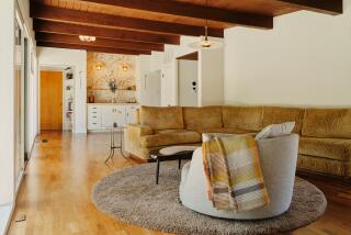
Several themes recur throughout the house--gabled roofs, inset glass blocks at the peak of each gable, exposed wood-beamed ceilings, natural-finish pine floors, white walls, and trim painted in shades of gray, pink or blue.
And Payne has used every foot of space, tucking closets and storage into the sloping under-roof areas, installing window seats, and making spaces appear larger by not cluttering them with too much furniture. High ceilings make the floor space seem greater than it actually is.
The kitchen, though compact, contains smart, European appliances, sleek cabinetry and a breakfast area with a banquette built into the rounded bay, which can be seen at the front of the house.
The most prominent, yet most contradictory, furnishings are several mahogany antiques--a secretary, dining table and chairs, and corner cabinet--that have been passed down through Hunter’s family. These heirlooms blend comfortably with their contemporary environment.
Payne designed the floor plan so that she and Hunter could close off the northernmost structure (which contains a bedroom and bath) and a downstairs bedroom and bath (located behind the garage). Both areas, though very much a part of the overall design, have their own entrances.


